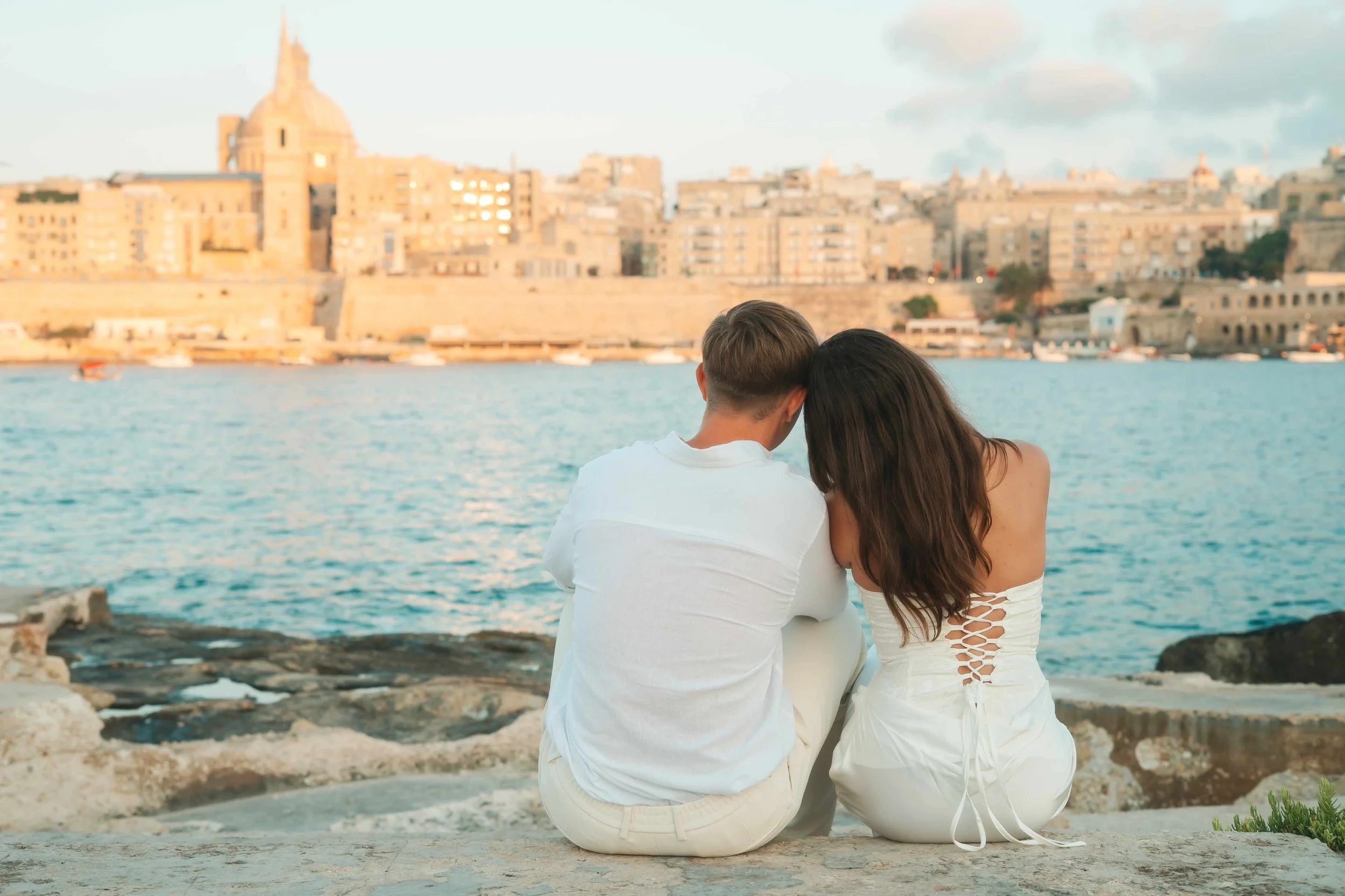
Best Photoshoot Locations in Malta: How to Choose the Right One for You
If you're visiting Malta for the first time, chances are you don't know the spots I do. So instead of asking you to pick a location, this is what I ask you first.
Beach, Nature or Architecture?
This is always my first question, and it narrows things down immediately. Malta holds three genuinely different worlds: the coastline, the countryside and gardens, and the historic towns.
From there, a couple of quick follow-ups: do you feel shy in front of a camera, and are you up for a walk to reach a location, or would you rather avoid one? Those answers usually point straight to the right spot.
Still not sure? Send me a few inspo photos, saved or liked from anywhere, even other photographers or other countries. It tells me more than trying to describe it in words ever could.
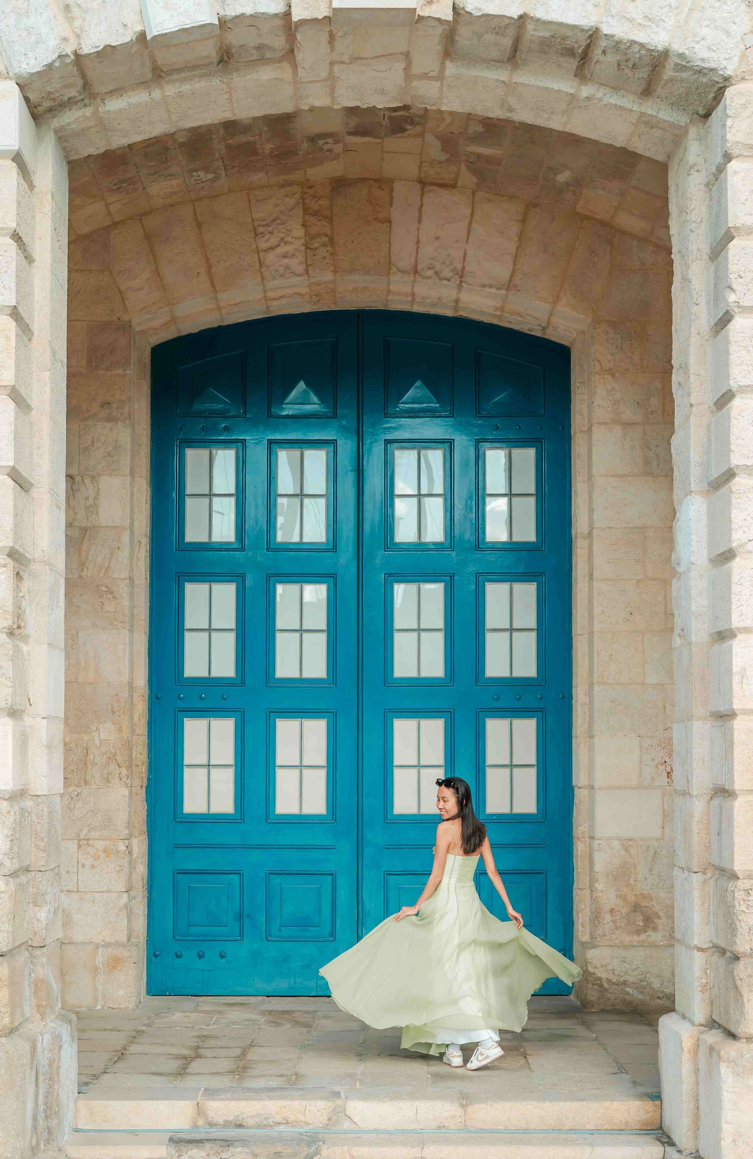
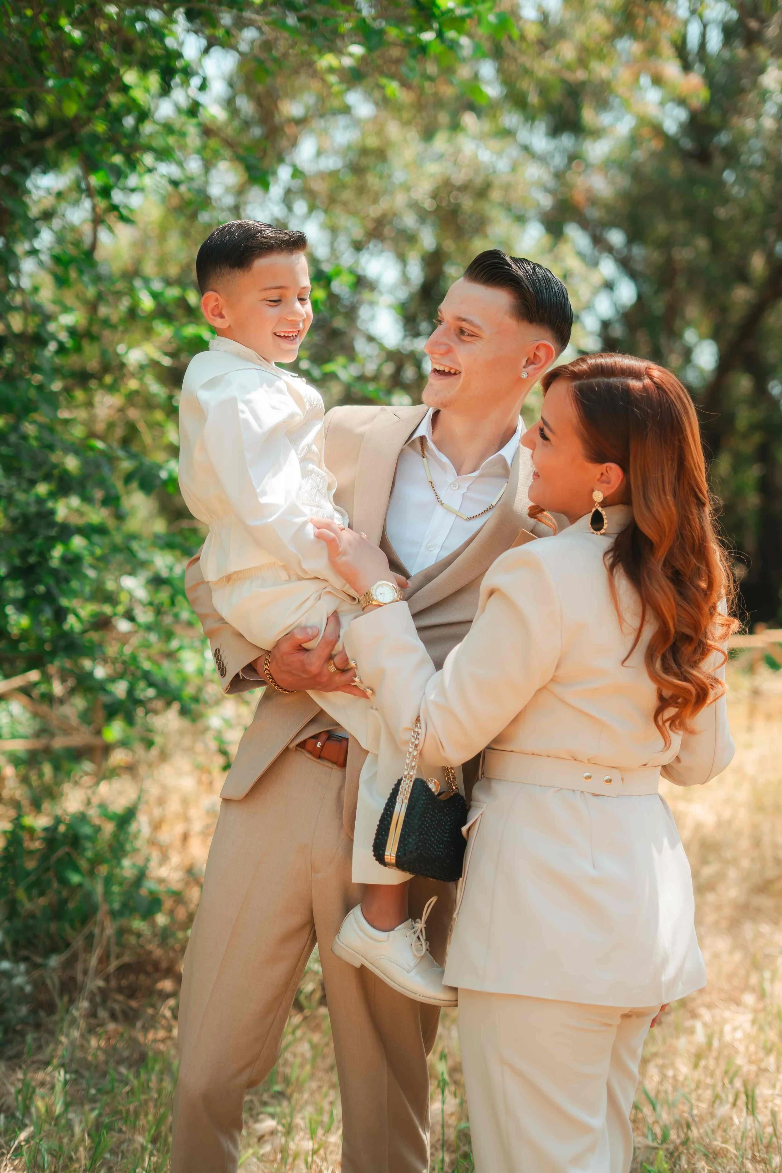
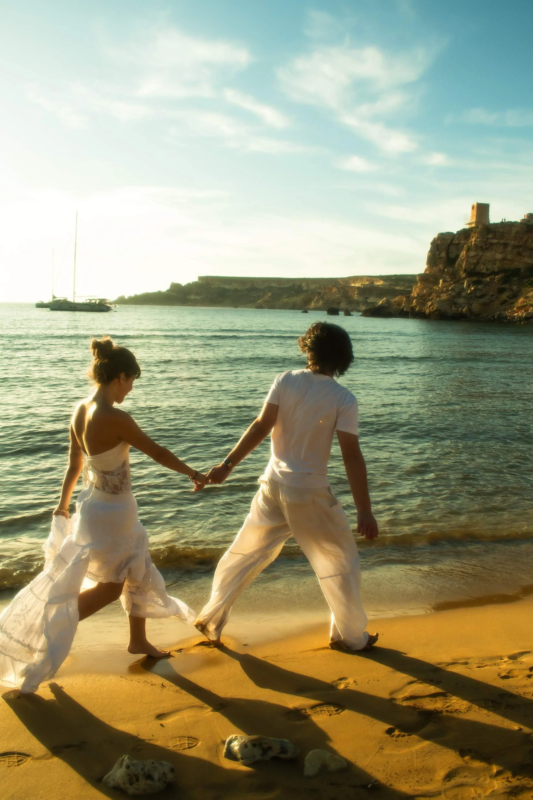
What Kind of Light Do You Want?
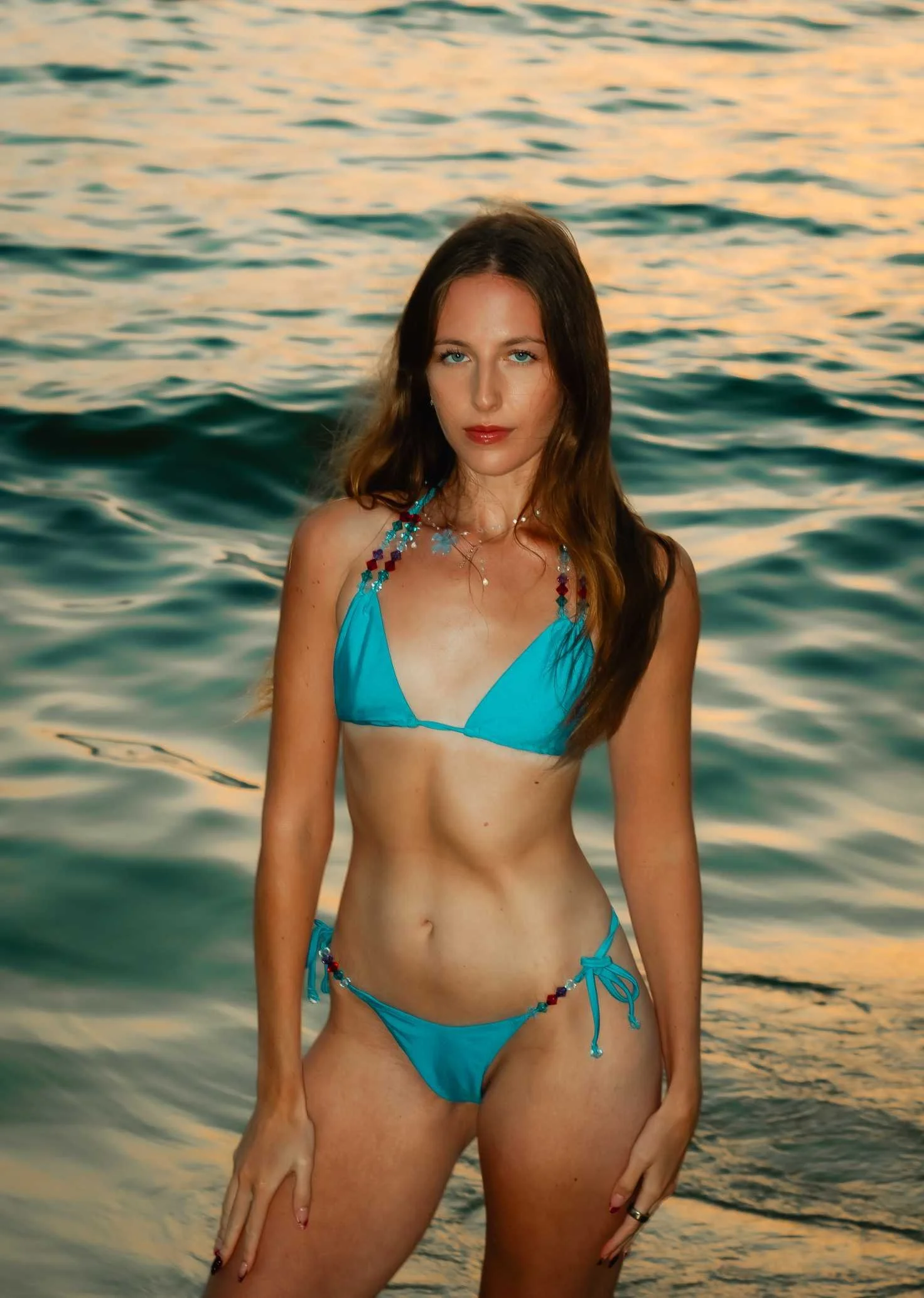
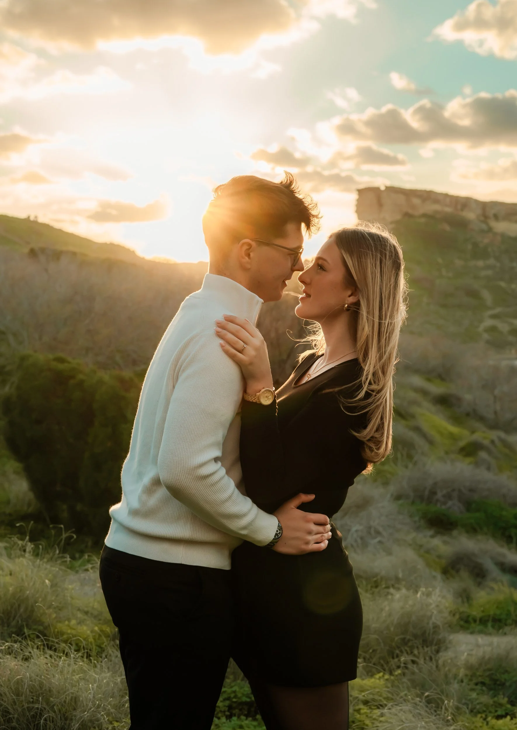
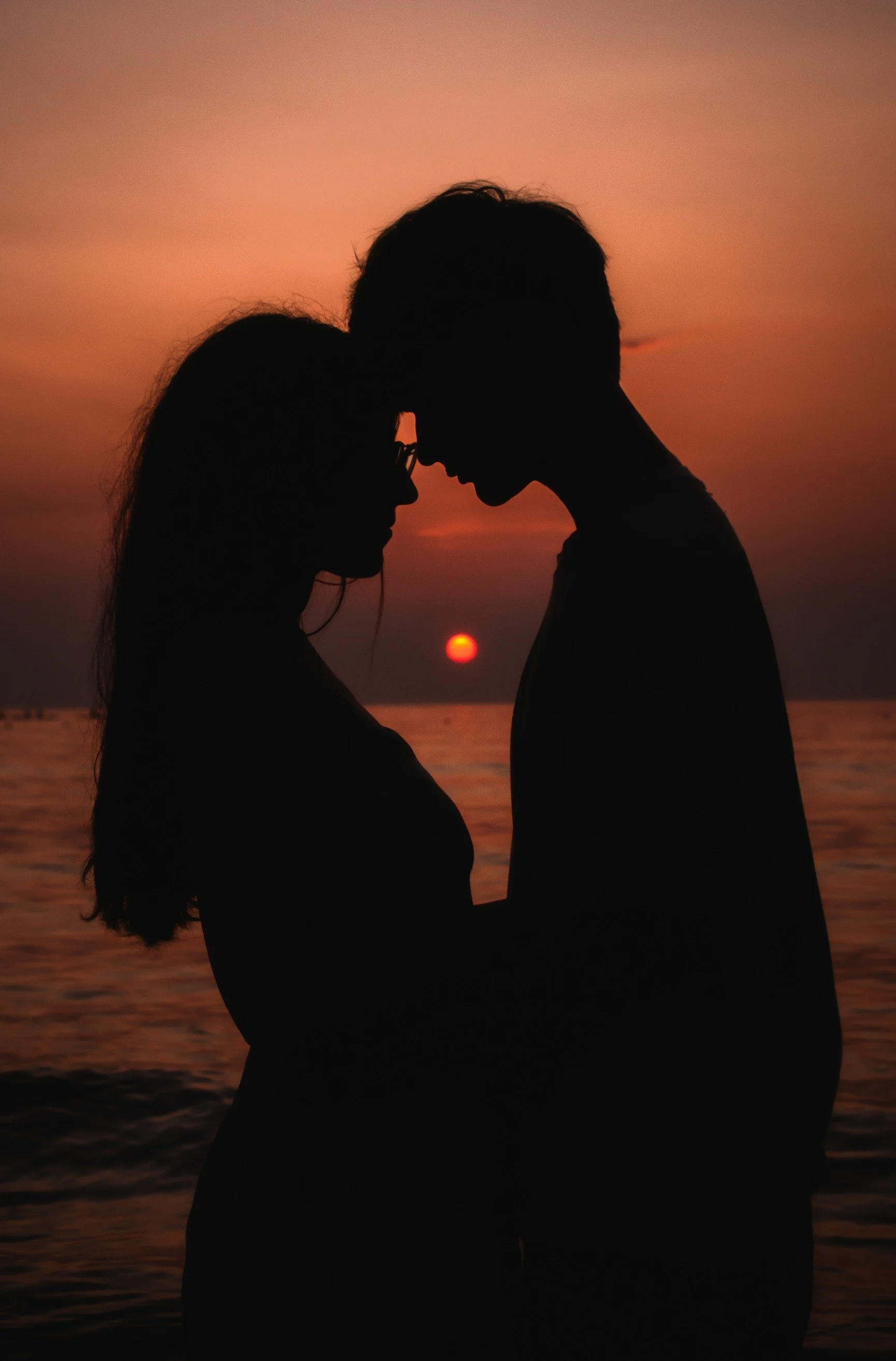
Worth thinking about alongside your category, since it shapes the whole mood of your photos. Golden hour, the hour before sunset, gives you that soft, warm, dreamy look most couples and portrait clients go for. Right at sunset, the sky turns dramatic; deeper colour, more contrast, a bigger sense of occasion. Midday, in shaded or covered spots, gives you something quieter and a little surreal; softer shadows, moodier tones, less of the obvious "golden hour" feel.
None of these are better than the others, they just feel different. Weather plays into it too, of course; an overcast day softens everything regardless of the hour, so what we're after can shift a little depending on what the sky's doing that day.
If you're not sure which you're drawn to, this is another thing your inspo photos will tell me. And once we've landed on a location and a light, I'll help you think through what to wear so your outfit works with it rather than against it.
Malta Locations, By Category
Here's how these break down in practice; light, crowds and access included, so you know exactly what you're picking.
Beach
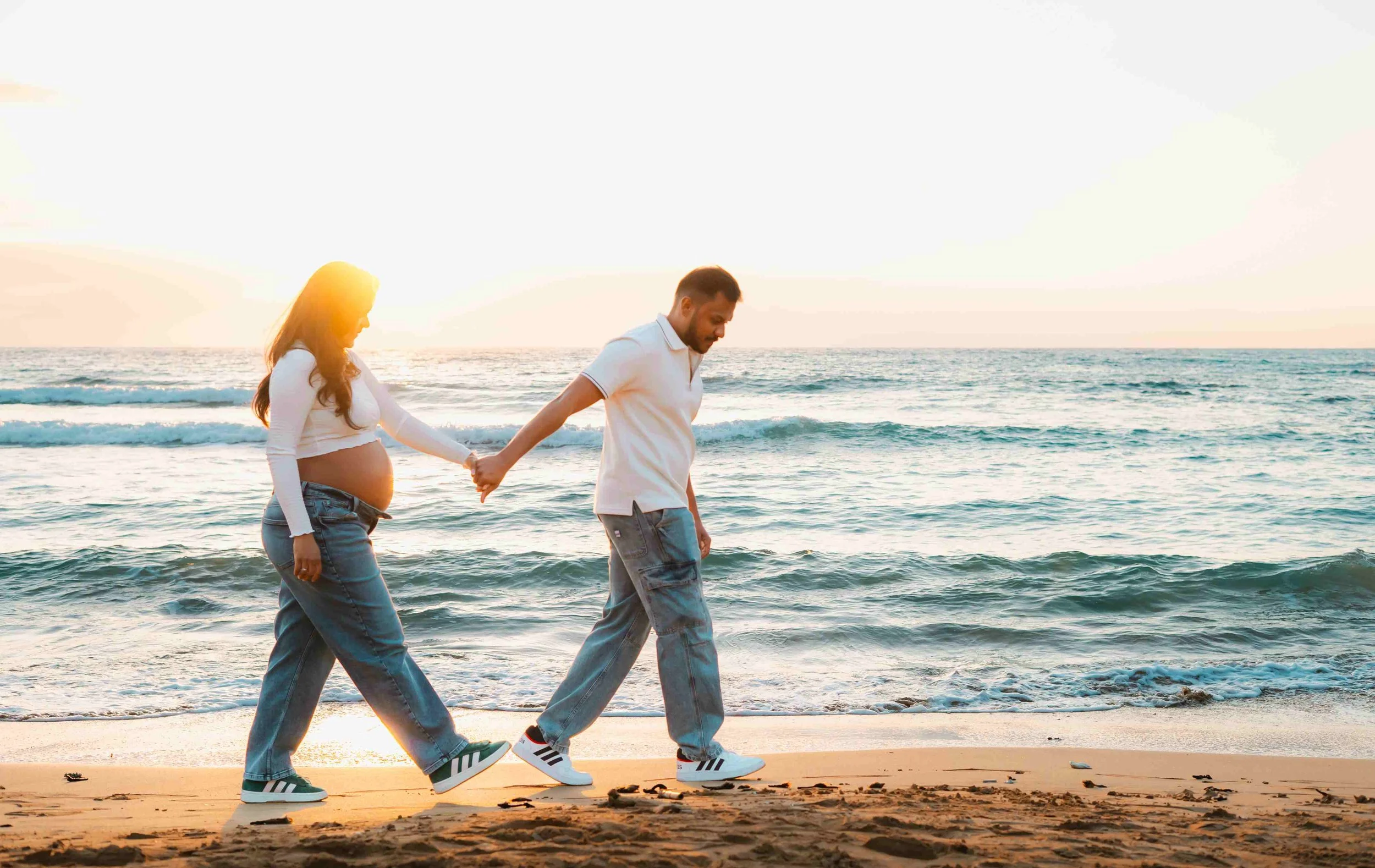
Riviera Bay. My top pick, it has the most variety in one location and the best golden hour and sunset views on the island. It also has plenty of quiet corners, so it works even if you feel shy in front of the camera. There's a short, easy walk down to the bay with genuinely rewarding views along the way, though it's completely optional if you'd rather skip it.
Wied iż-Żurrieq. A favourite for surprise proposals and group photos; it's a genuinely unique spot that many tourists haven’t discovered yet. (Għar Lapsi is normally on this list too, but it's currently unavailable following storm damage.)
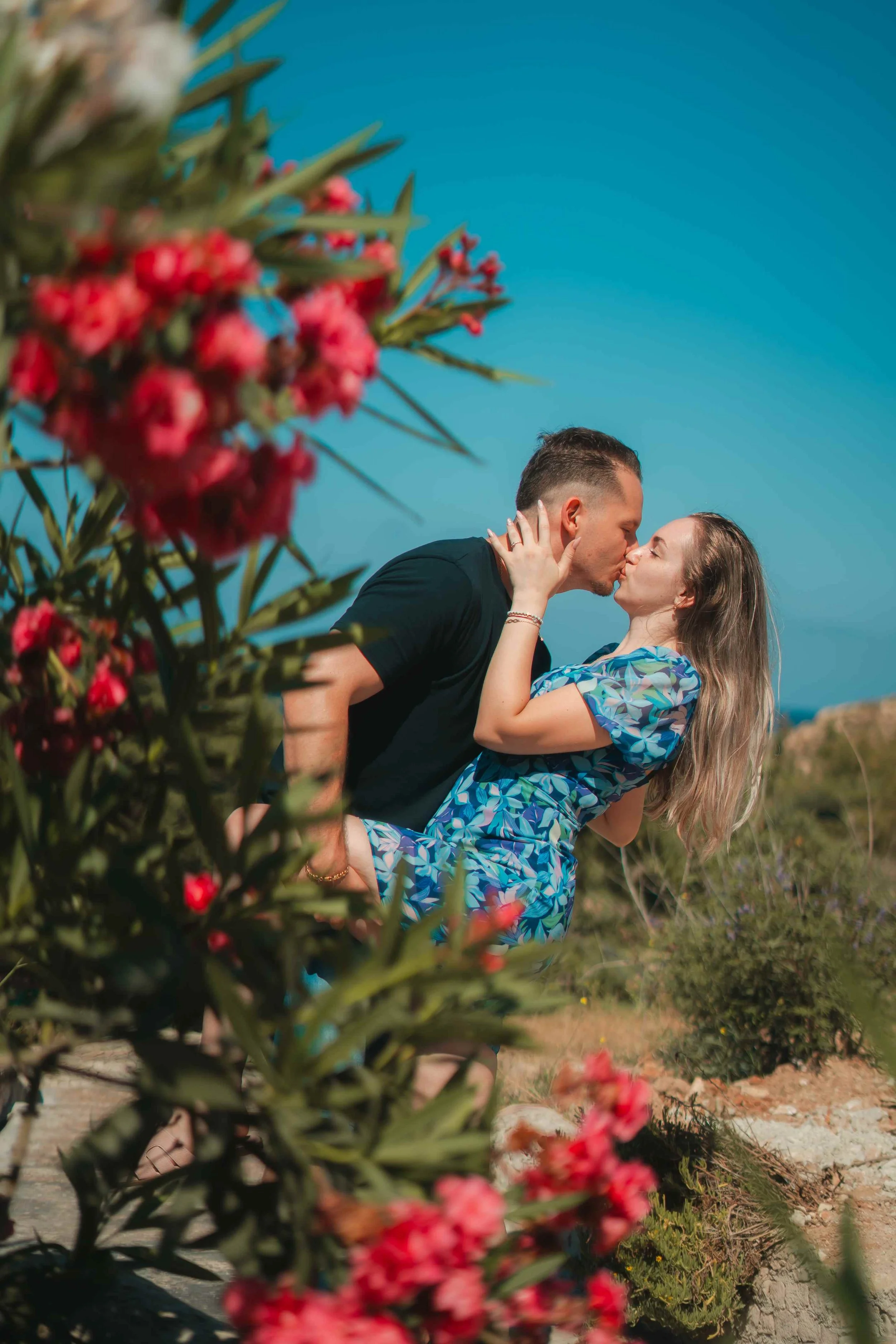
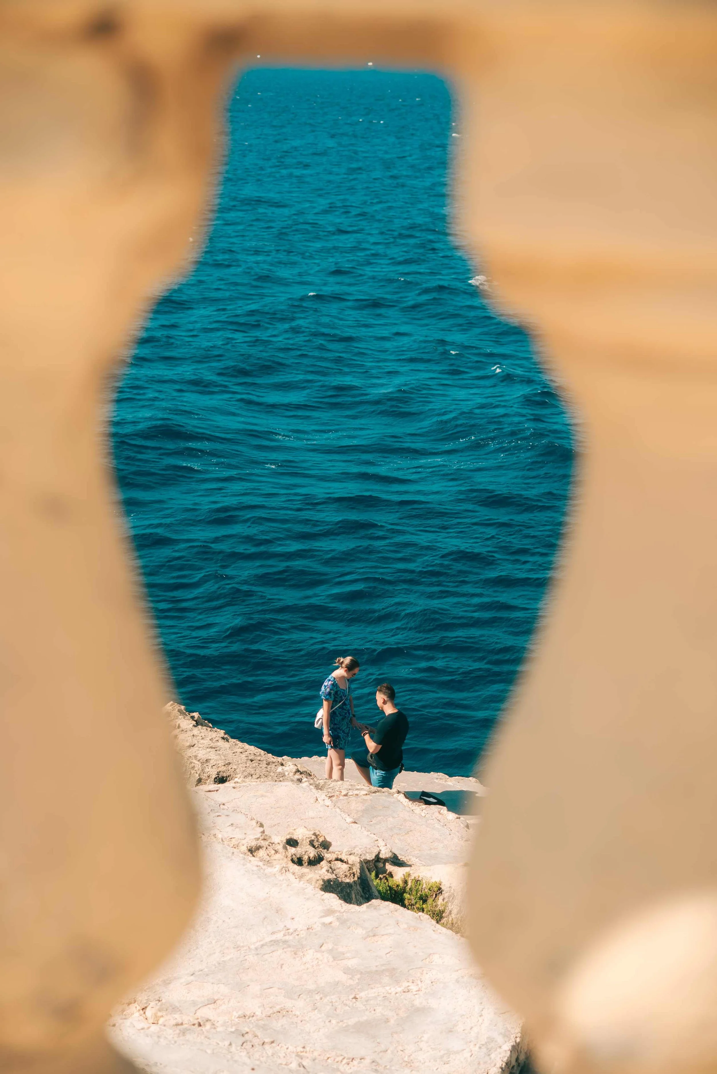
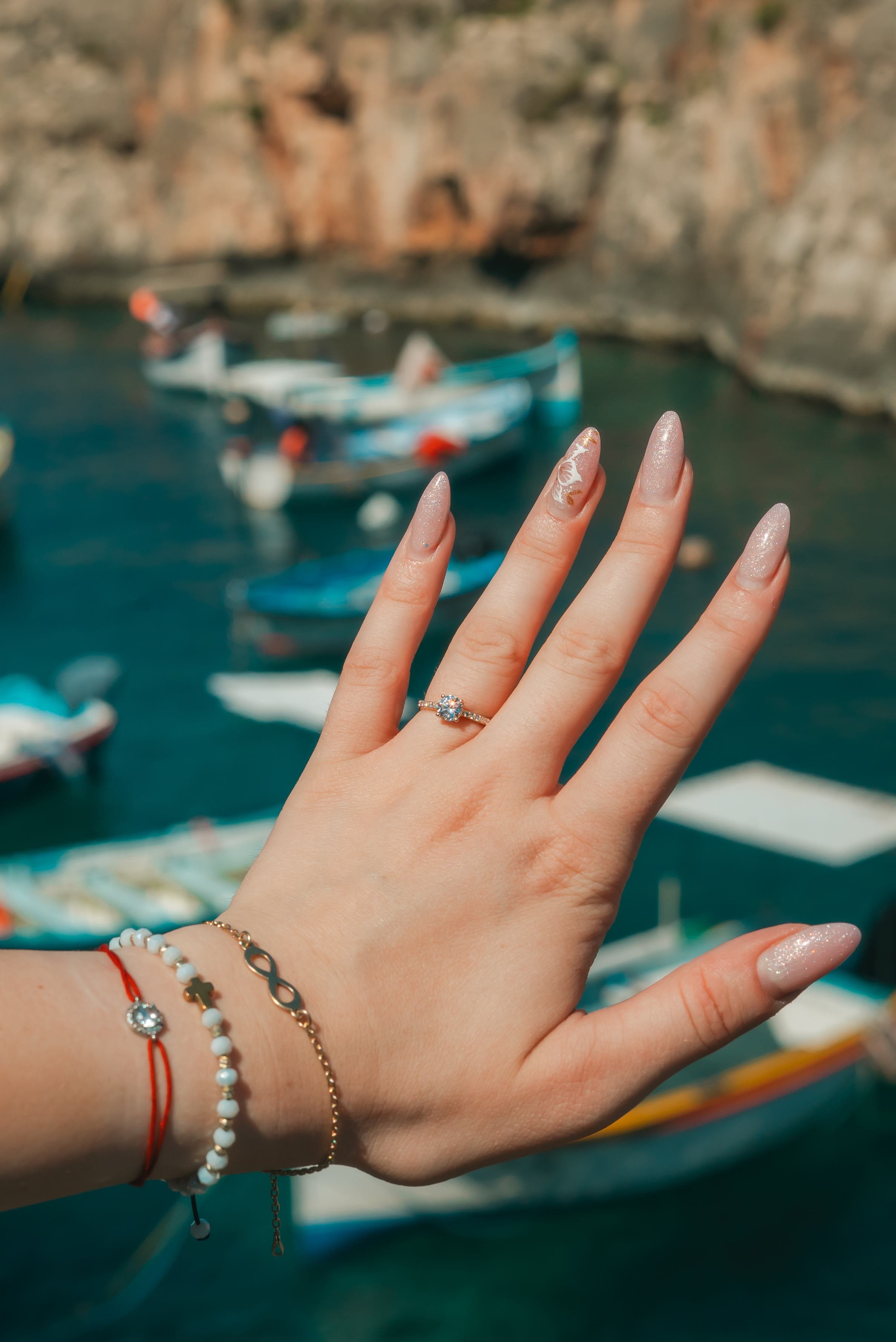
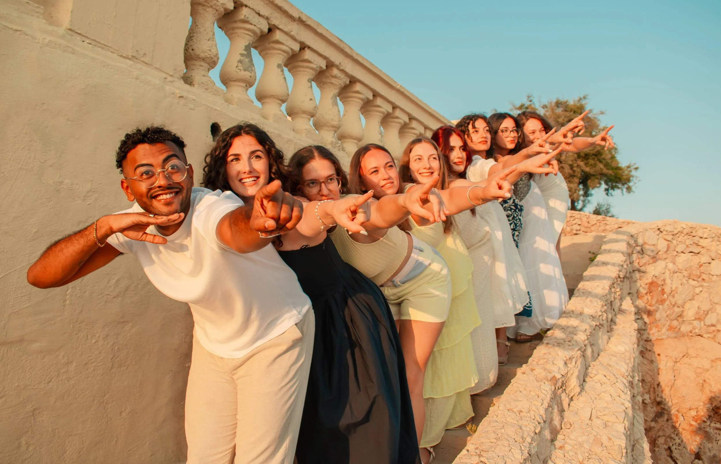
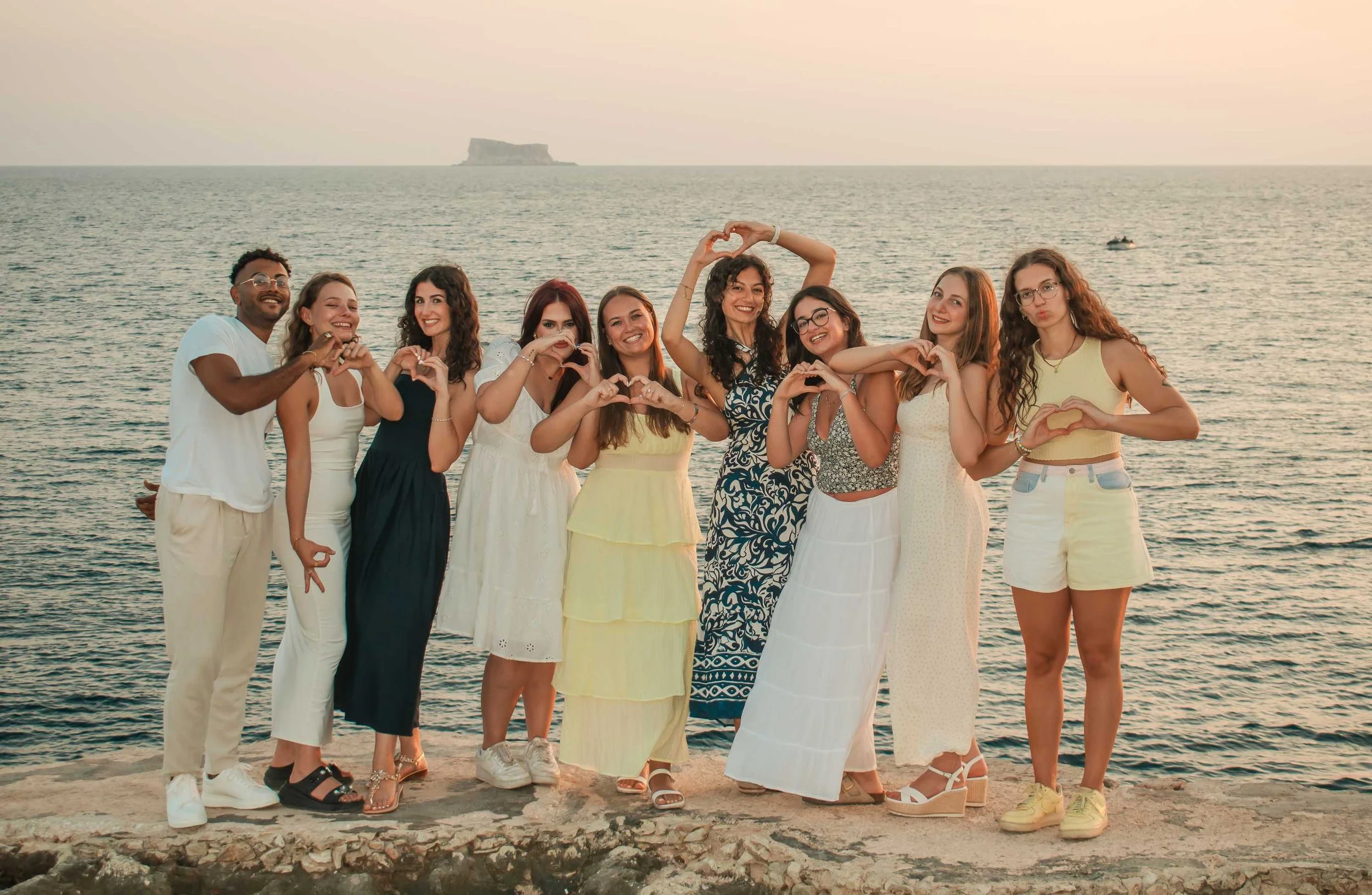
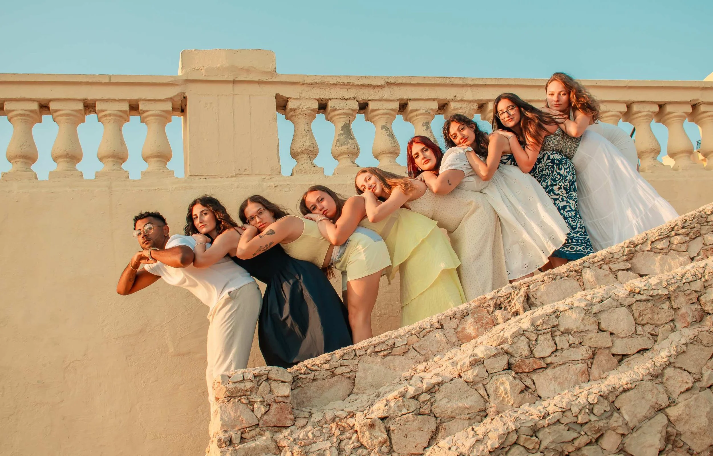
Fomm ir-Rih. One of Malta's most remote and dramatic bays. Rugged, raw, and genuinely hard to get to, with a proper walk down; which means you'll almost certainly have it to yourselves. For couples who want something completely off the beaten track, this is it.
Migra l-Ferħa. A hidden coastal gem that most visitors never find. Dramatic cliffs, crystal water and a quietness that's hard to come by. Worth the effort to get there, and worth documenting when you do.
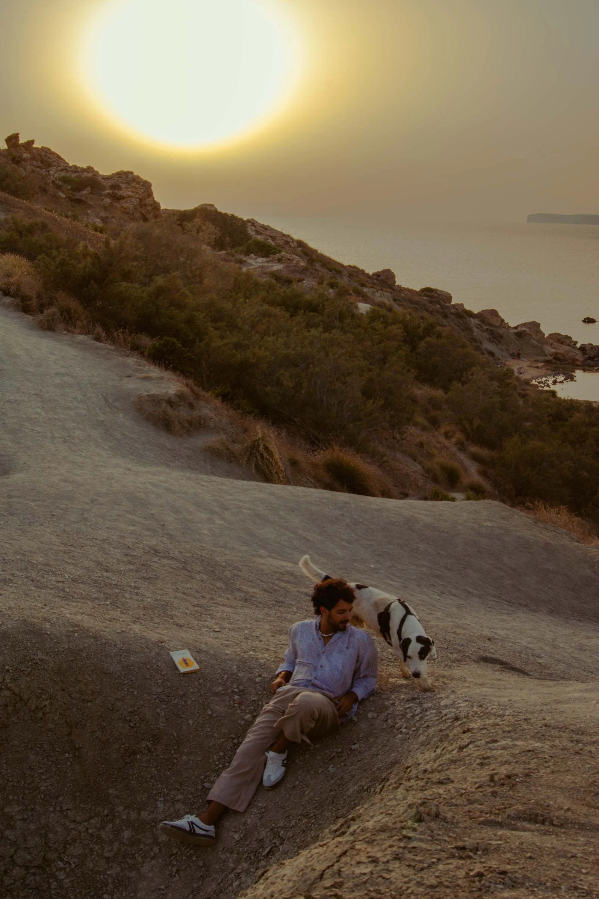
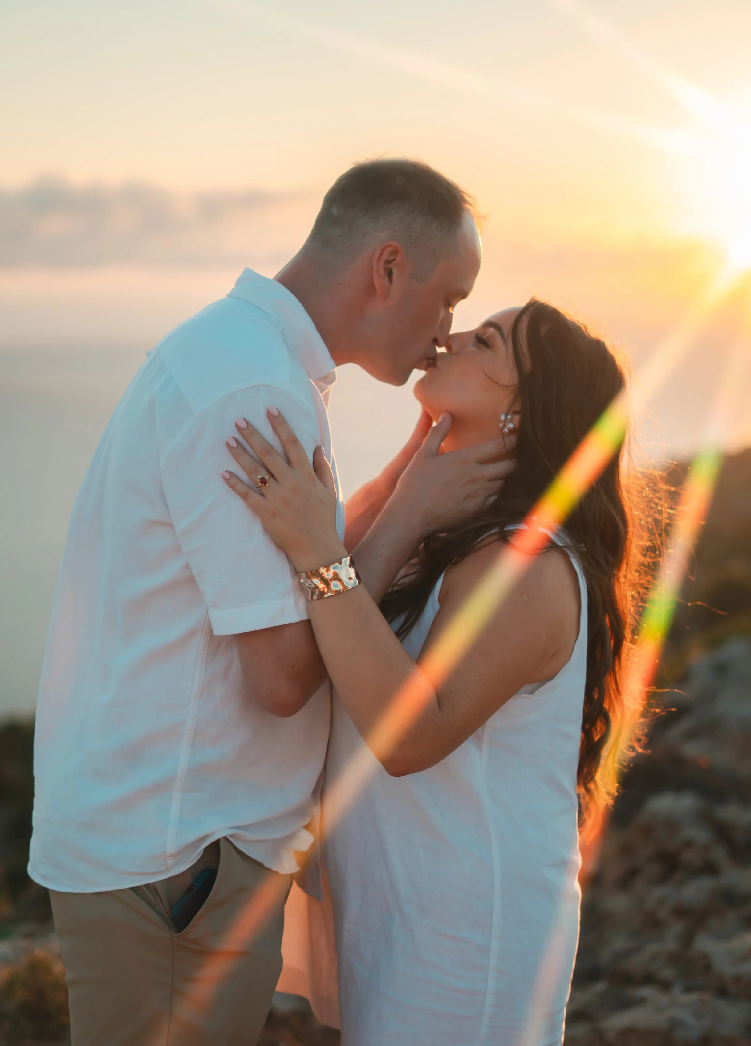
Dingli Cliffs. Not a beach, but sea views all the way, from the highest point in Malta. Breathtaking at any time of day and completely open, which makes for incredible wide shots.
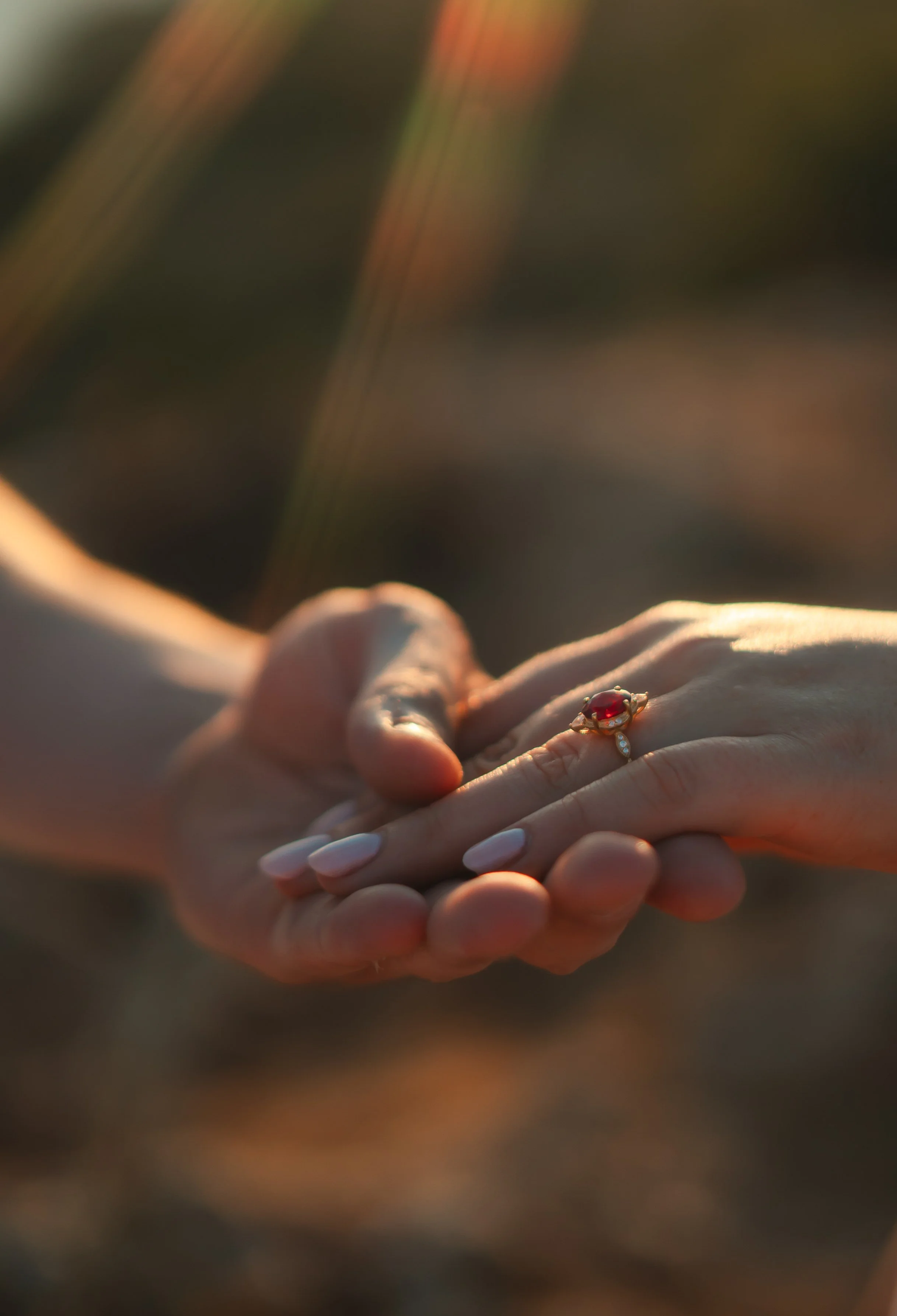
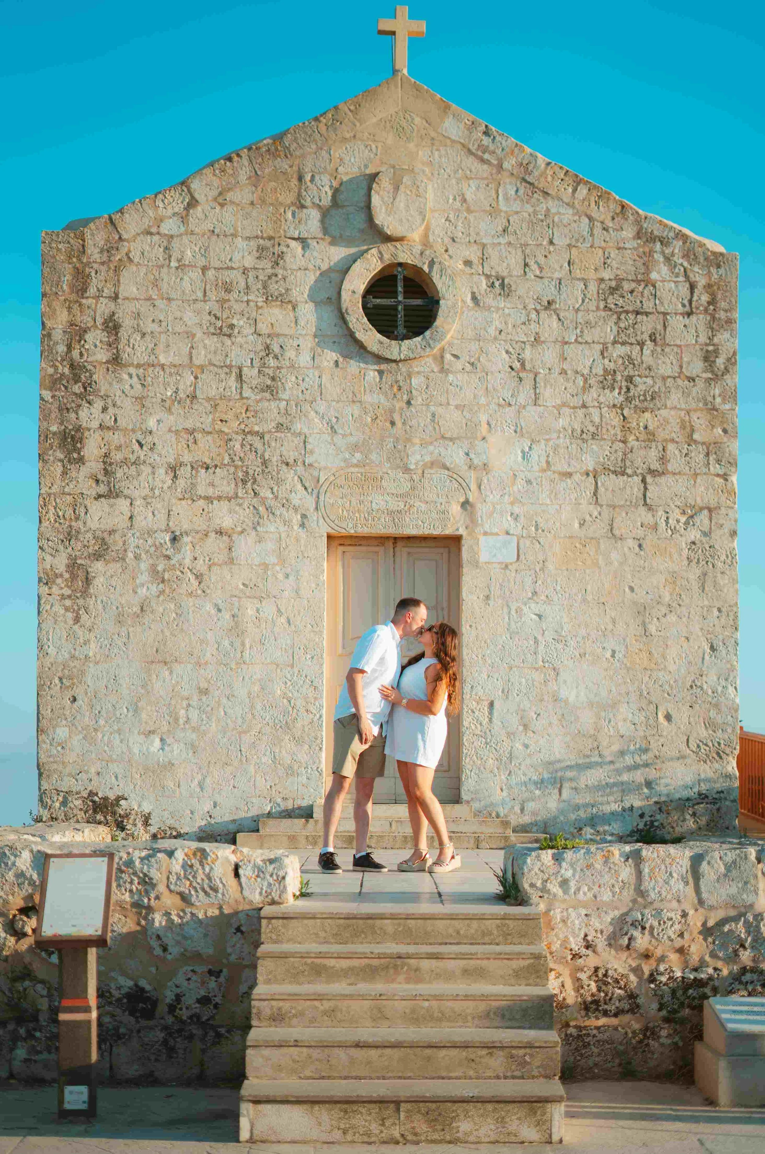
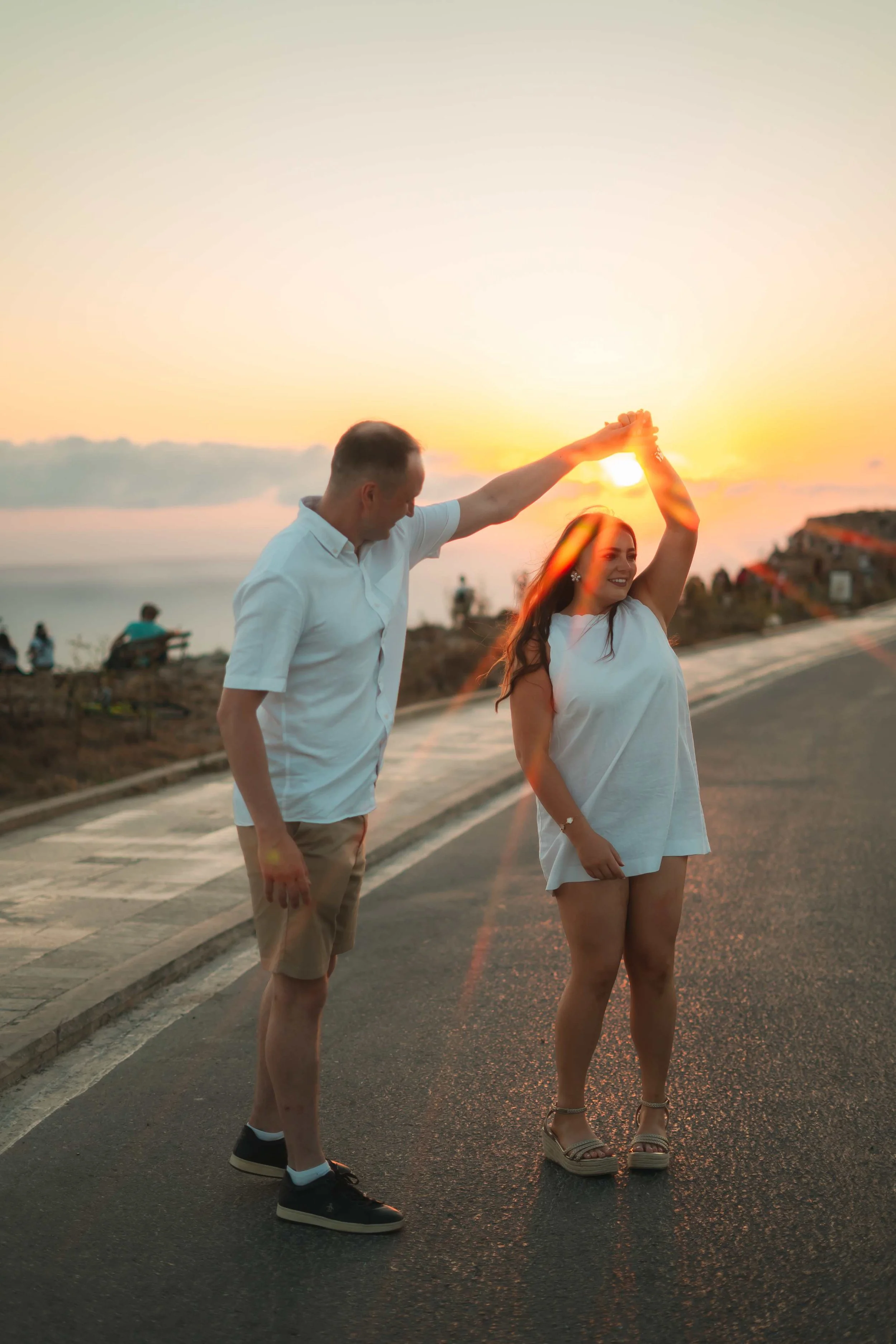
Nature
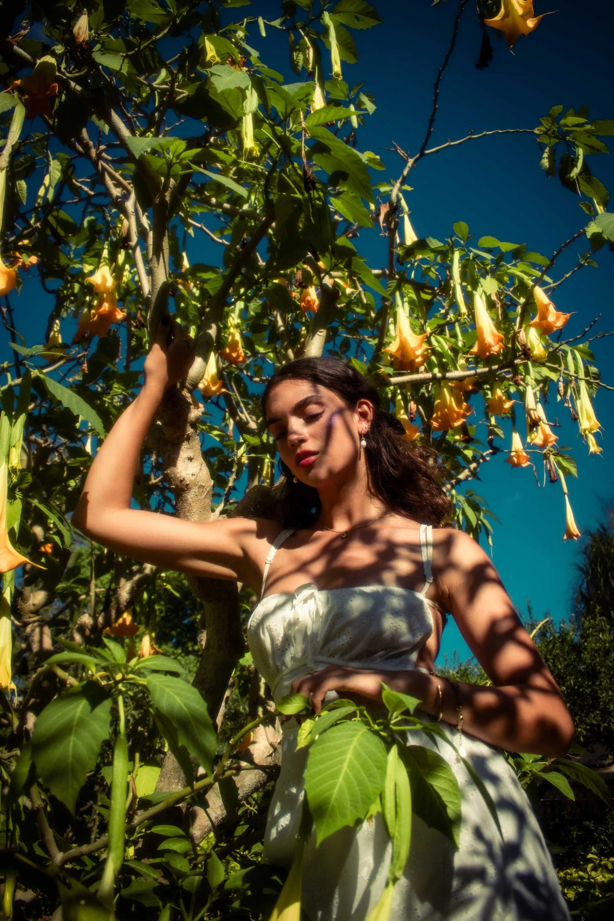
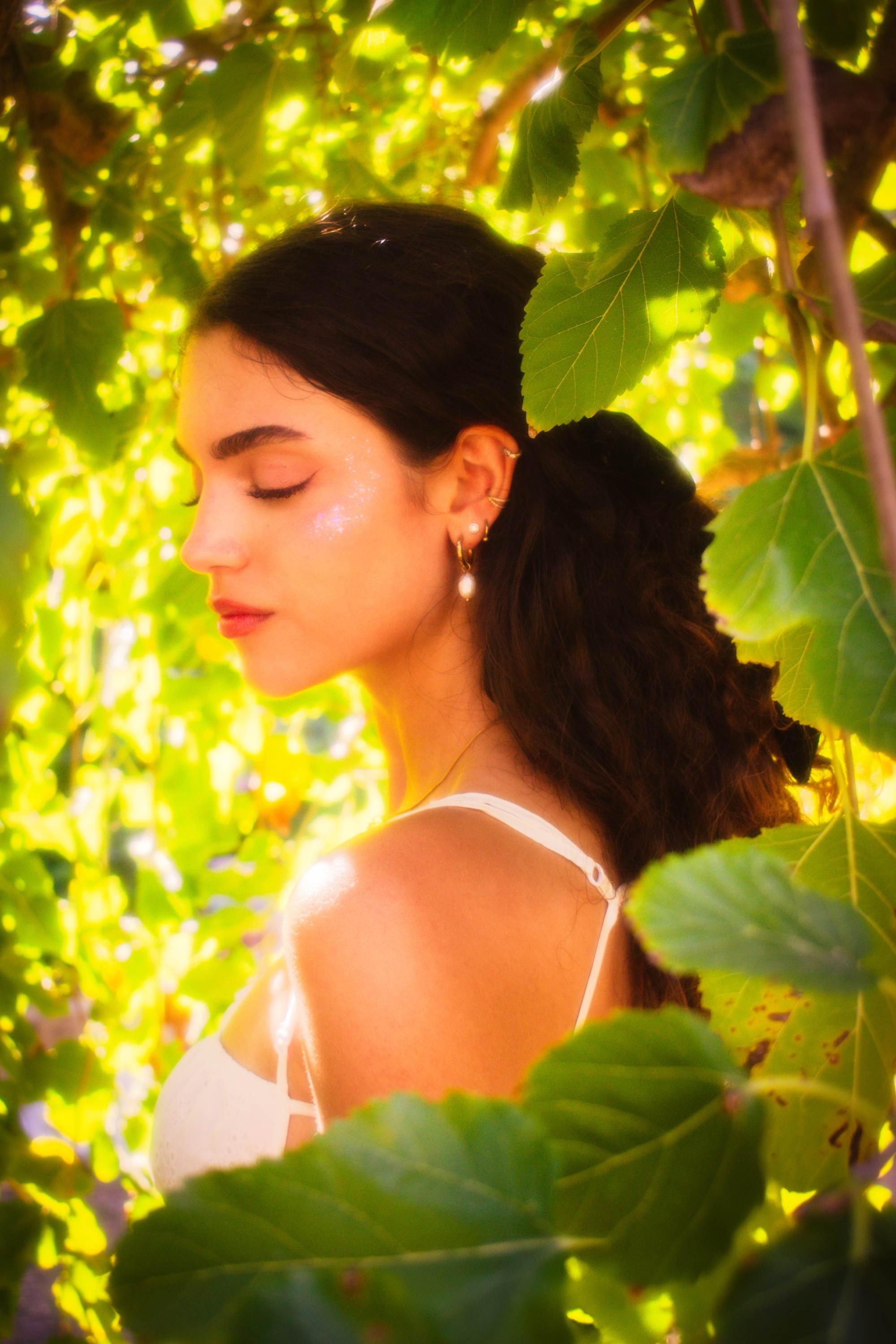
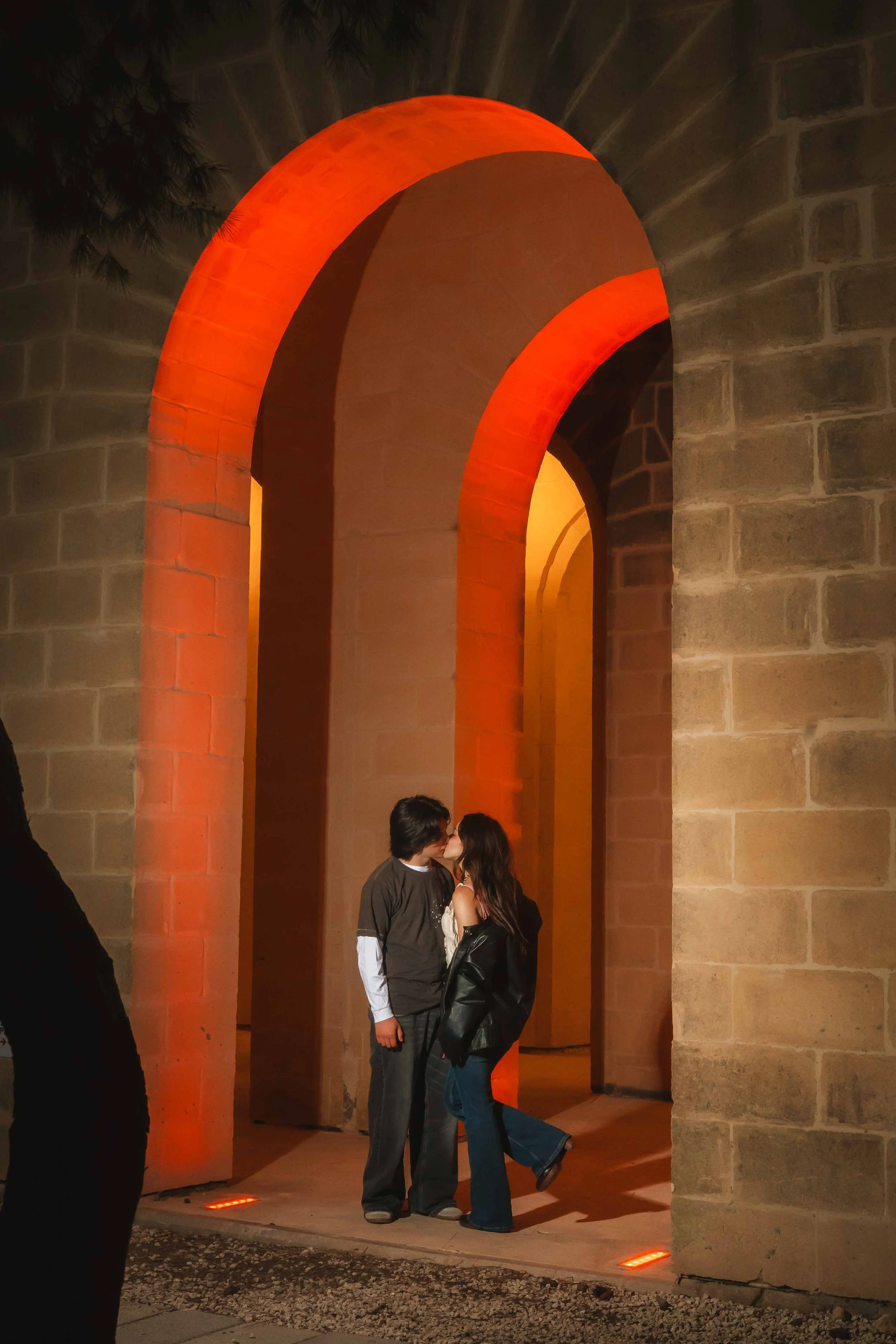
Buskett. The most un-Malta part of Malta. Lush, overgrown and a little otherworldly; the Alice in Wonderland of the island. Shaded canopy cover means it also works beautifully at midday, not just golden hour.
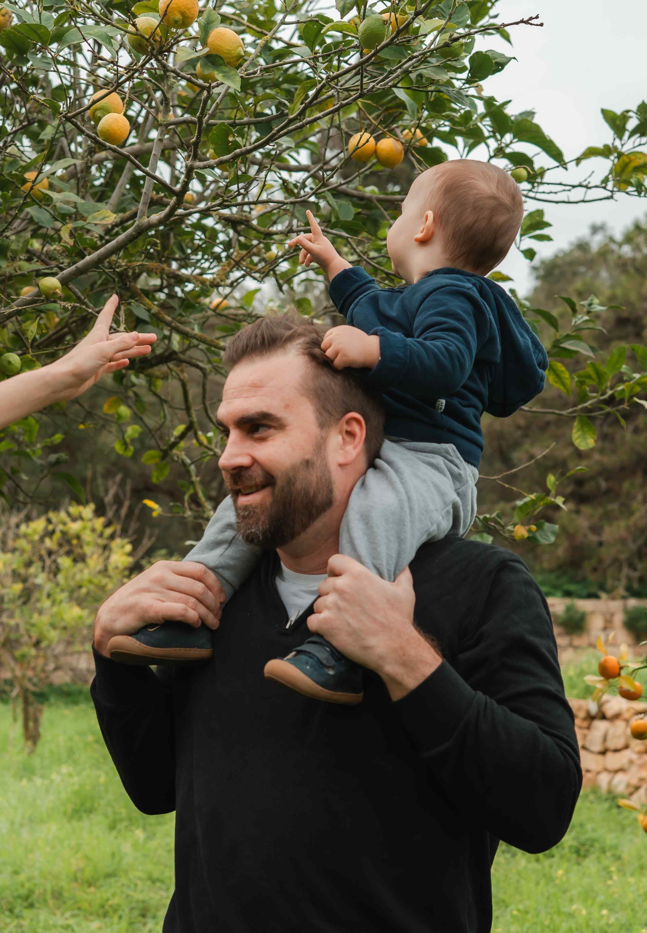
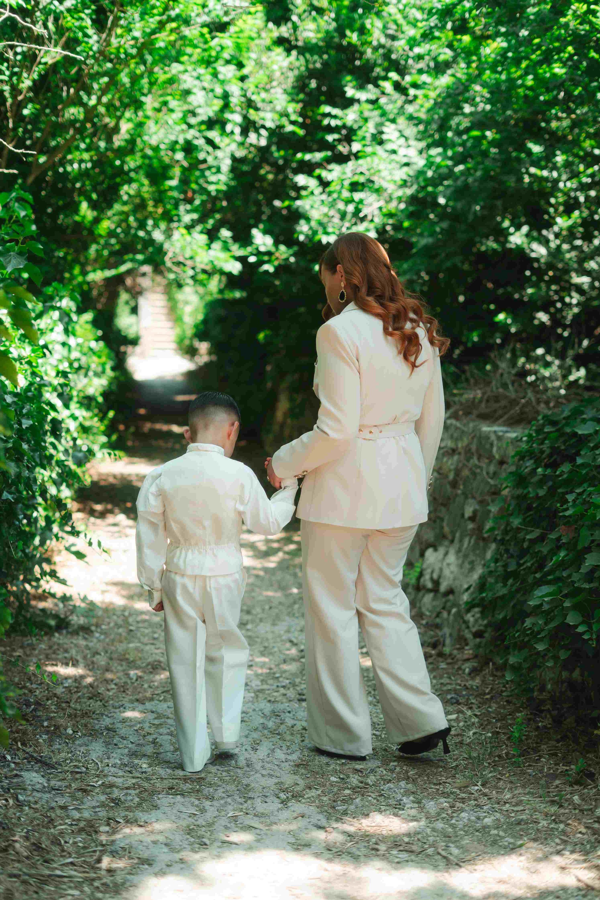
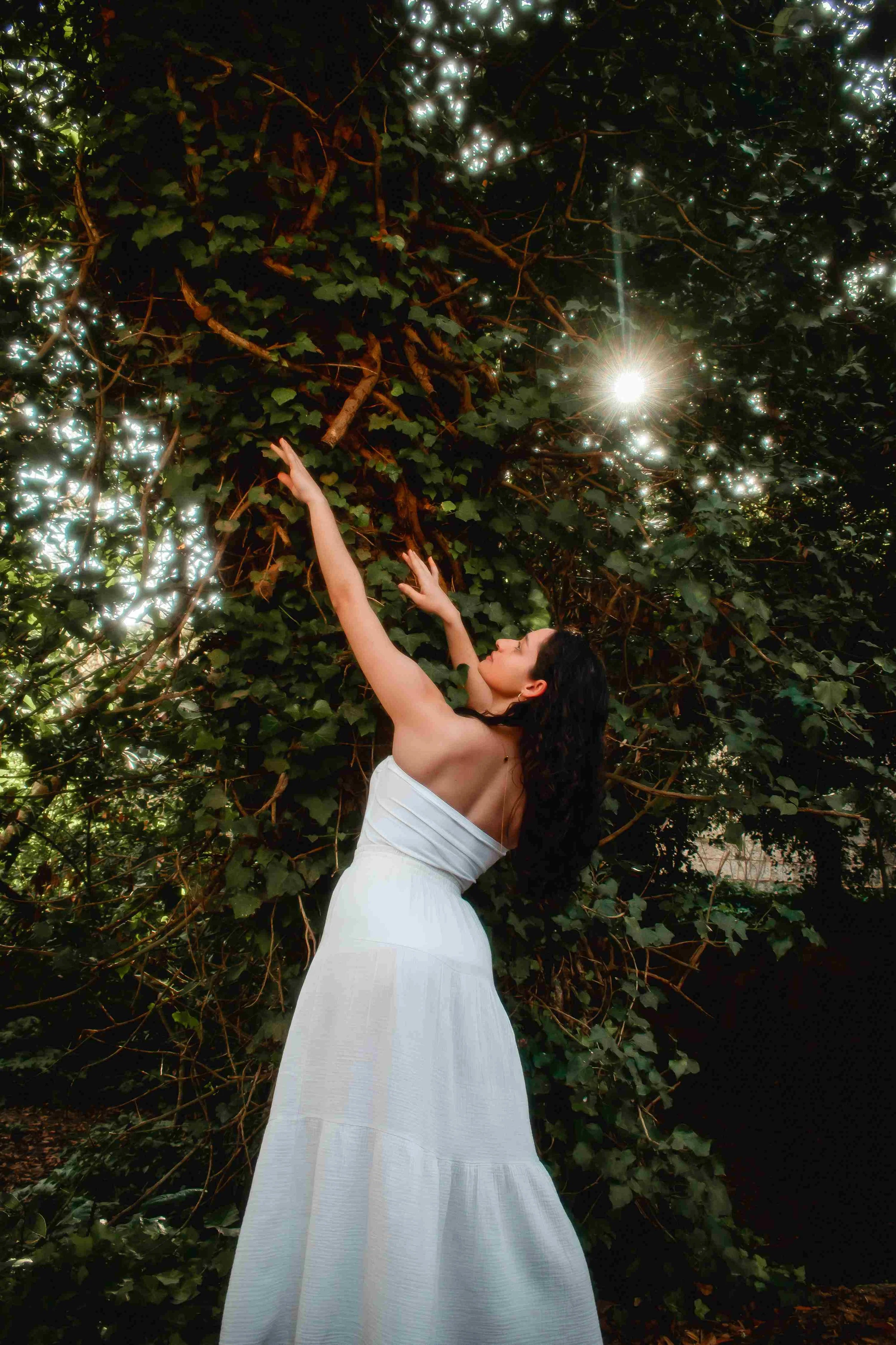
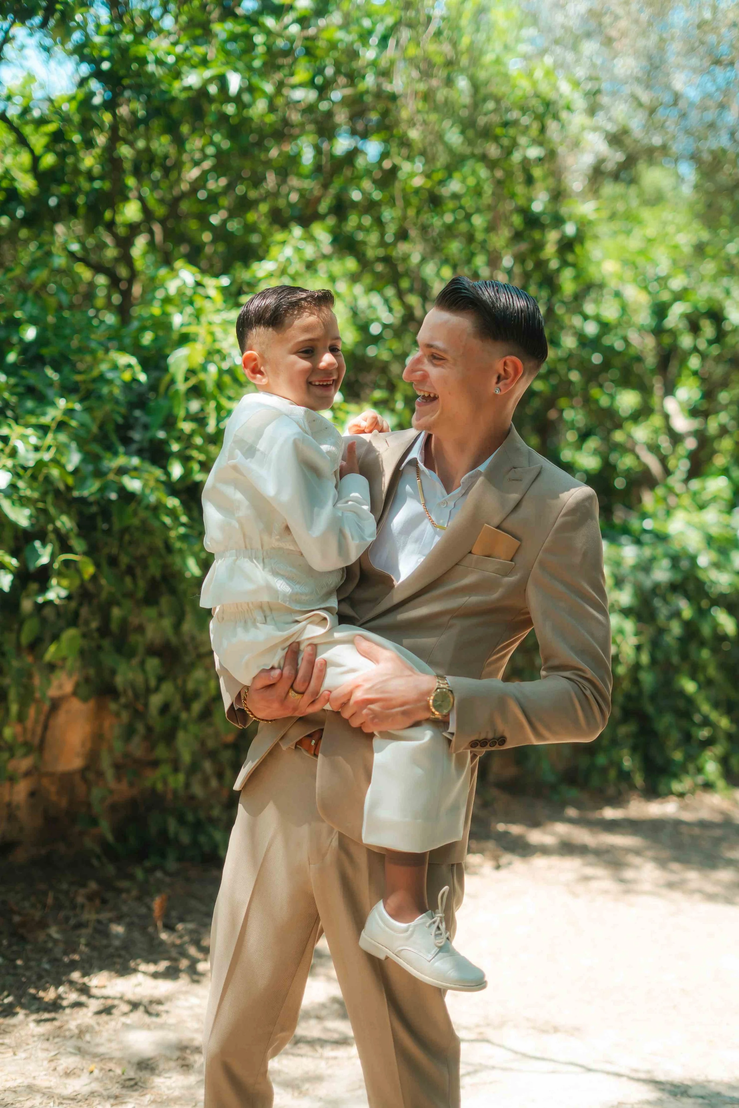
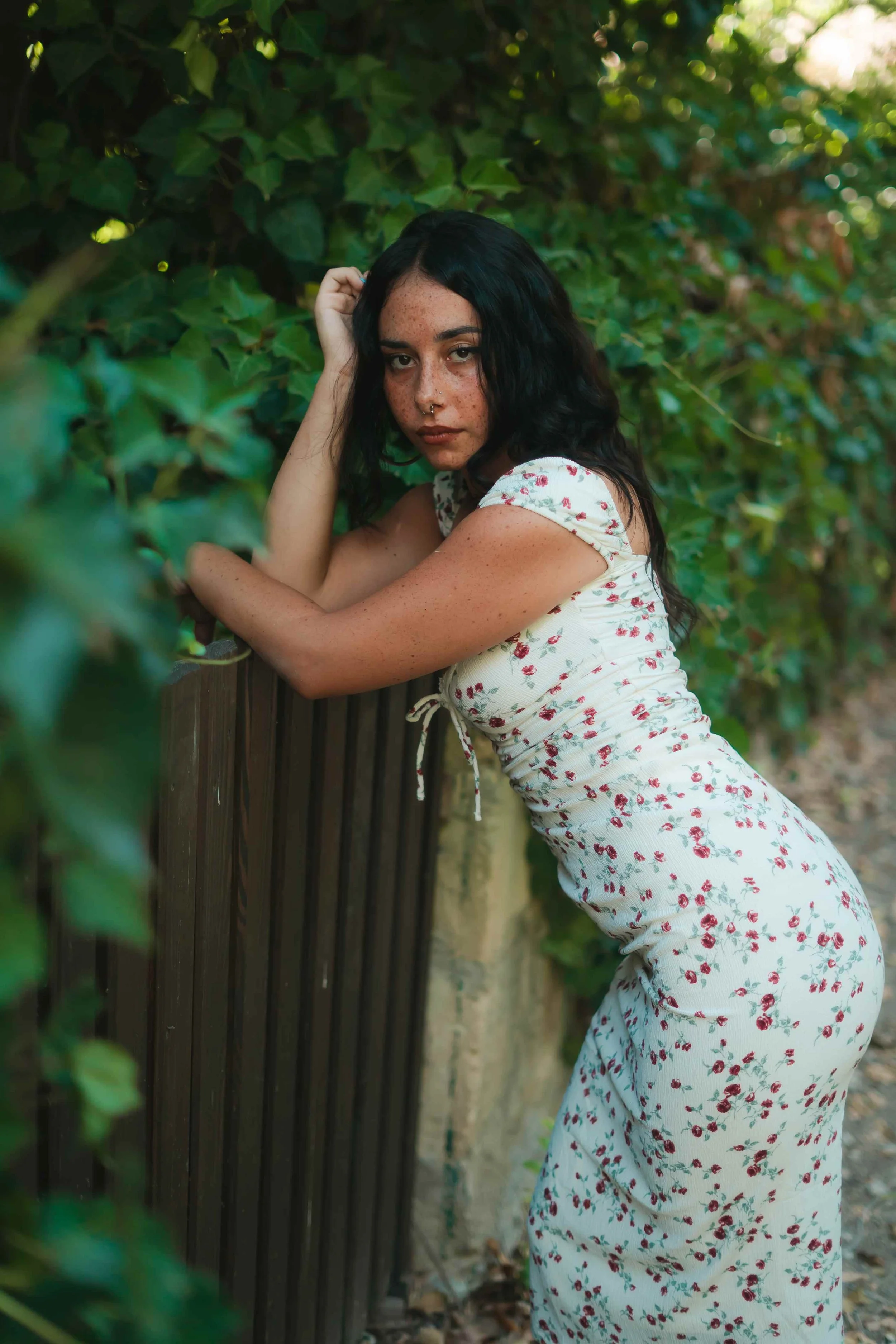
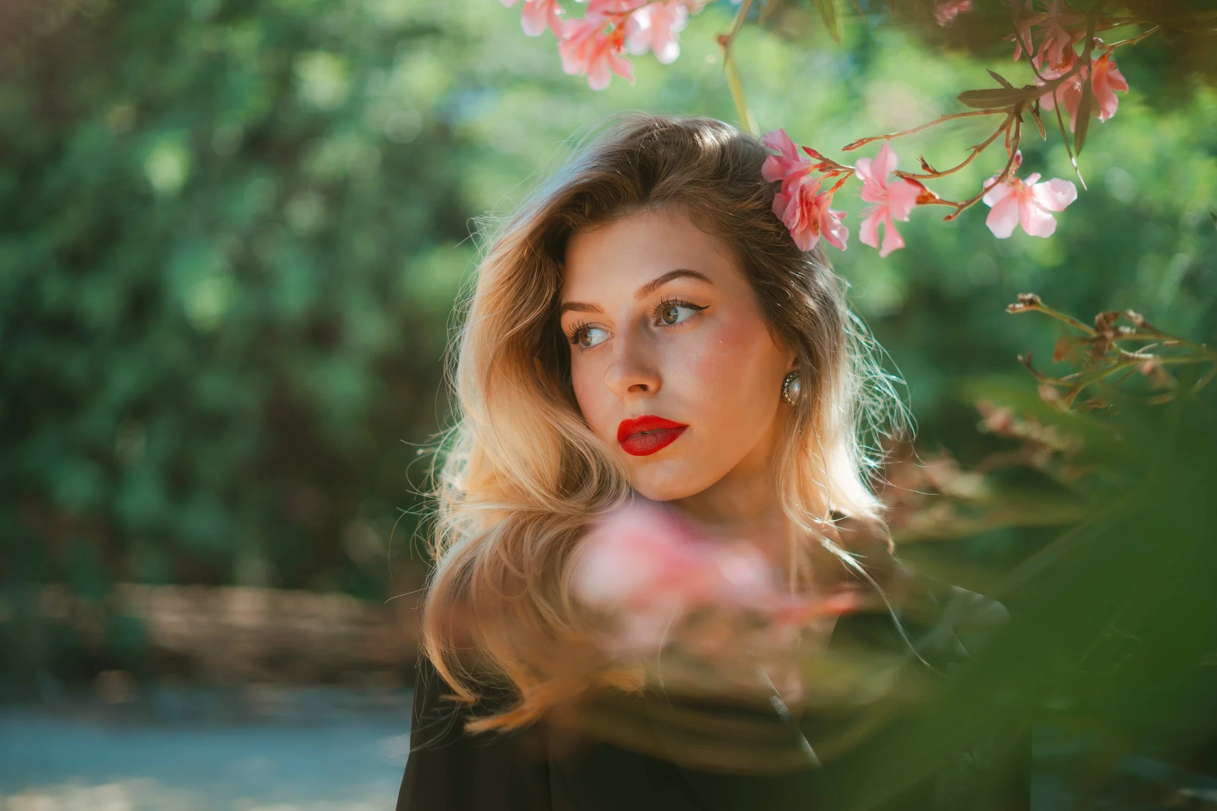
Palazzo Parisio Gardens. Secret garden energy at its absolute peak in spring when the flowers are in full bloom. Romantic, intimate and unlike anything else on the island. You can also pair the session with brunch there, which makes for a beautiful morning; and a whole set of images that document the day properly rather than just the shoot.
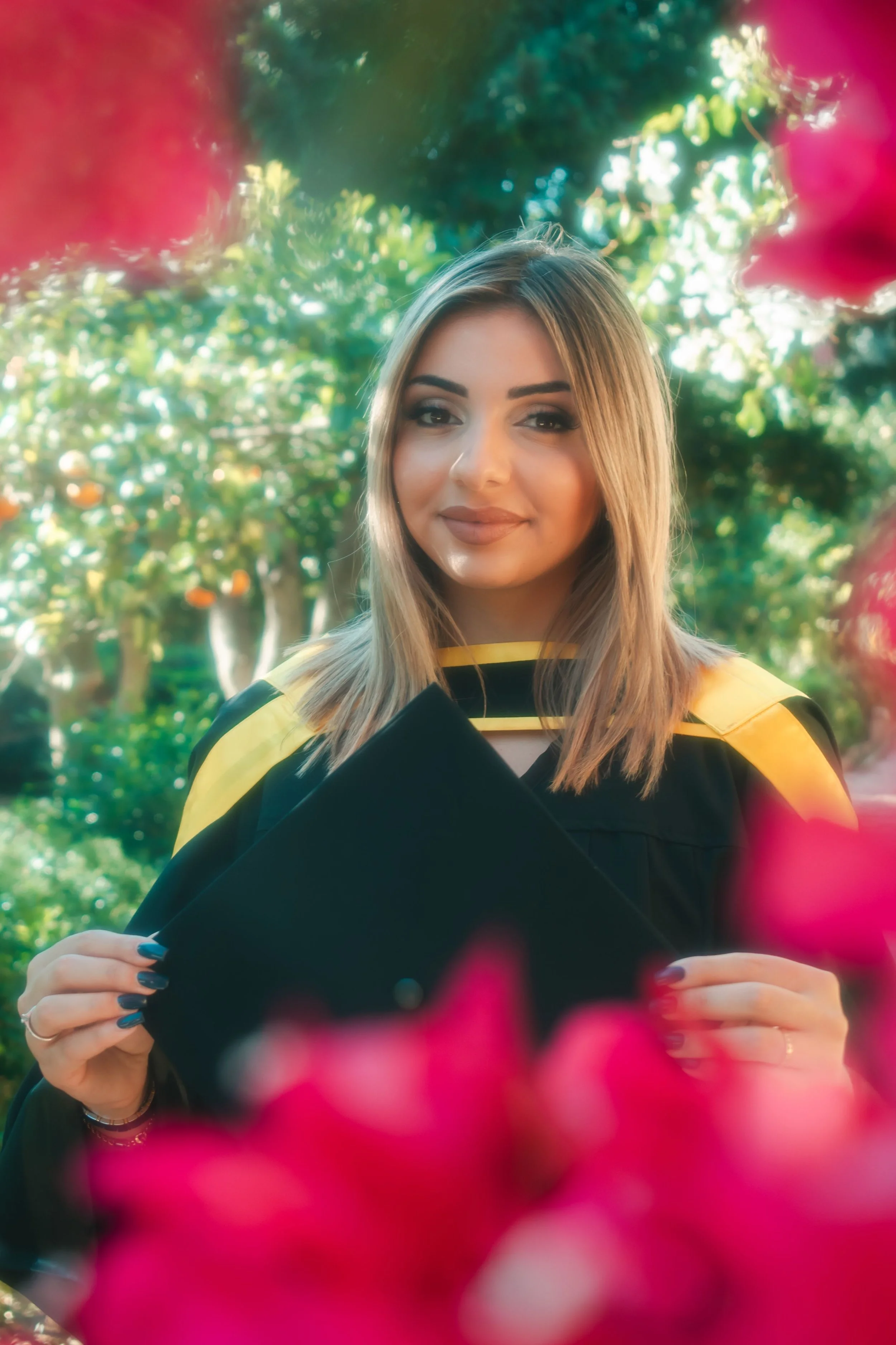
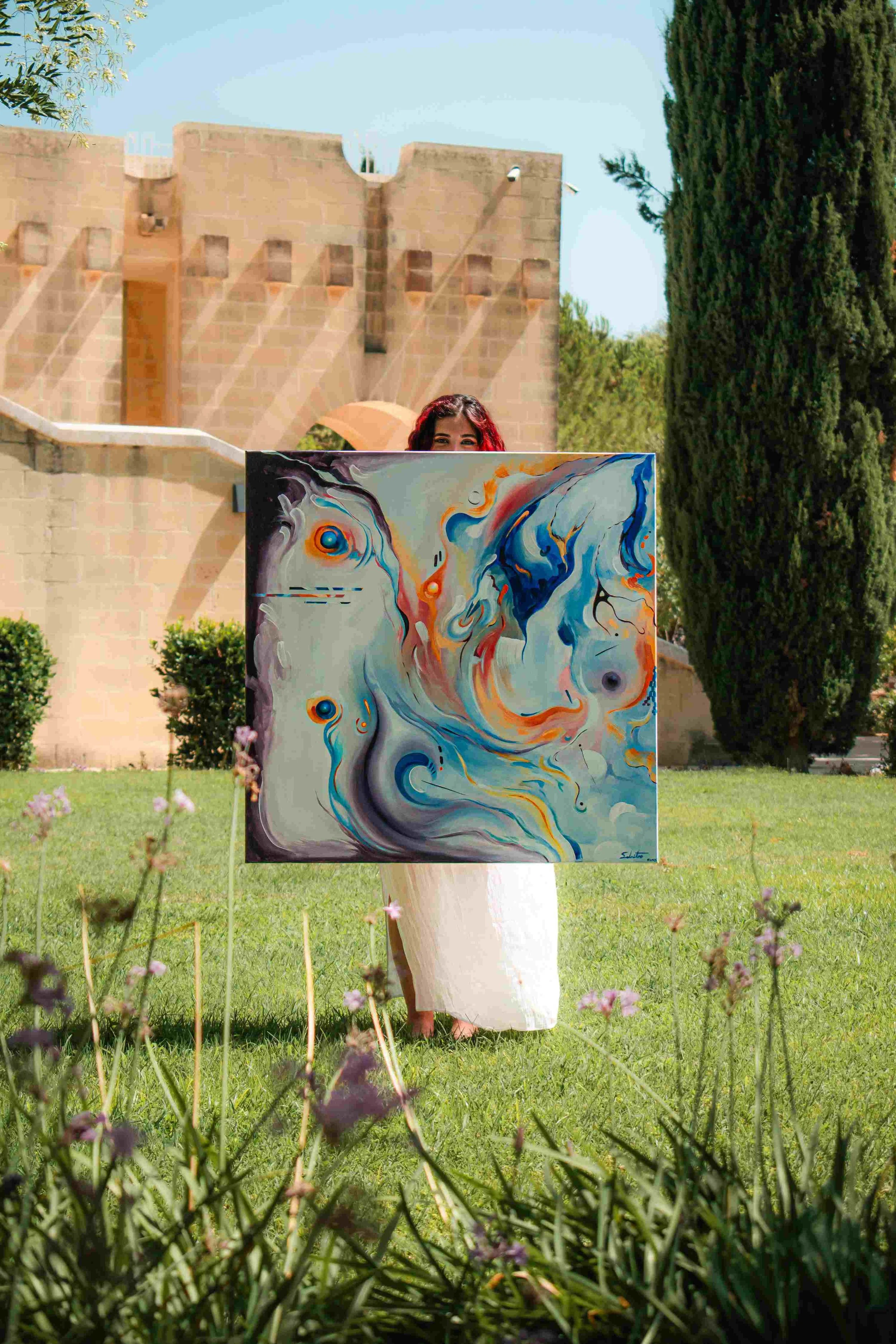
Ta' Qali National Park. A wide, green stretch with big skies and a set of arches that frame a shot beautifully. Especially good if you're a larger group or a family and want space to actually spread out. The Crafts Village sits right next door too, so it's easy to work in a few frames with more character if you want variety within the same visit. One thing to flag: summer often brings events and fairs to the park, so it isn't always free, I'll check availability before we build a plan around it.
Architecture
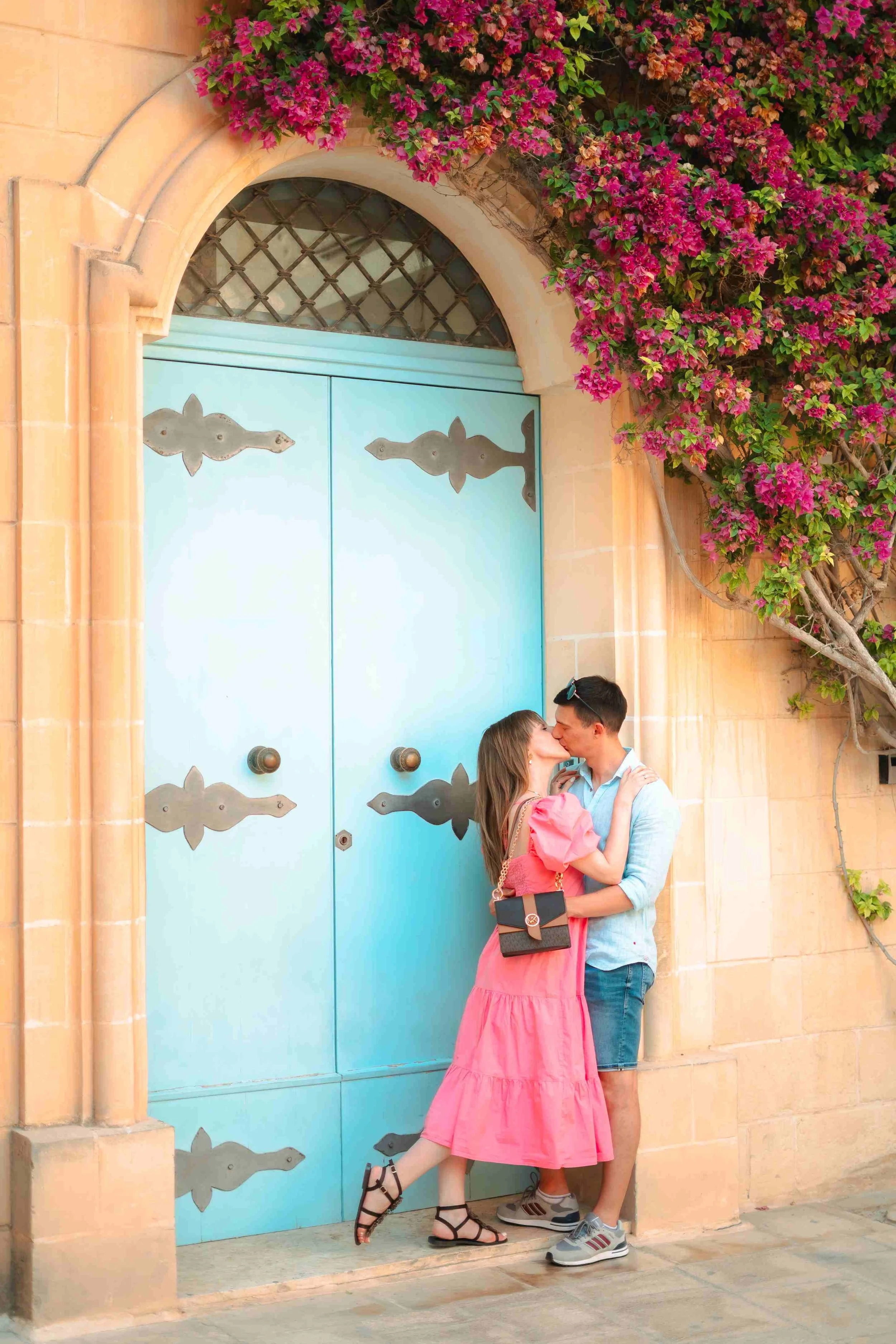
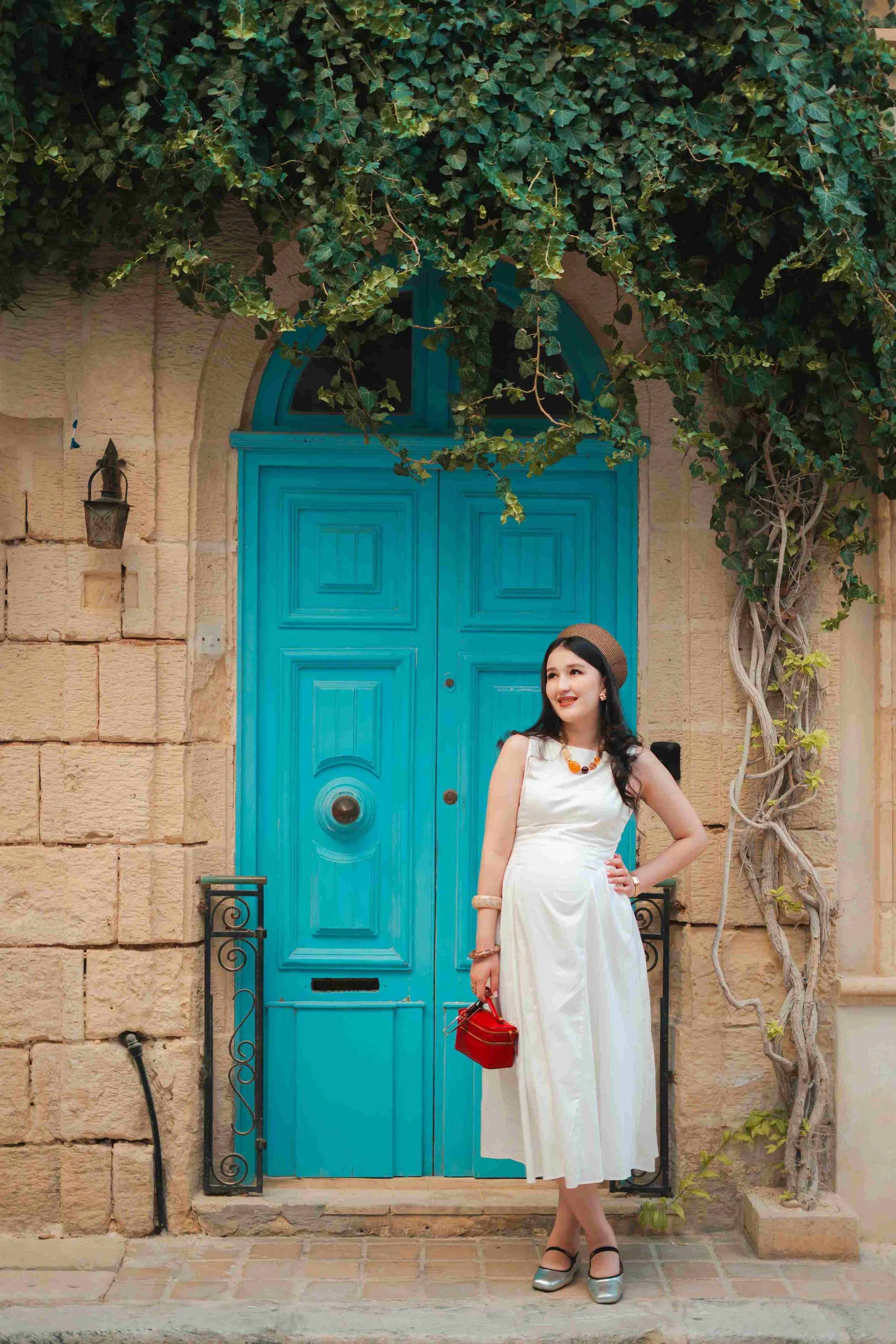
Birgu. My go-to for clients who are shy or want something more intimate; there's more colour in the streets and far less pressure than shooting somewhere busy. It has the same architecture as Valletta, without the crowds.
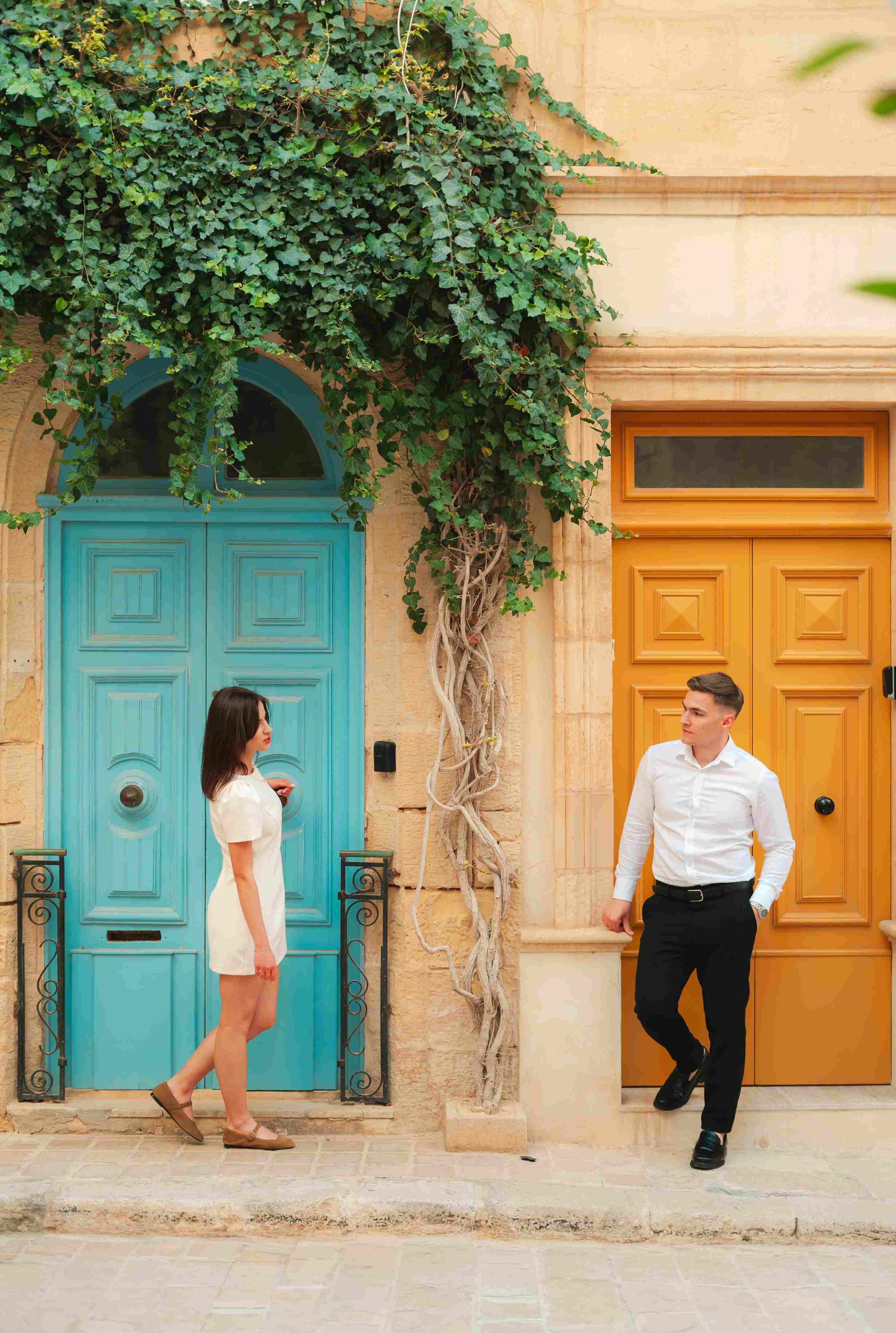
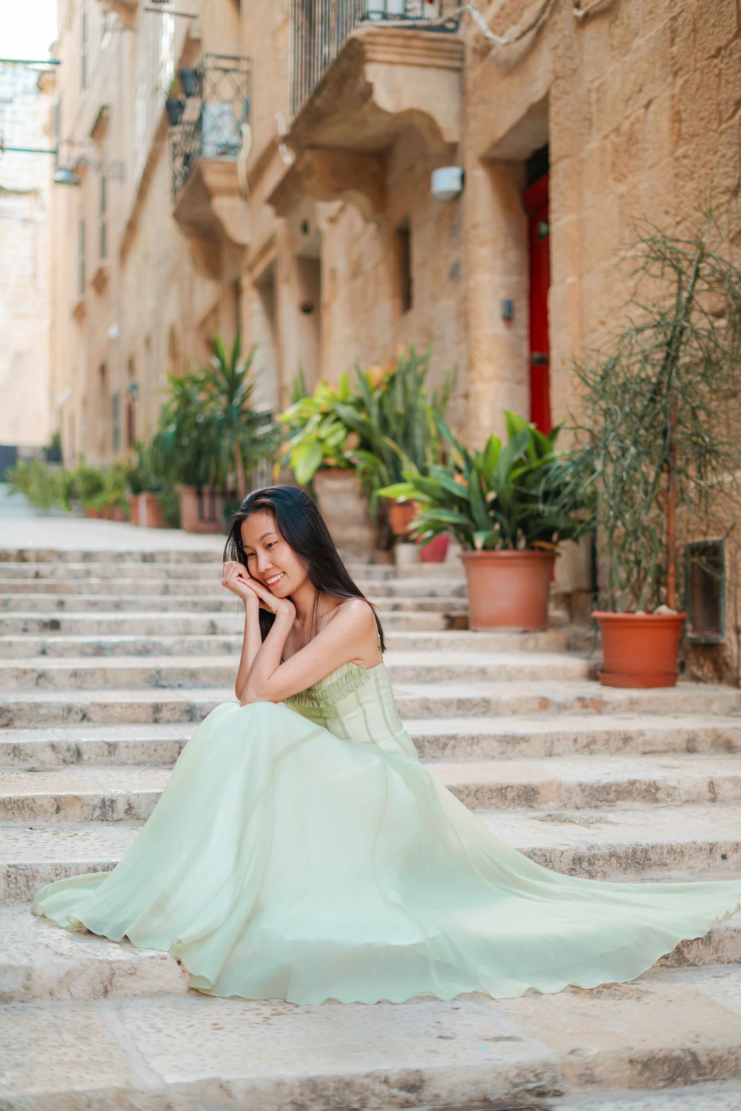
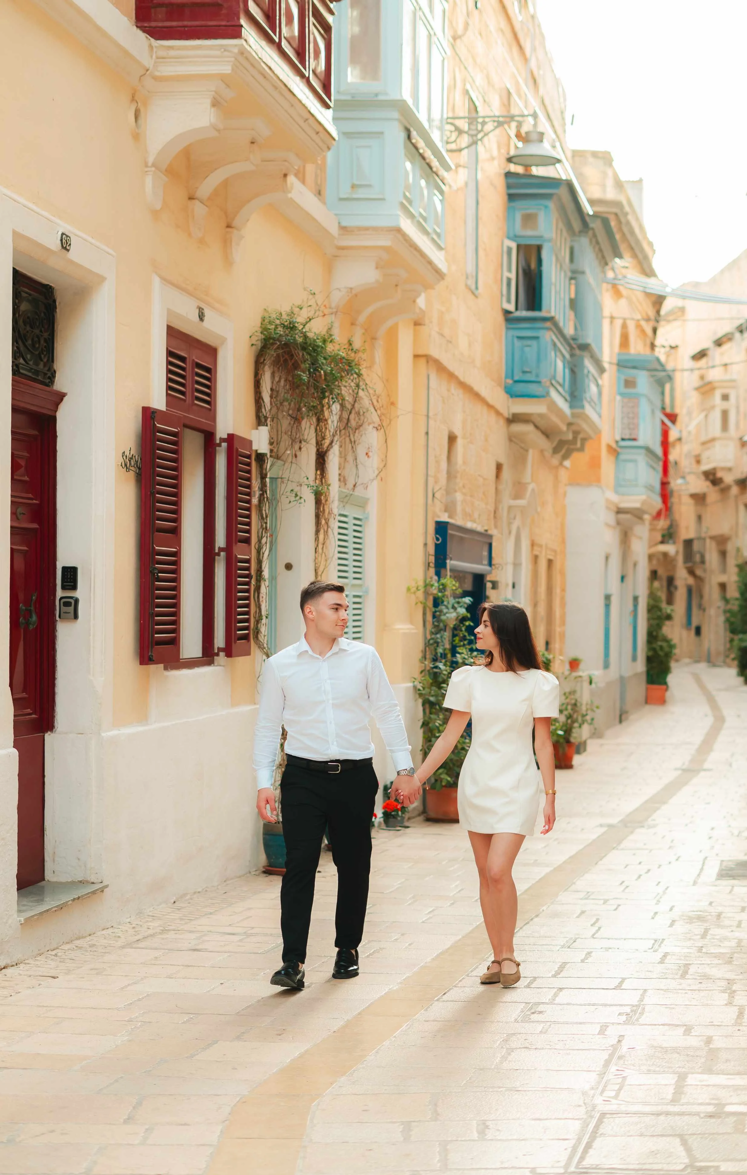
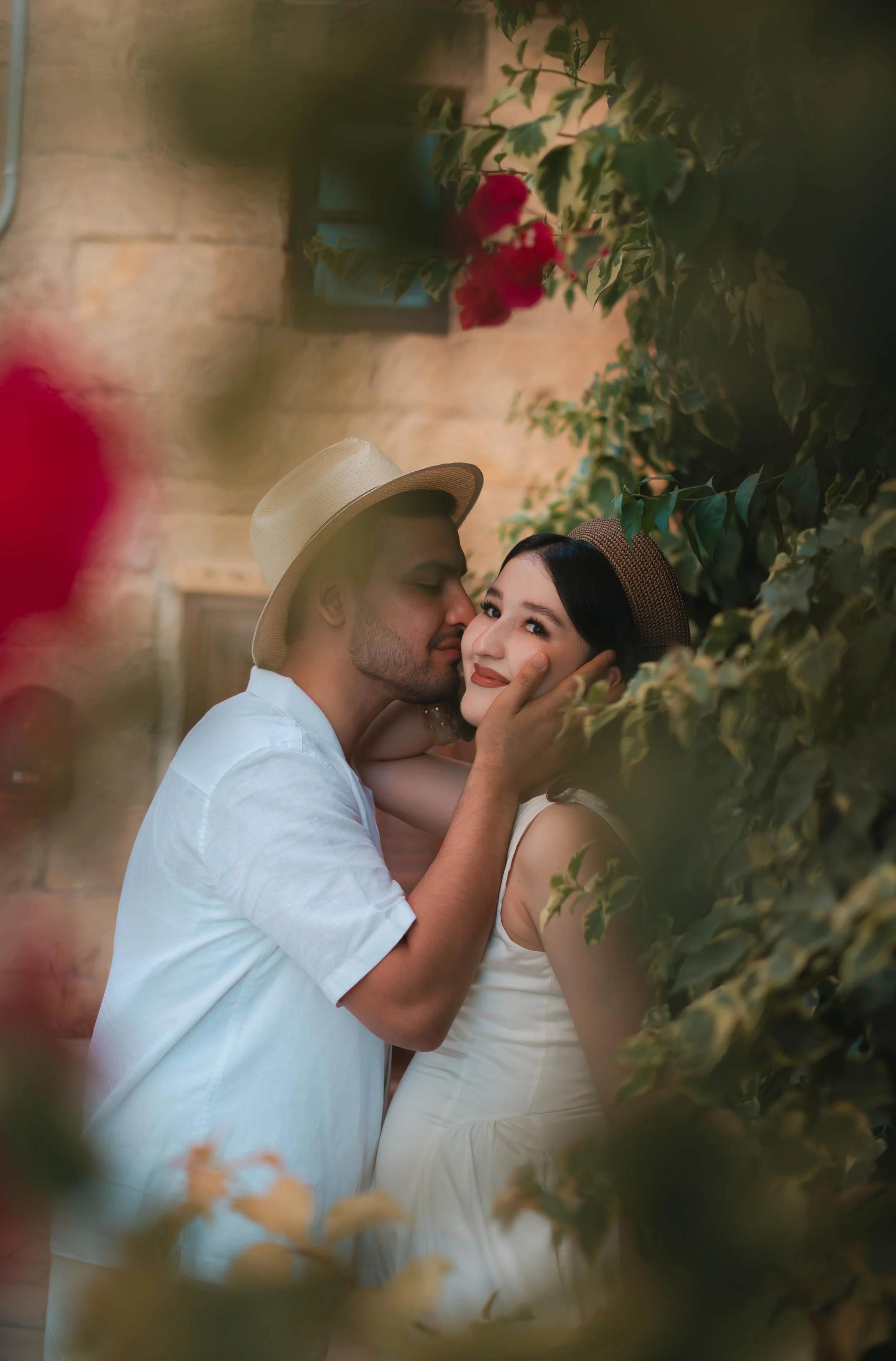
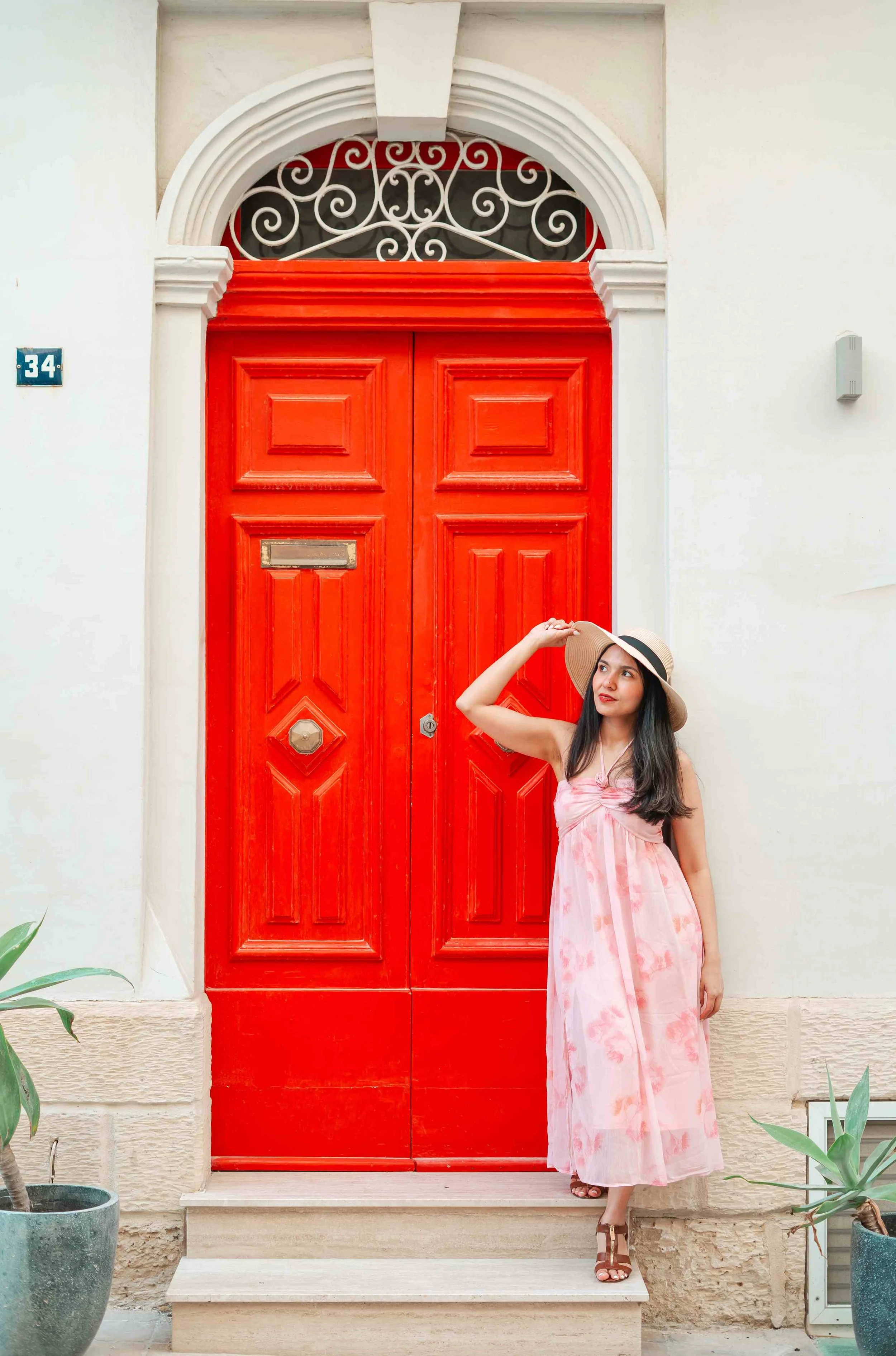
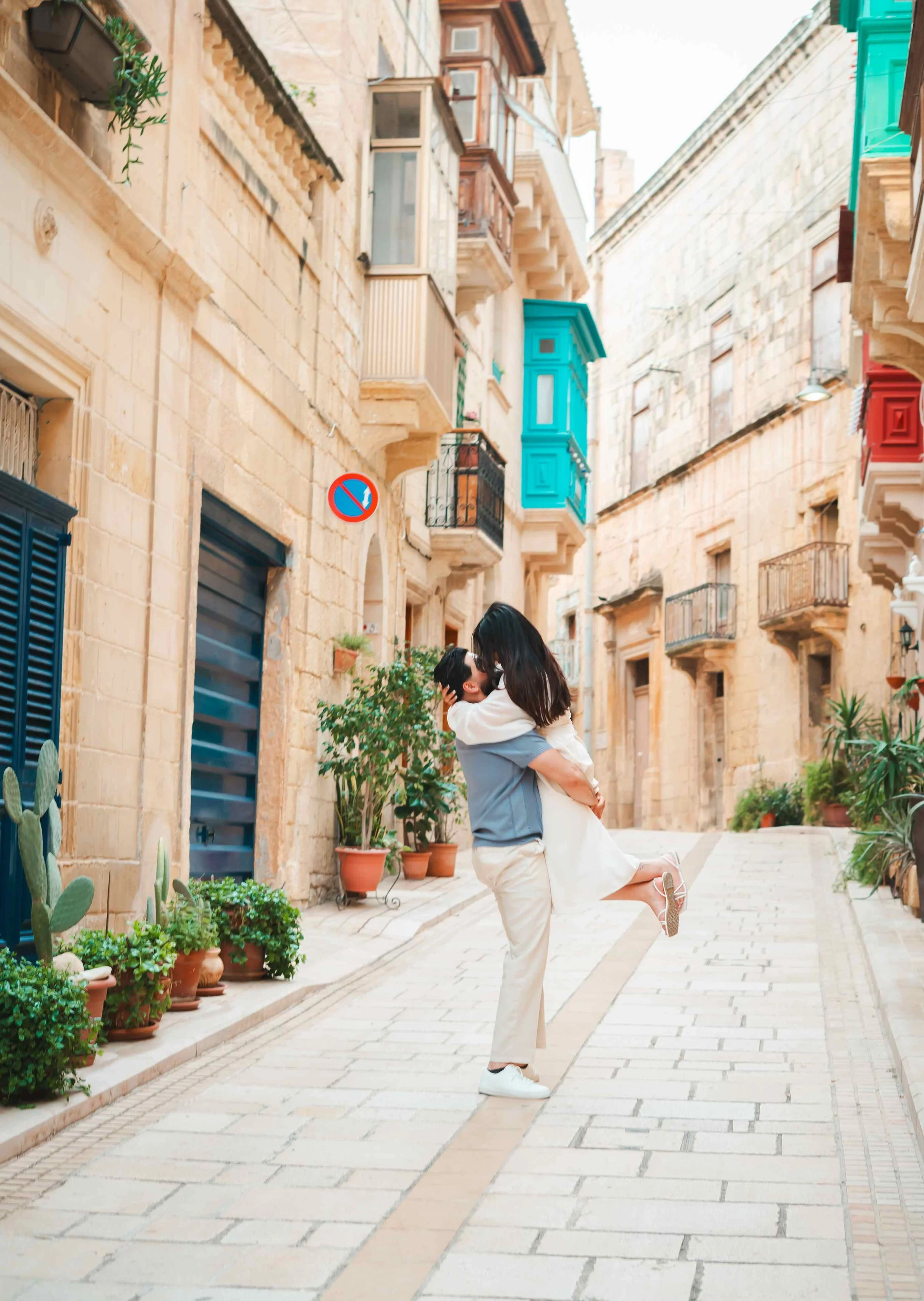
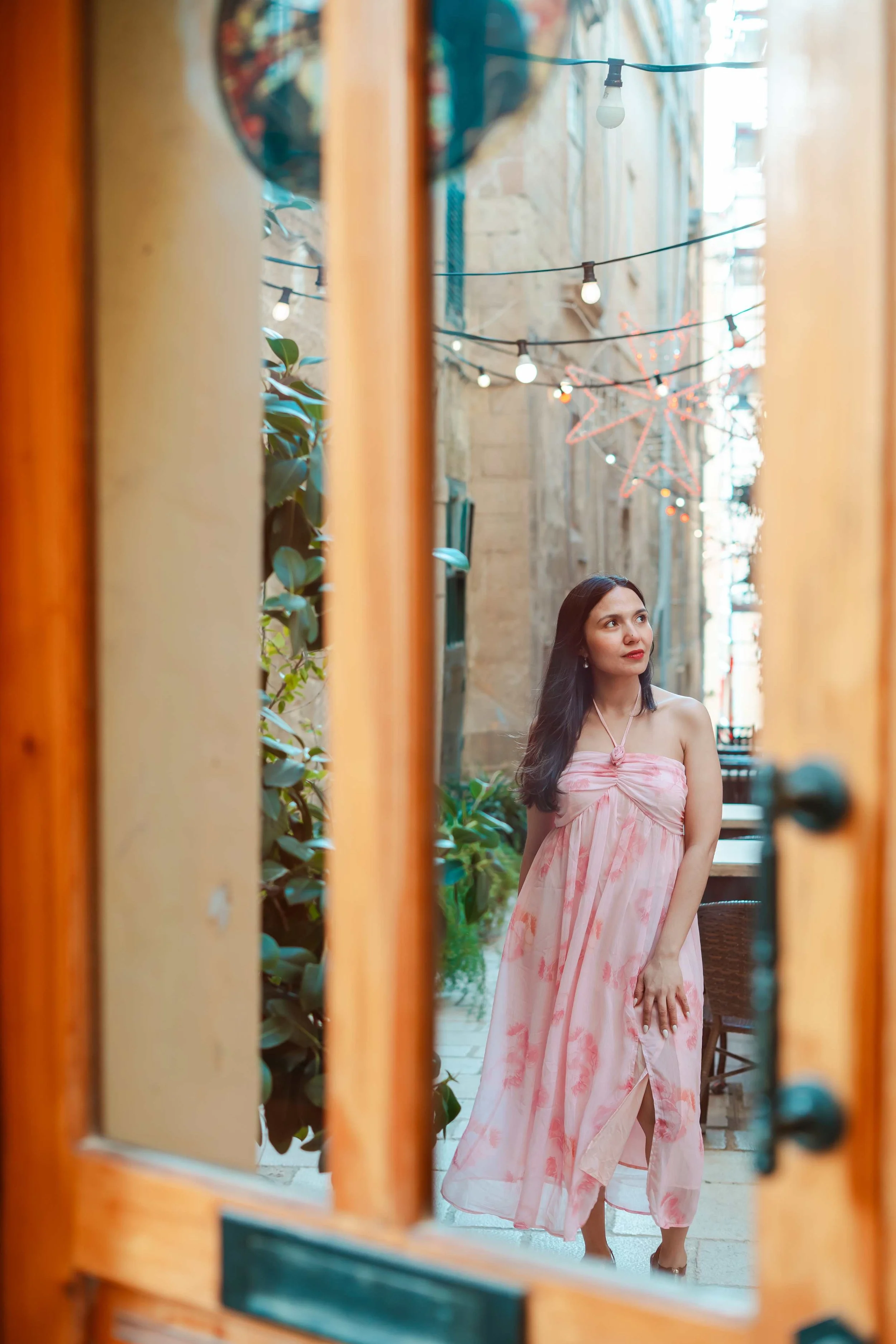
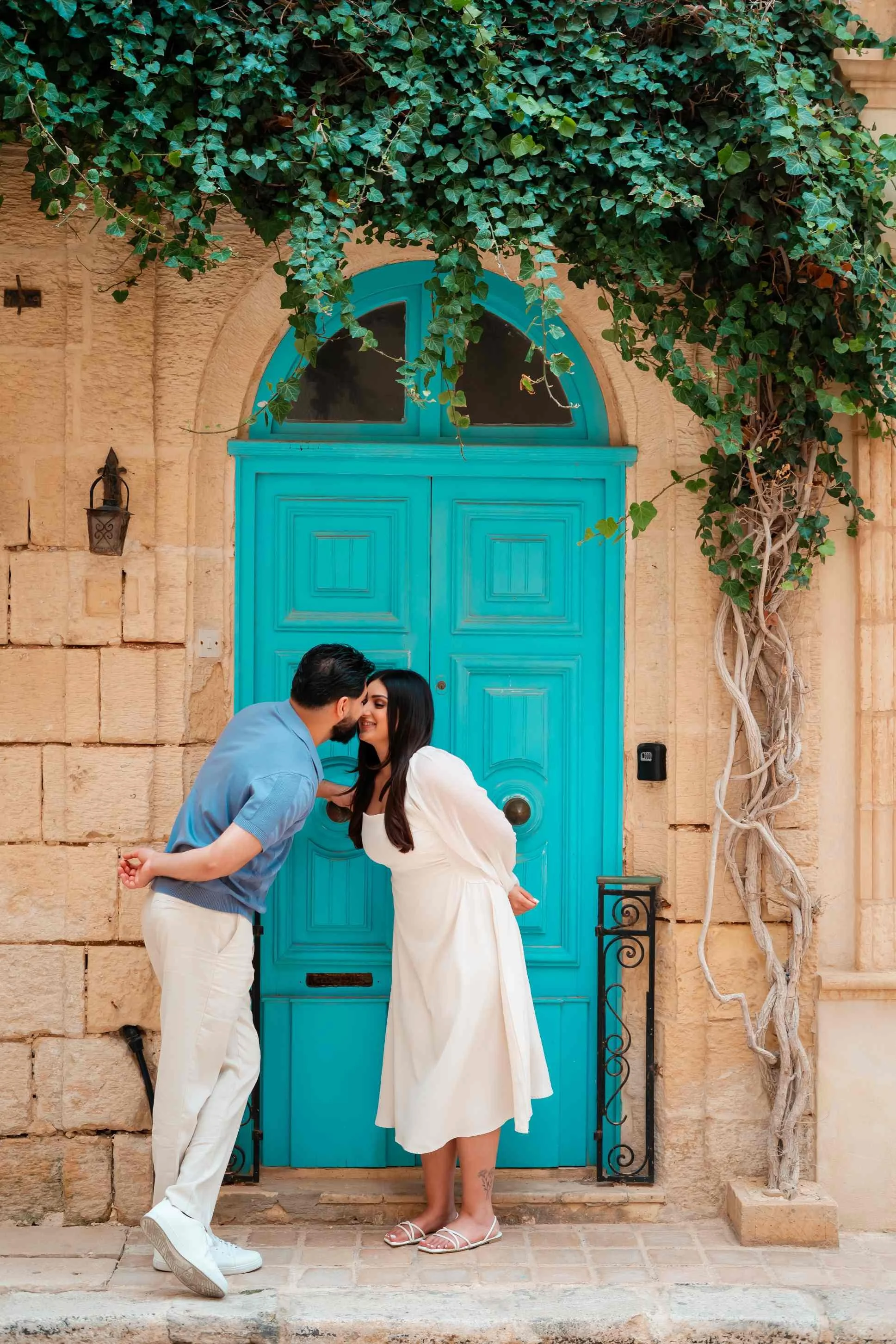
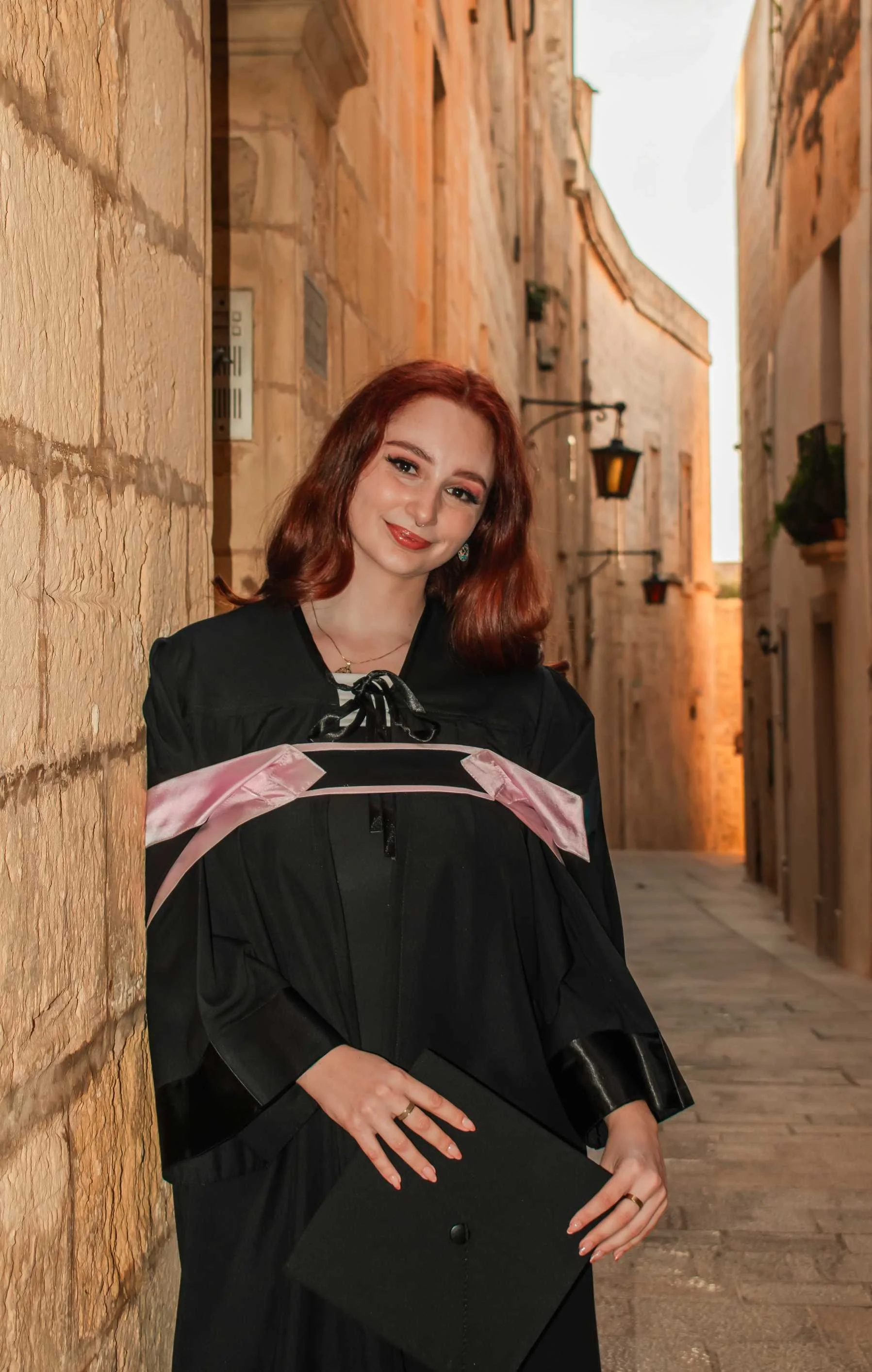
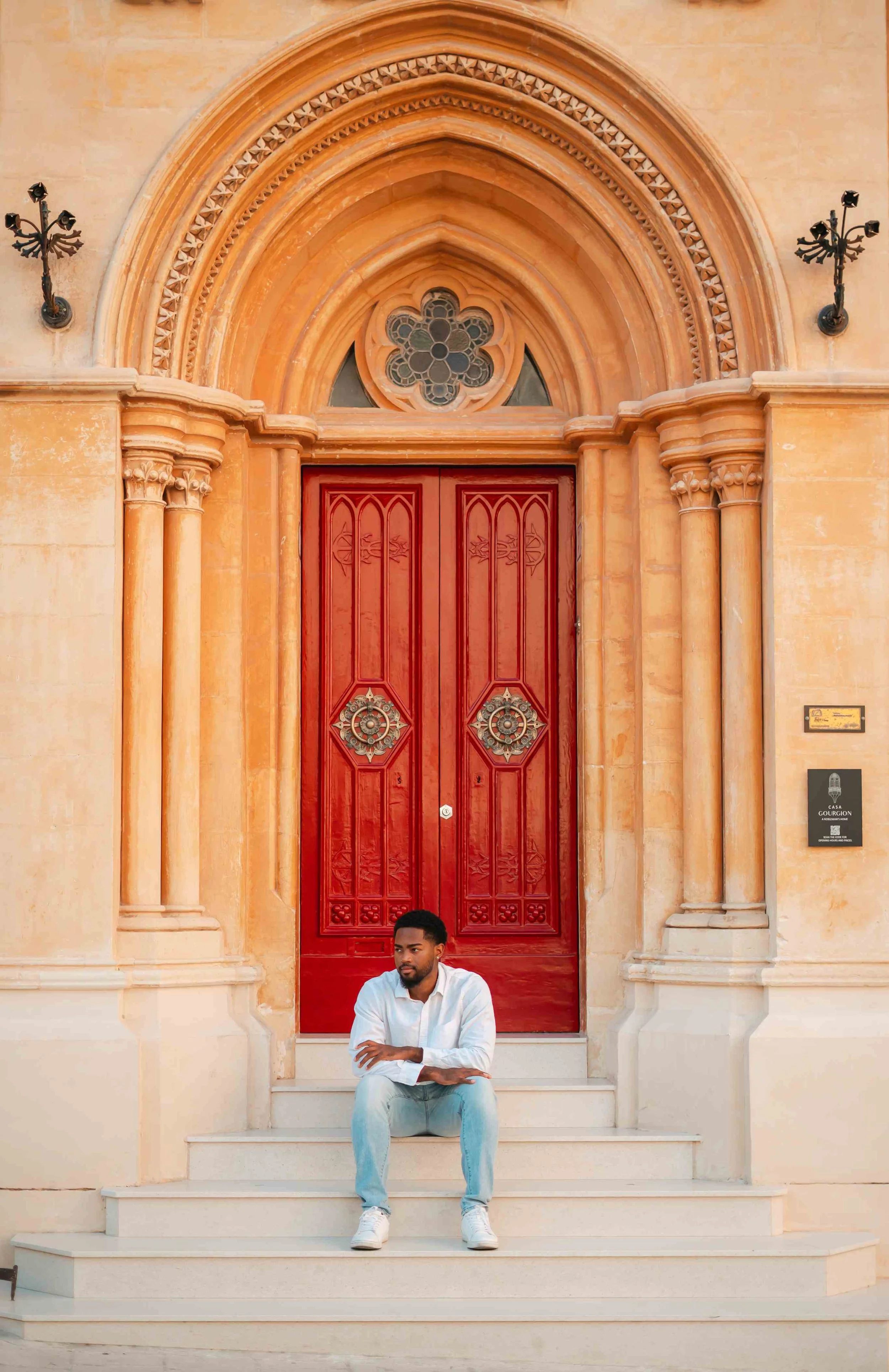
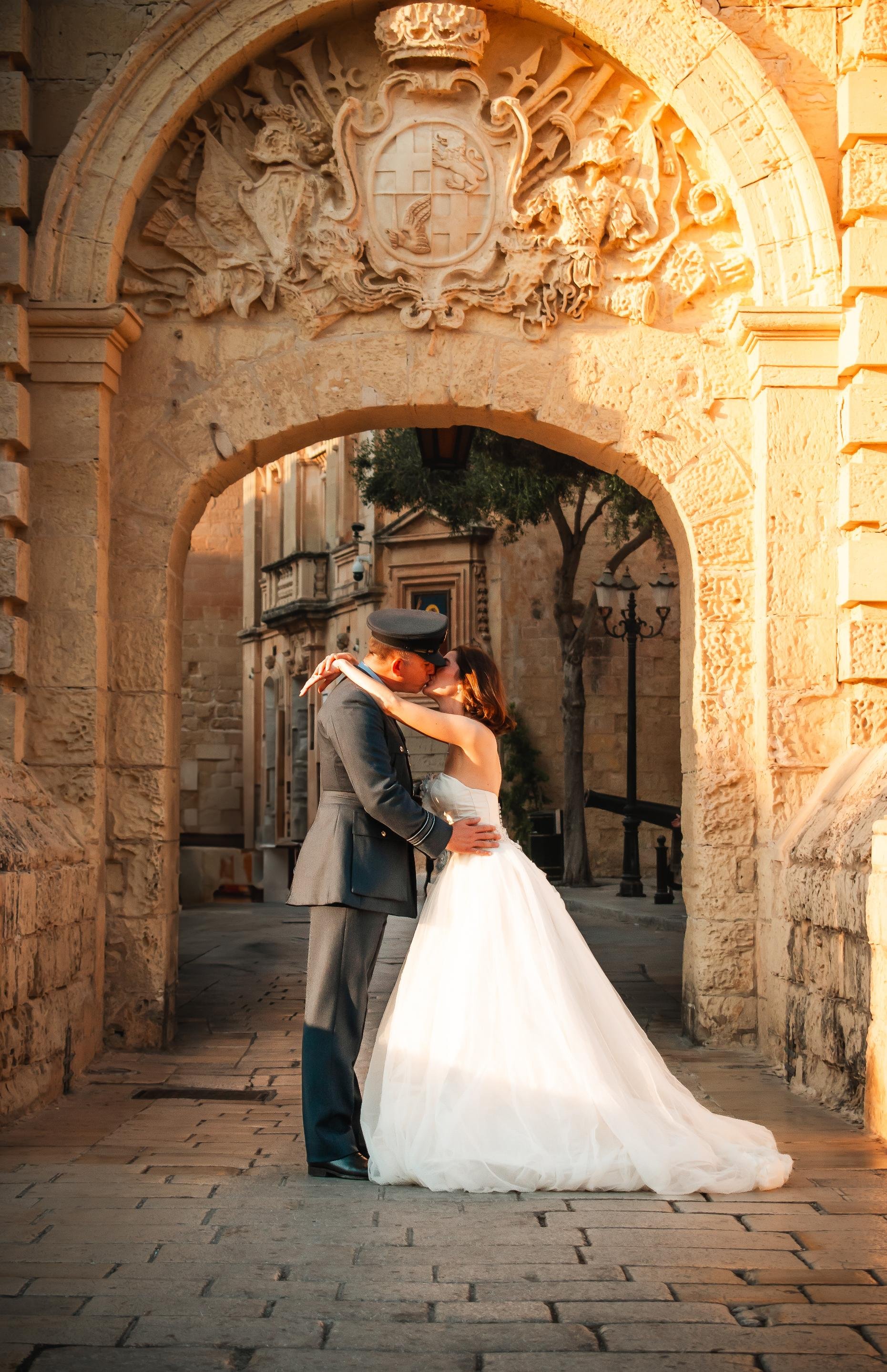
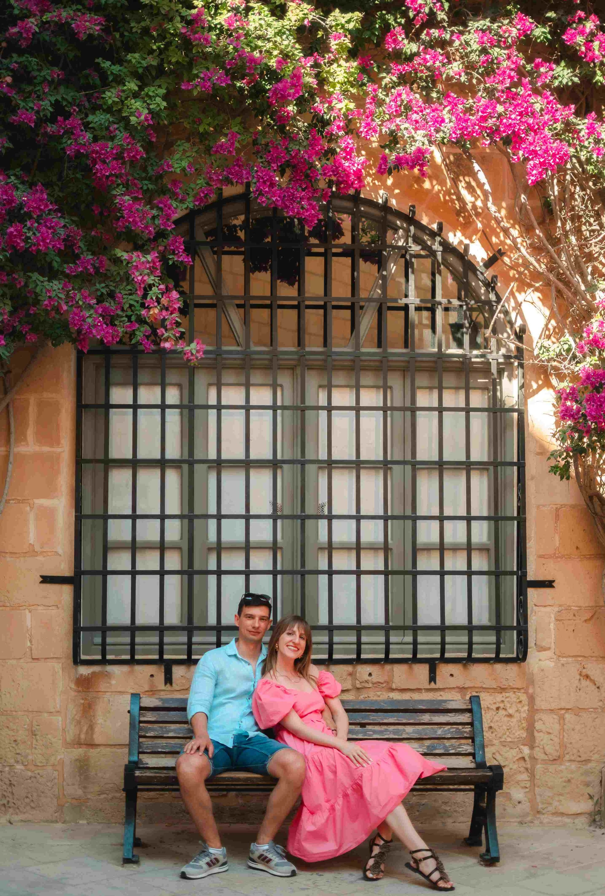
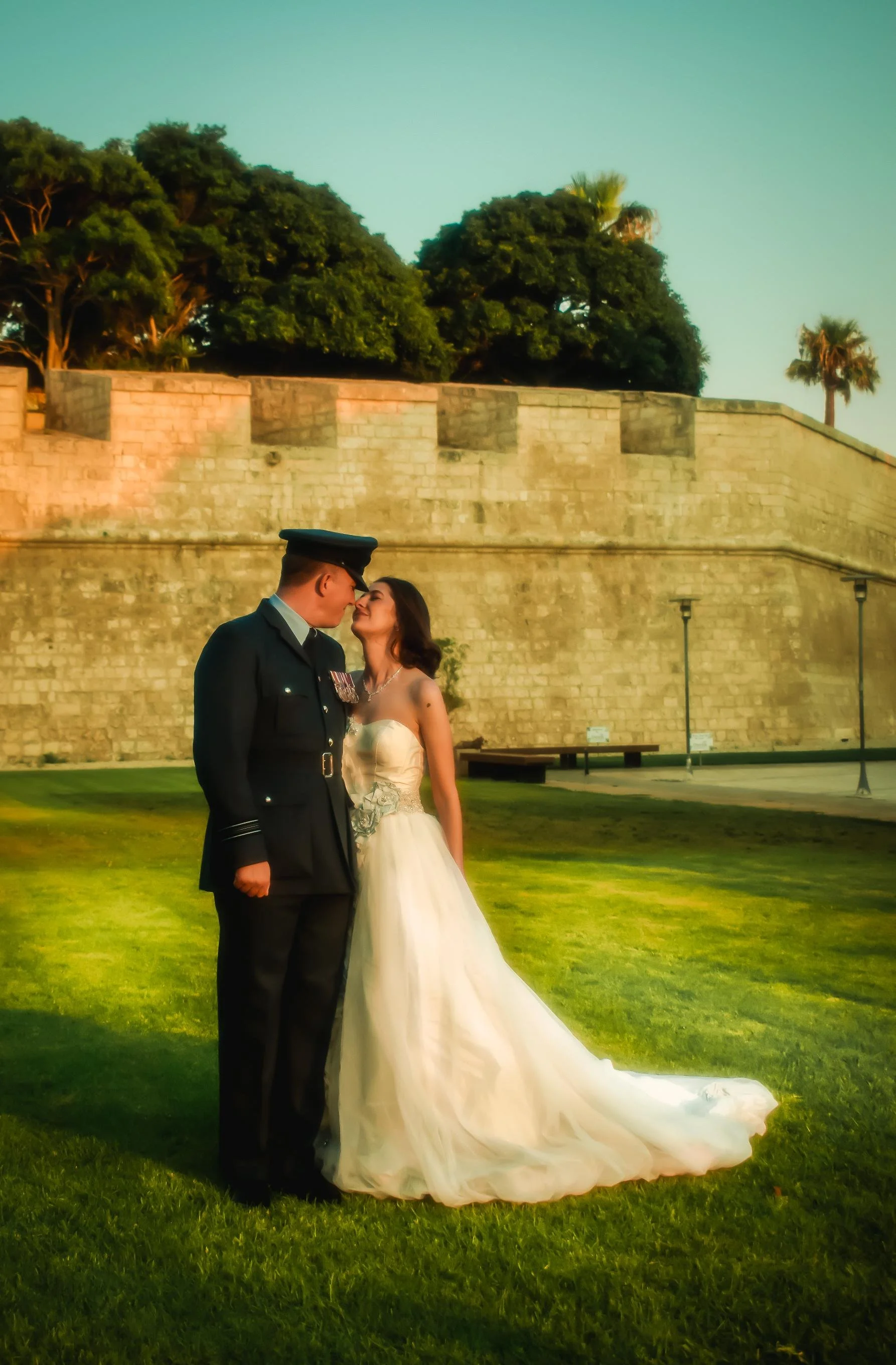
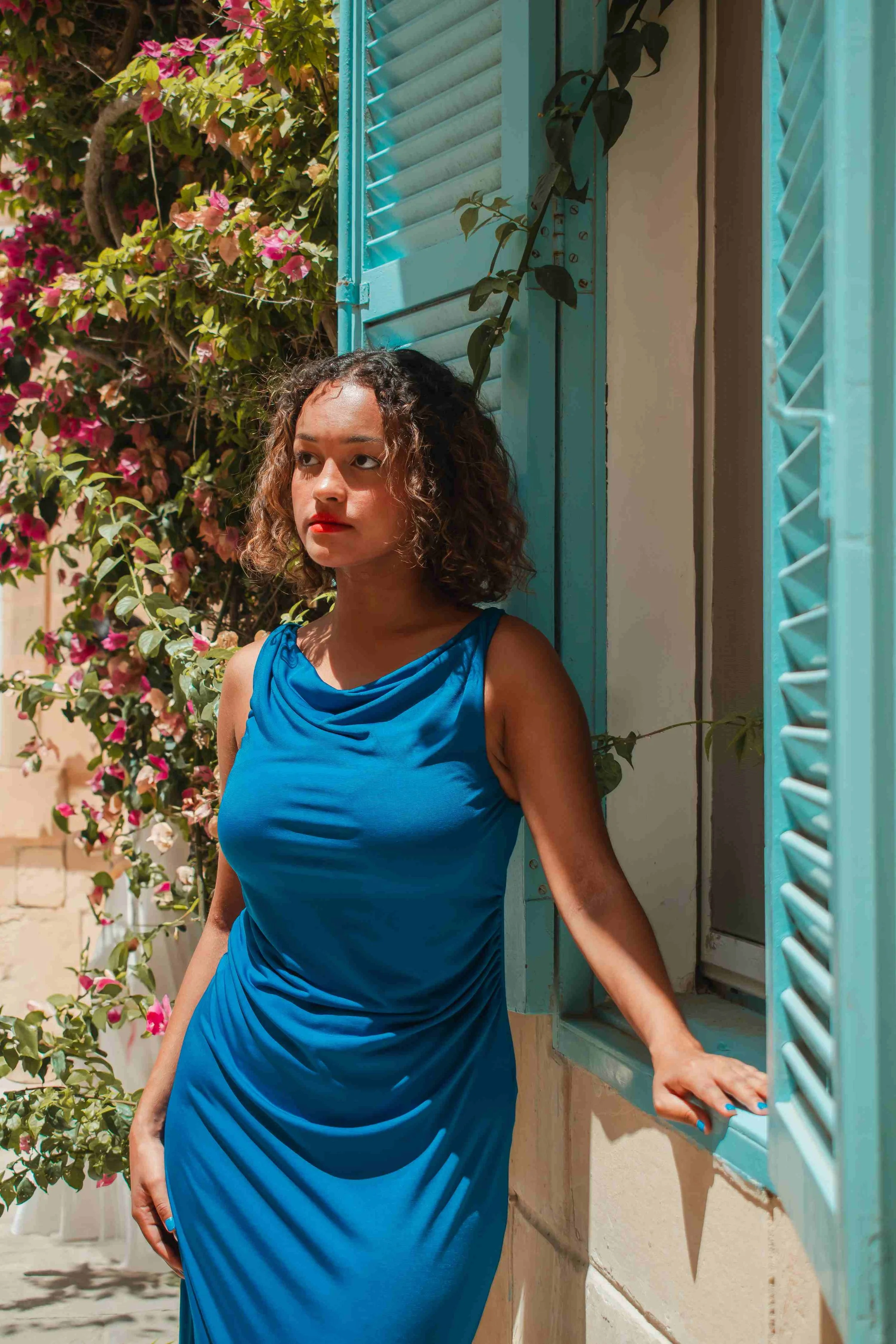
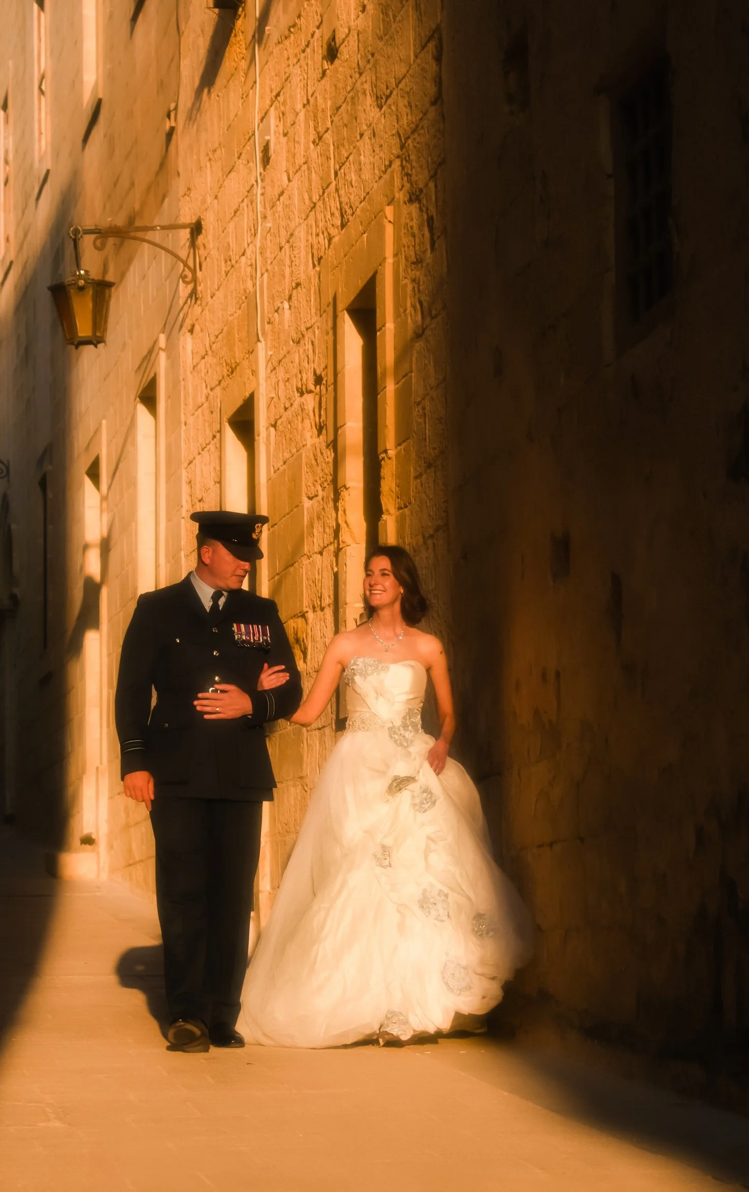
Mdina. Beautiful and timeless at any time of day, and unlike anywhere else in Malta. Better suited to clients who feel comfortable in front of a camera since it is usually crowded. Narrow, shaded streets make it forgiving in harsh midday sun.
A Mix of Everything
Manoel Island. One of my personal favourites and still underrated. The light isn't always ideal and it can get a little busy, but in winter especially it's a quiet spot most tourists don't know about, with a real mix of beach, architecture and nature in one place.
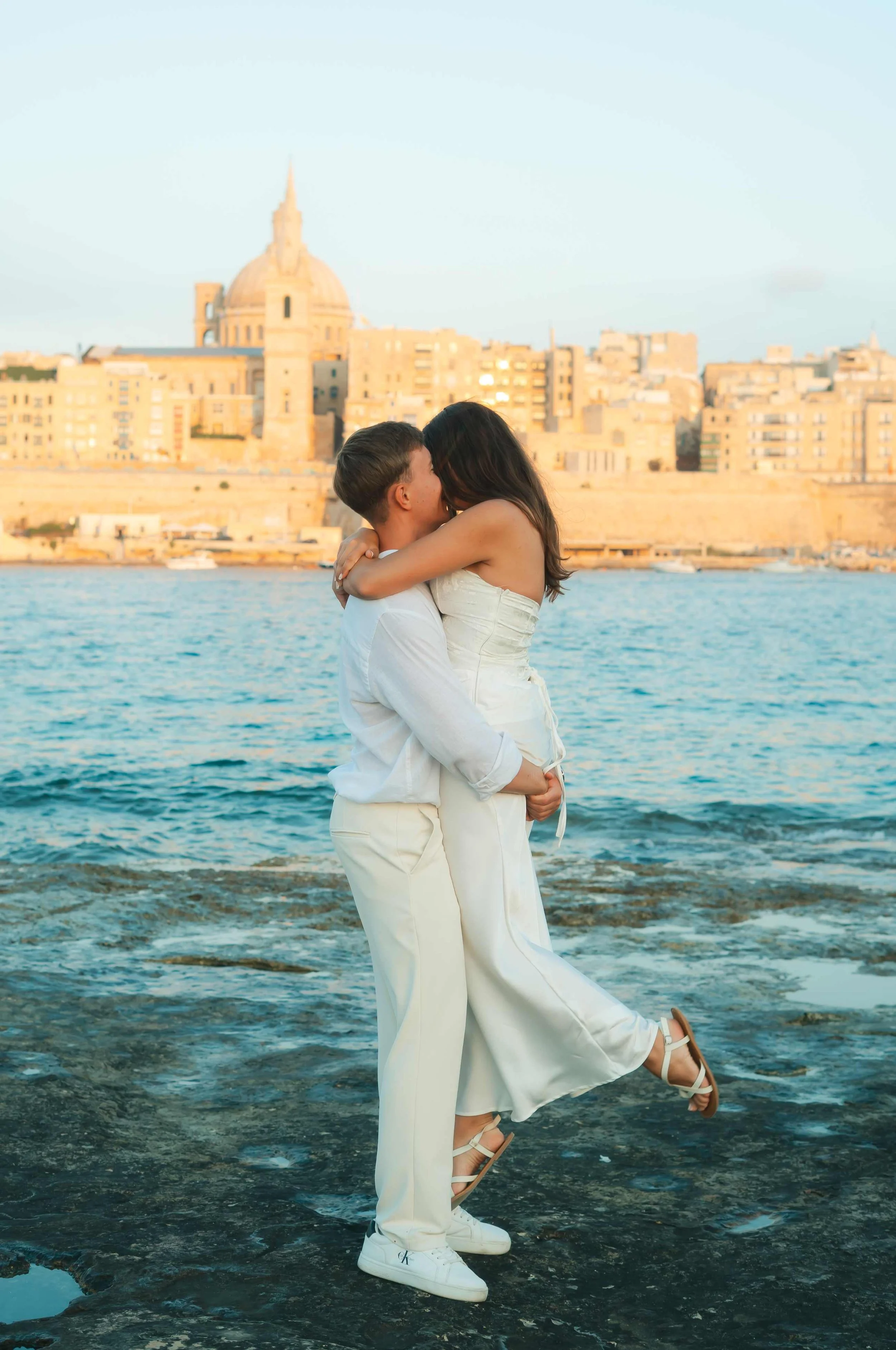
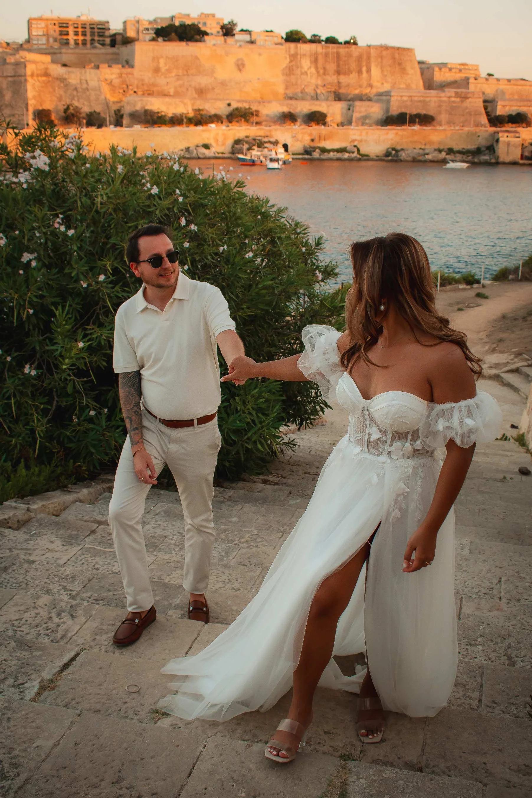
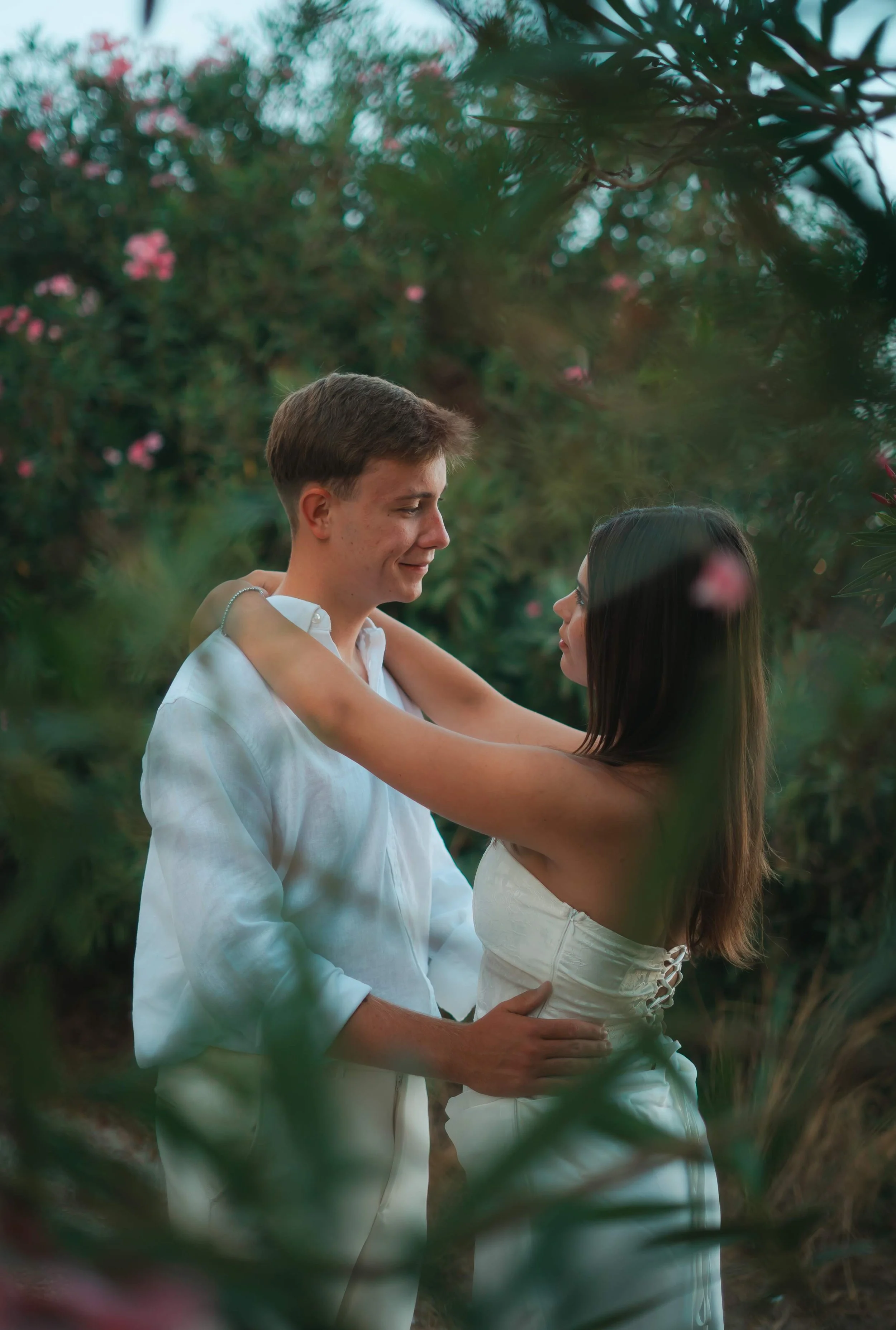
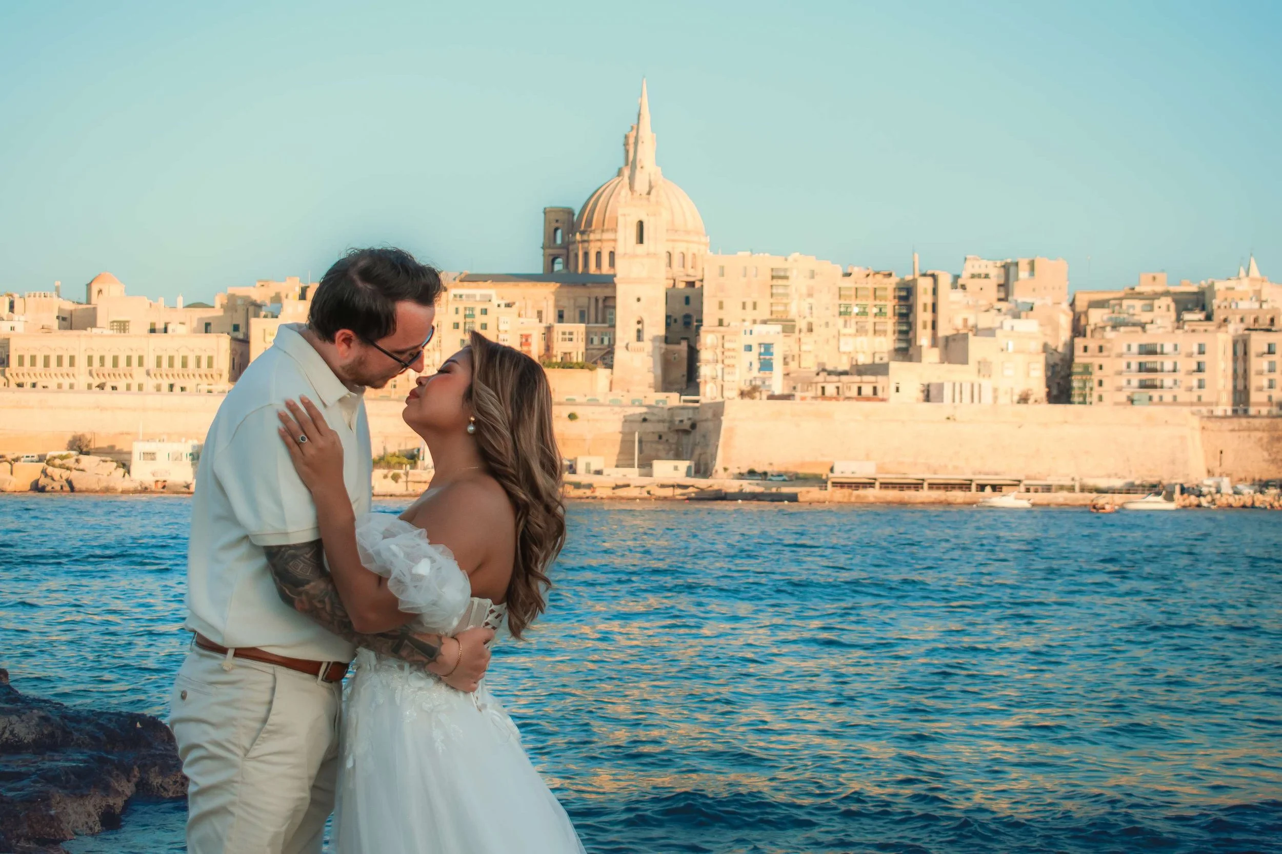
If none of these instantly speak to you, that's completely normal, and it's exactly what sending me a few inspo photos helps solve.
Practical Things That Actually Matter
Accessibility: Is there a walk involved? Some of the most beautiful spots, like Fomm ir-Rih, require effort to reach. Worth it, but know what you're signing up for.
Crowds: Some locations, like Mdina, can be busy throughout the day no matter when you go. If a completely quiet setting matters to you, tell me, it changes which spots I'll suggest.
Season: Spring is genuinely the best time to shoot in Malta. Fewer people, less heat, and the countryside is at its greenest and most colourful.
Surprise proposals: If you're planning one, we don't just agree on a general location. I'll visit the spot myself beforehand and send you videos of exactly where I'll be shooting from, with backup spots in case the main one is taken on the day.
Let's Find Your Spot
I'm Phoebe, a Malta-based destination photographer, and I've worked with all kinds of people, couples, families, solo travellers, tourists arriving from every corner of the world for their Malta trip. As a local, I know these locations properly, not just as pretty photo spots but as places with their own light, their own crowds, their own quiet moments; and I'll help you choose the one that actually suits you.
📩 info@photographoebe.com 🌐 www.photographoebe.com
Based in Malta. Shooting everything worth remembering.
What Wes Anderson Taught Me About Colour; And Why It Matters for Your Photoshoot
I was at university studying film aesthetics when I first properly got into Wes Anderson. I was also at that point where I was finally starting to feel confident in my editing; finding my style, figuring out what I actually wanted my photos to look like. I didn't know it at the time but I had been trying to do exactly what he does, without having the language for it. I started trying to replicate his colour grading, adjusted the palette depending on the shoot, and never really stopped.
The Rule Behind It
Wes Anderson works with something called the 60-30-10 rule. Sixty percent of a scene is one dominant colour that sets the overall mood. Thirty percent is a supporting colour that adds depth without competing. Ten percent is a bold accent, placed exactly where he wants your eye to go.
It sounds simple. The results are anything but.
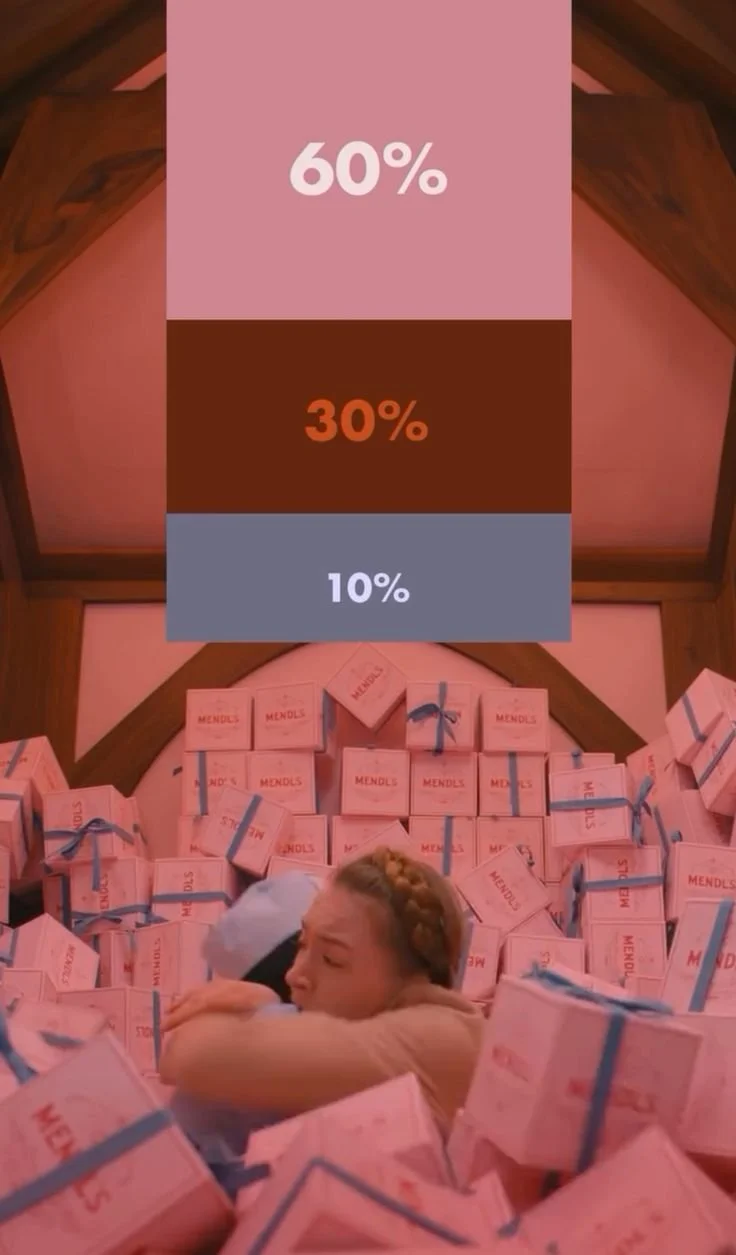
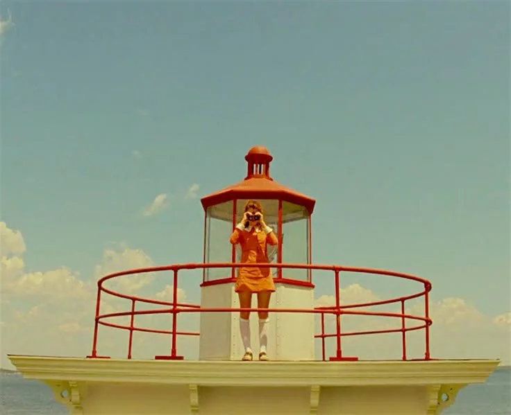
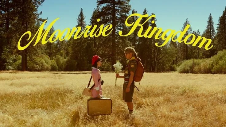
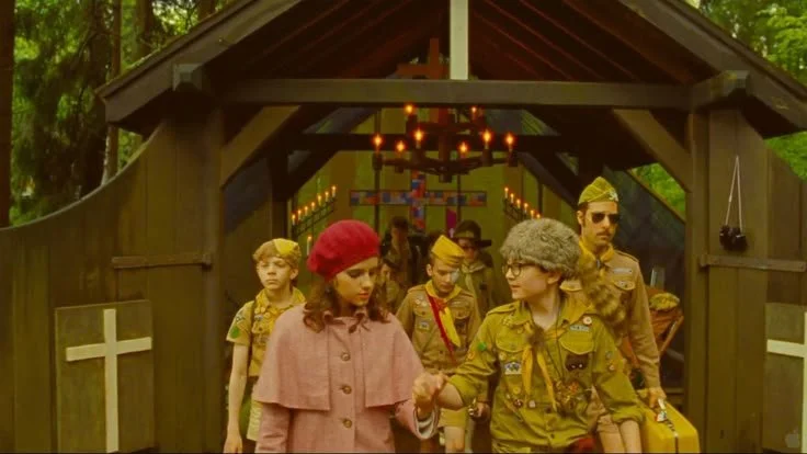
In The Grand Budapest Hotel it's sixty percent cotton candy pink, thirty percent deep red, ten percent sky blue. In Moonrise Kingdom, warm yellows and earthy greens carry the frame, with precise little hits of red doing the emotional heavy lifting. His scenes are packed with detail but because the colour is so disciplined, you never feel overwhelmed. Your eye always knows where to go. The films feel like living paintings. That's not a coincidence, it's the rule working exactly as it should.
This is also where film form comes in. Film form is the idea that the patterns within a film, including colour, create meaning in the audience's mind. Hence, the important distinction is that it's not just about what the characters feel, it's about how you feel watching it. The colour is working on you before you've registered it consciously. Anderson understands this completely, which is why his films feel so emotionally loaded even when the dialogue is deadpan and the pacing is slow. The form is doing the work.
Moonrise Kingdom is my favourite of his films aesthetically. I think you can see why.
Moonrise kingdom:
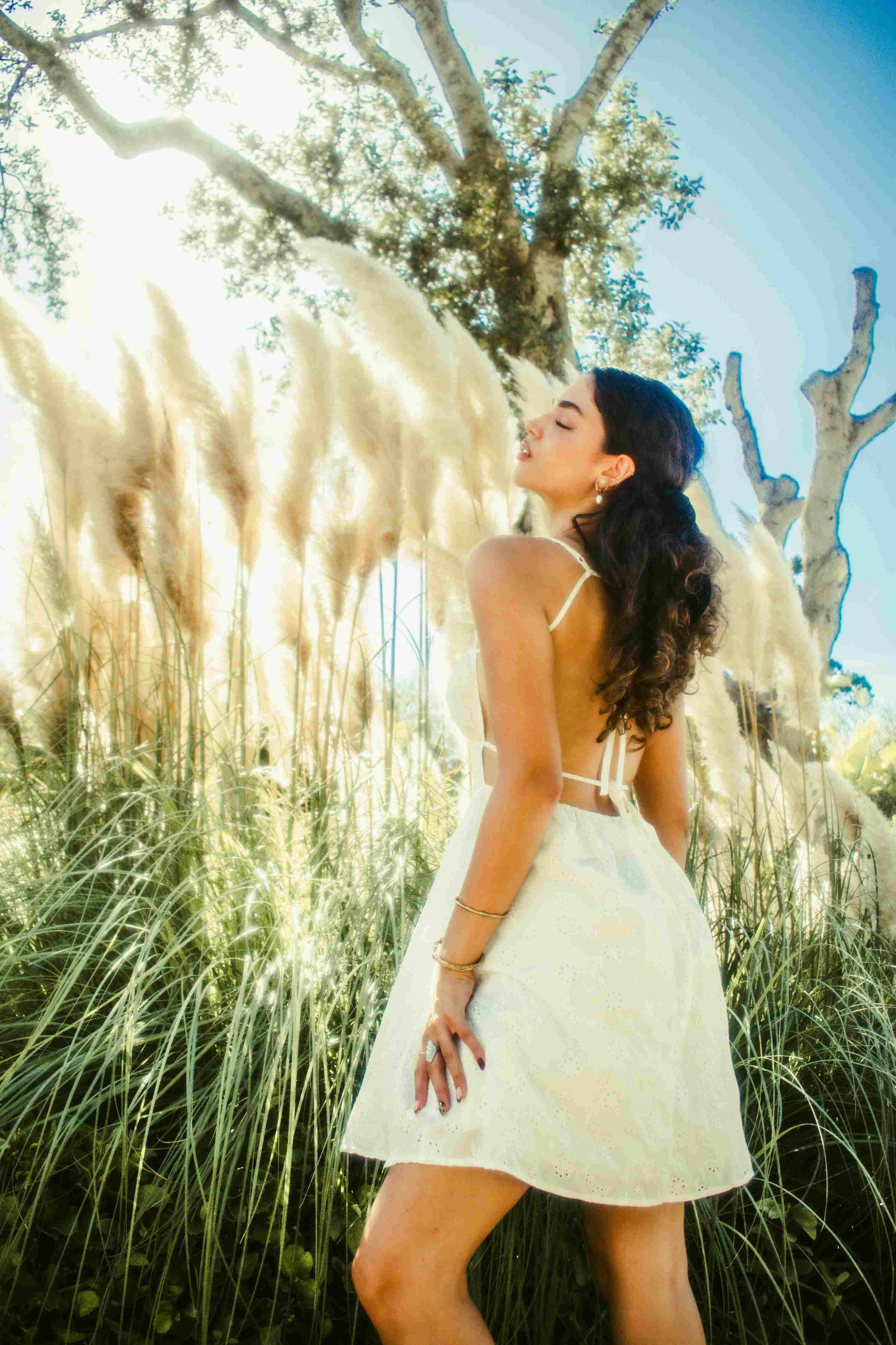
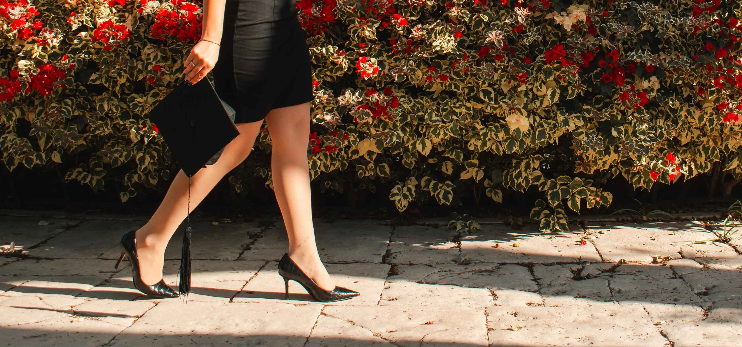
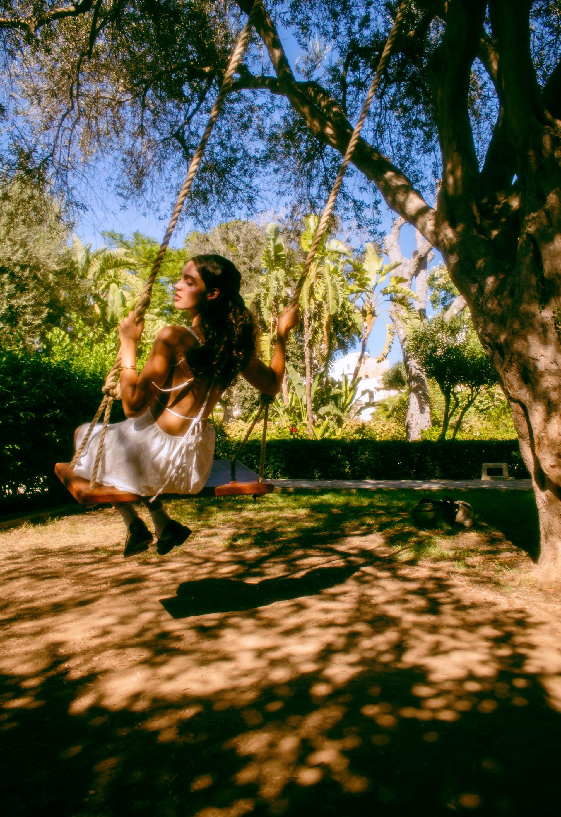
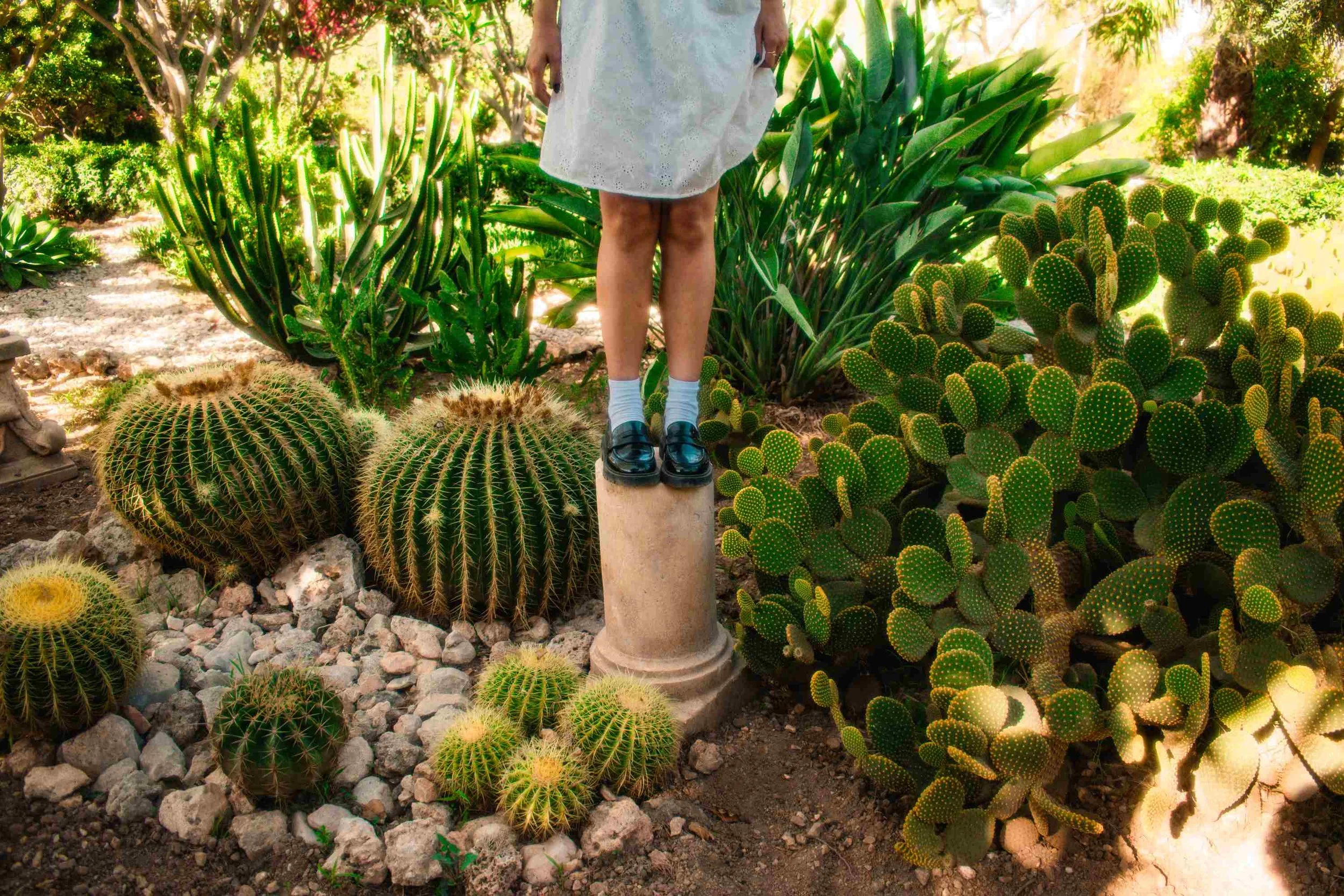
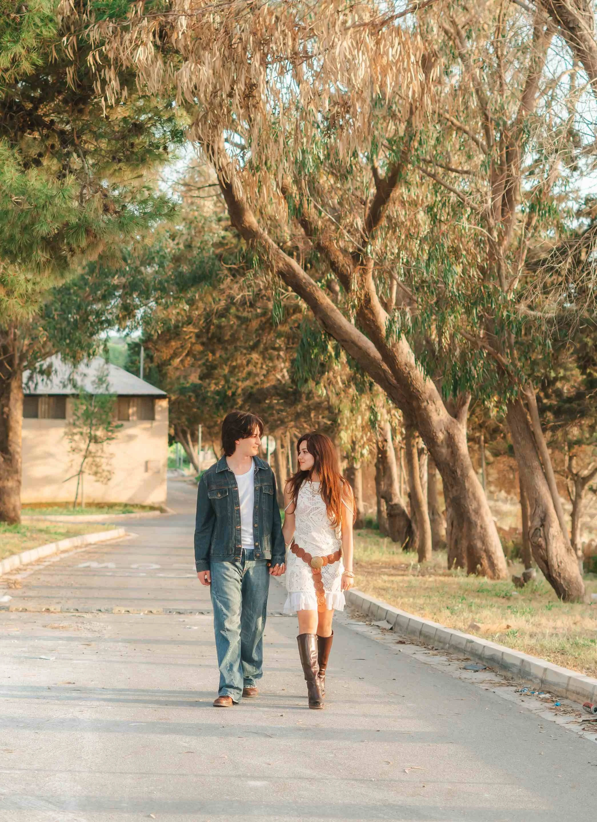
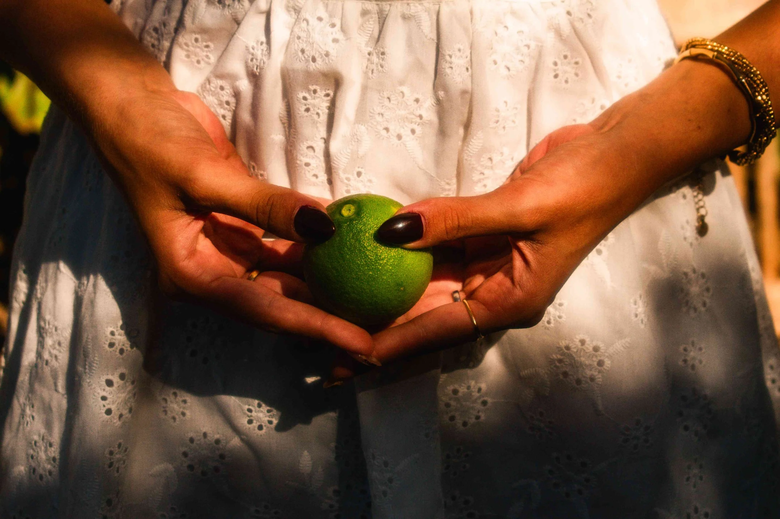
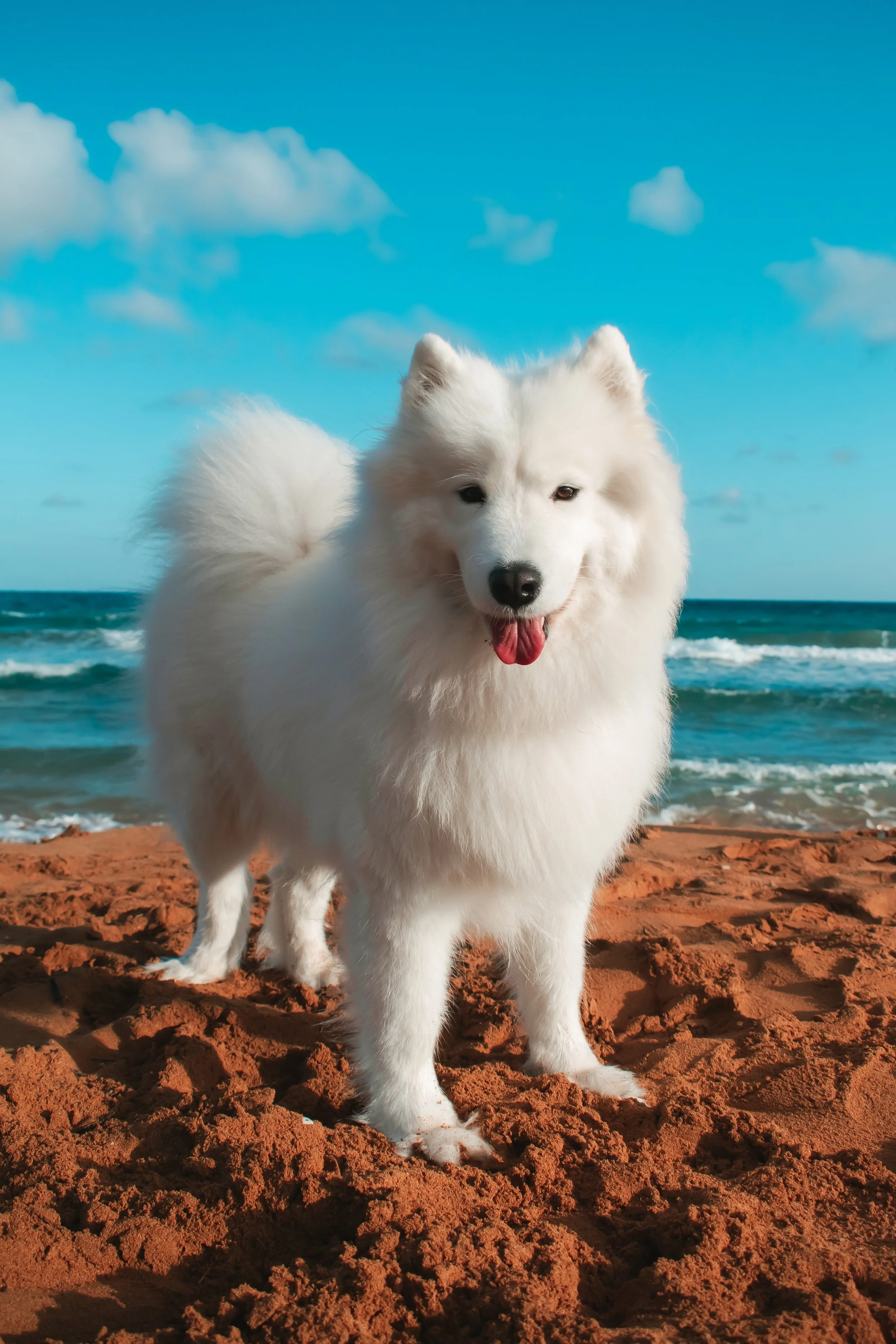
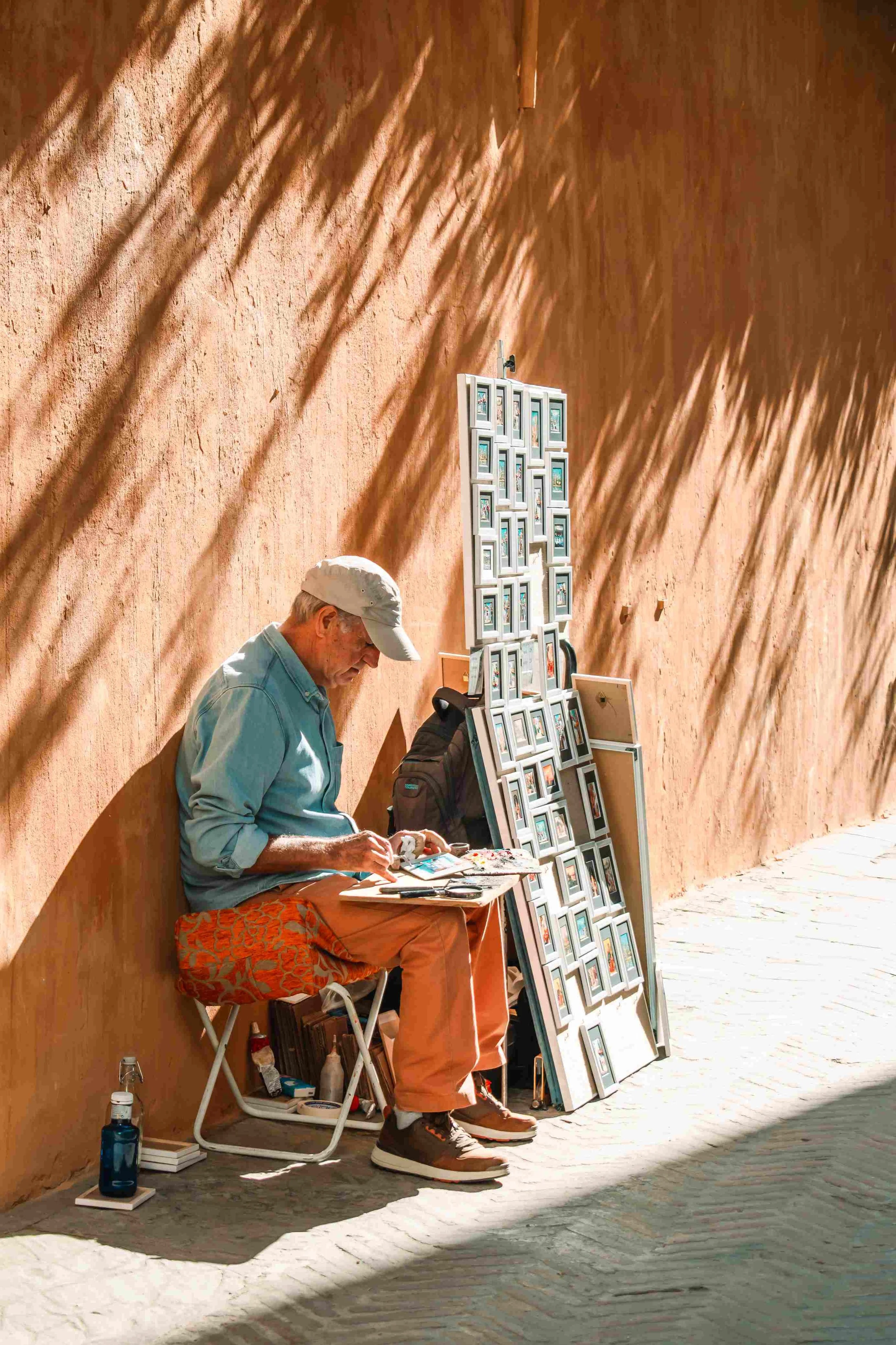
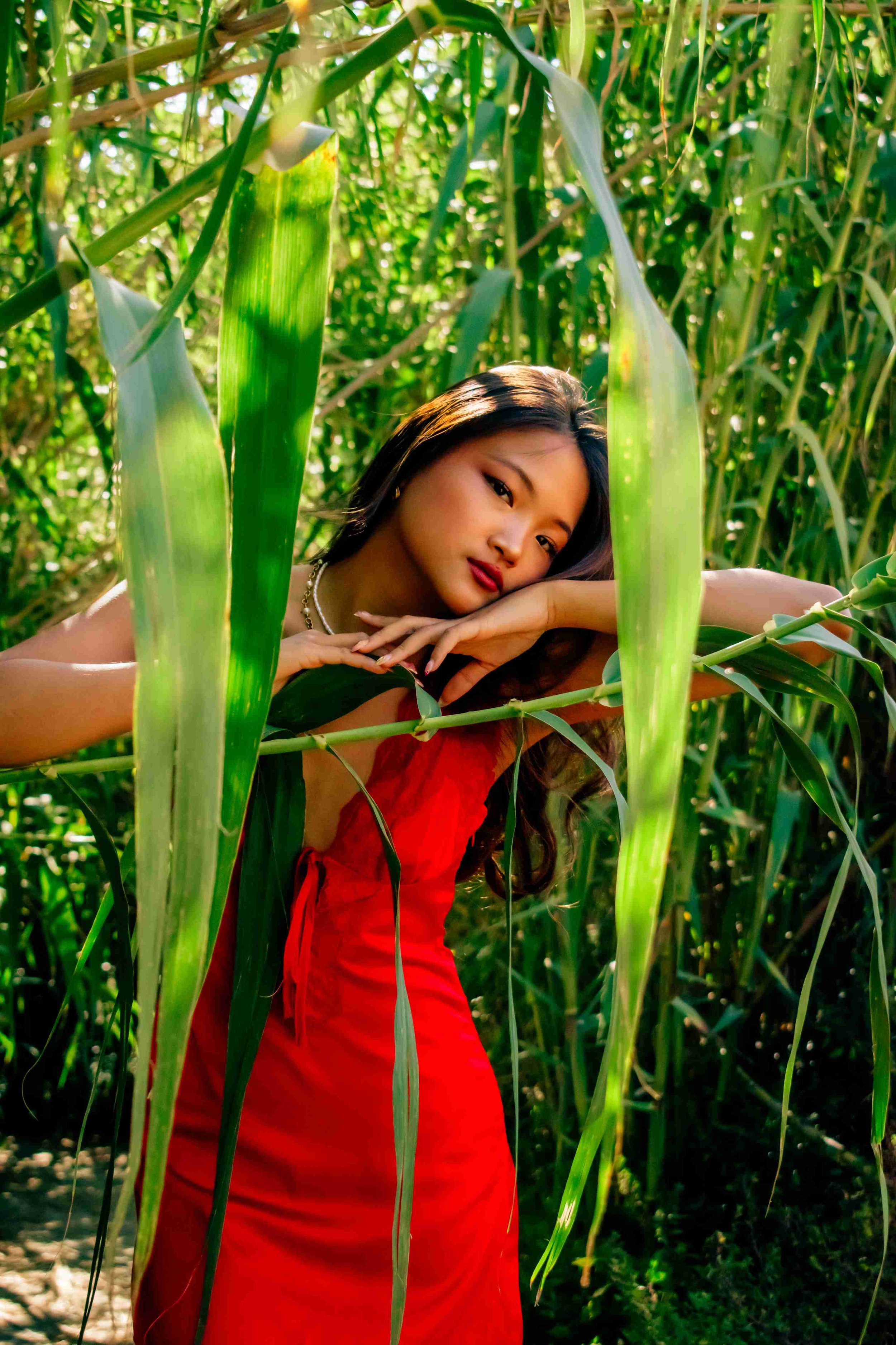
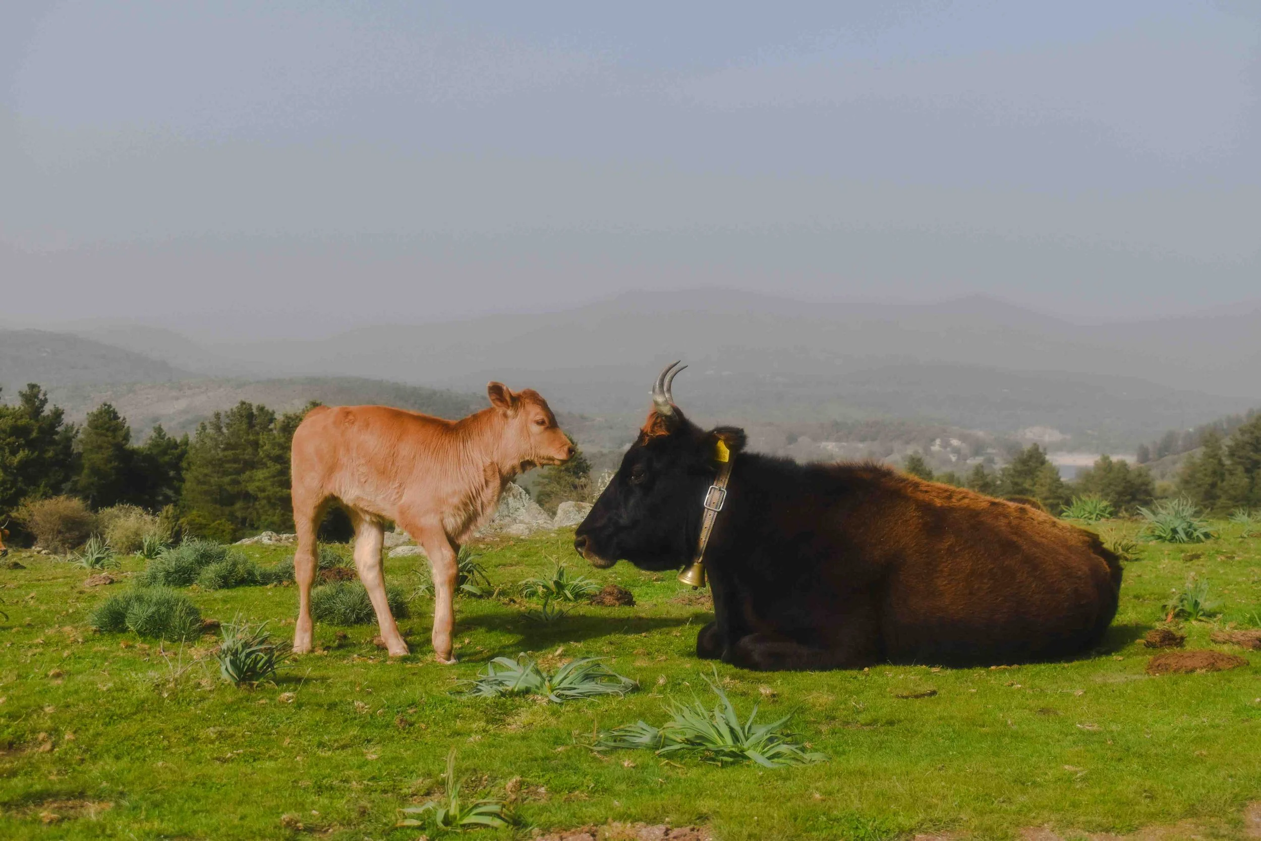
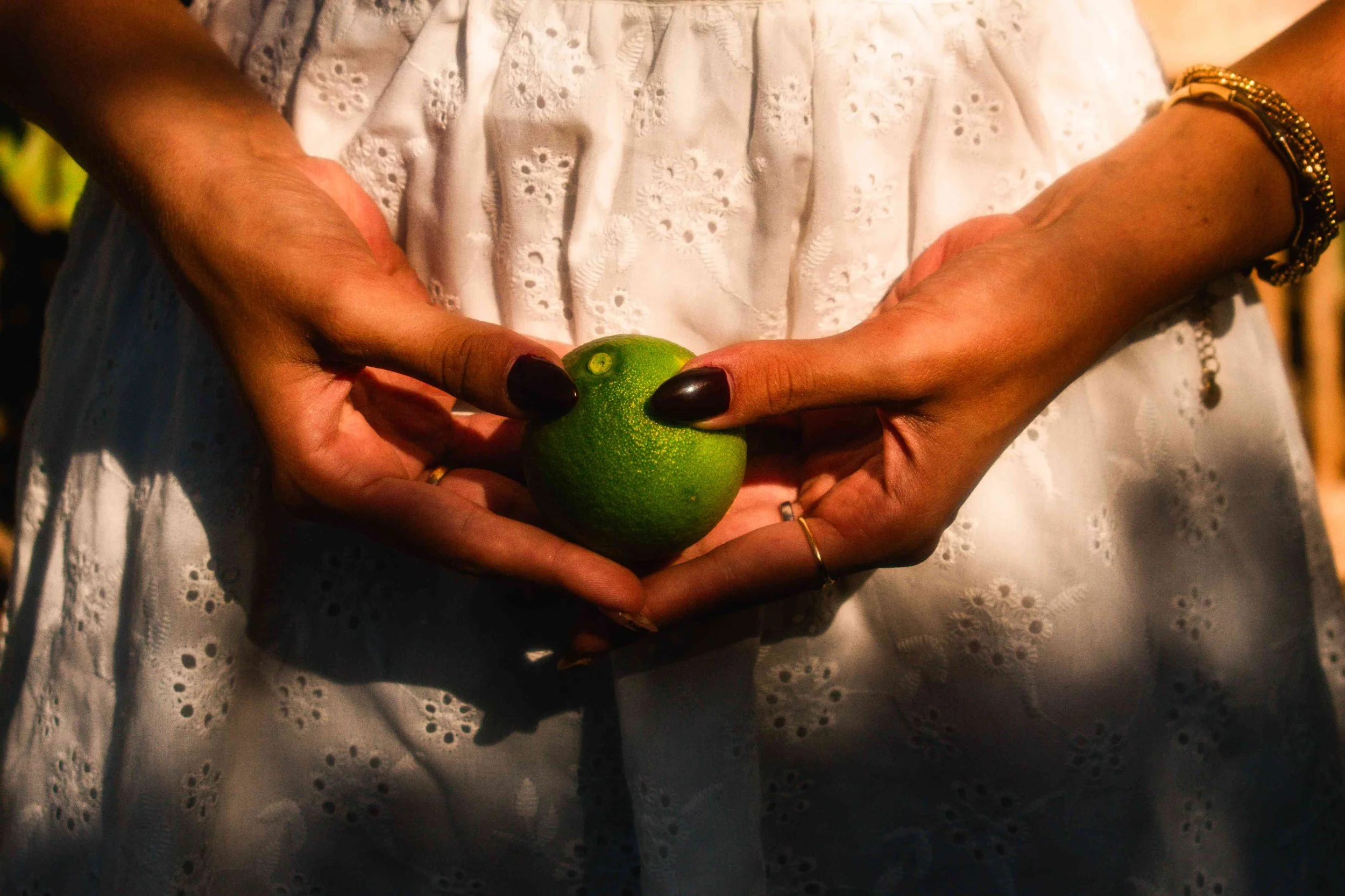
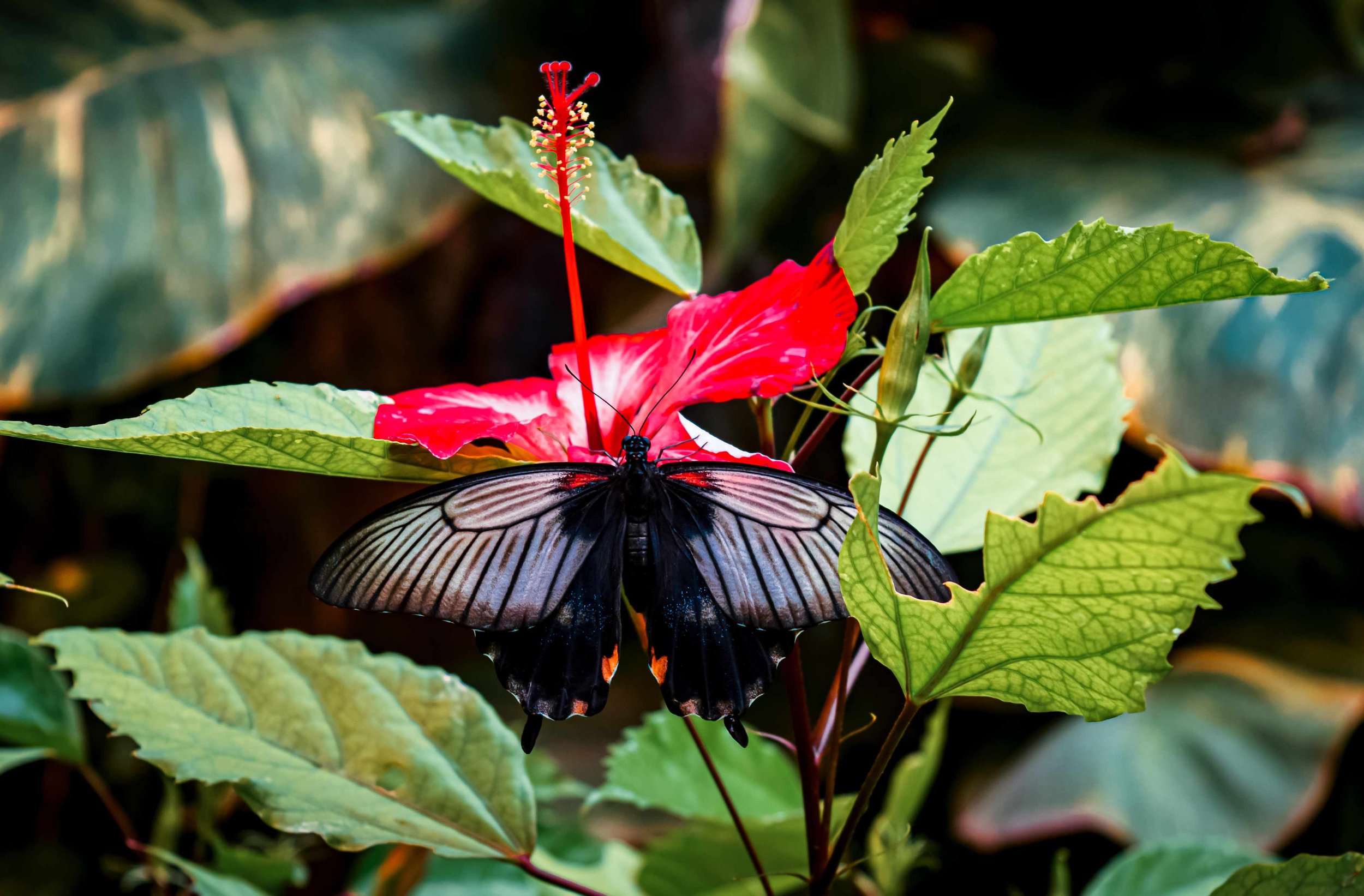
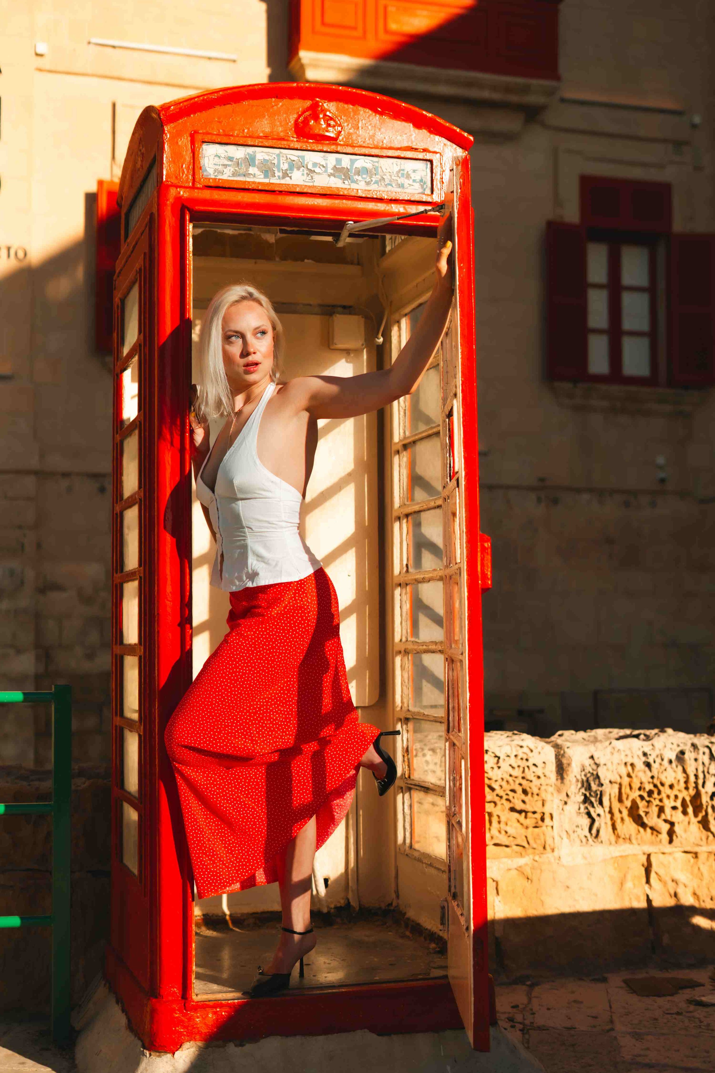
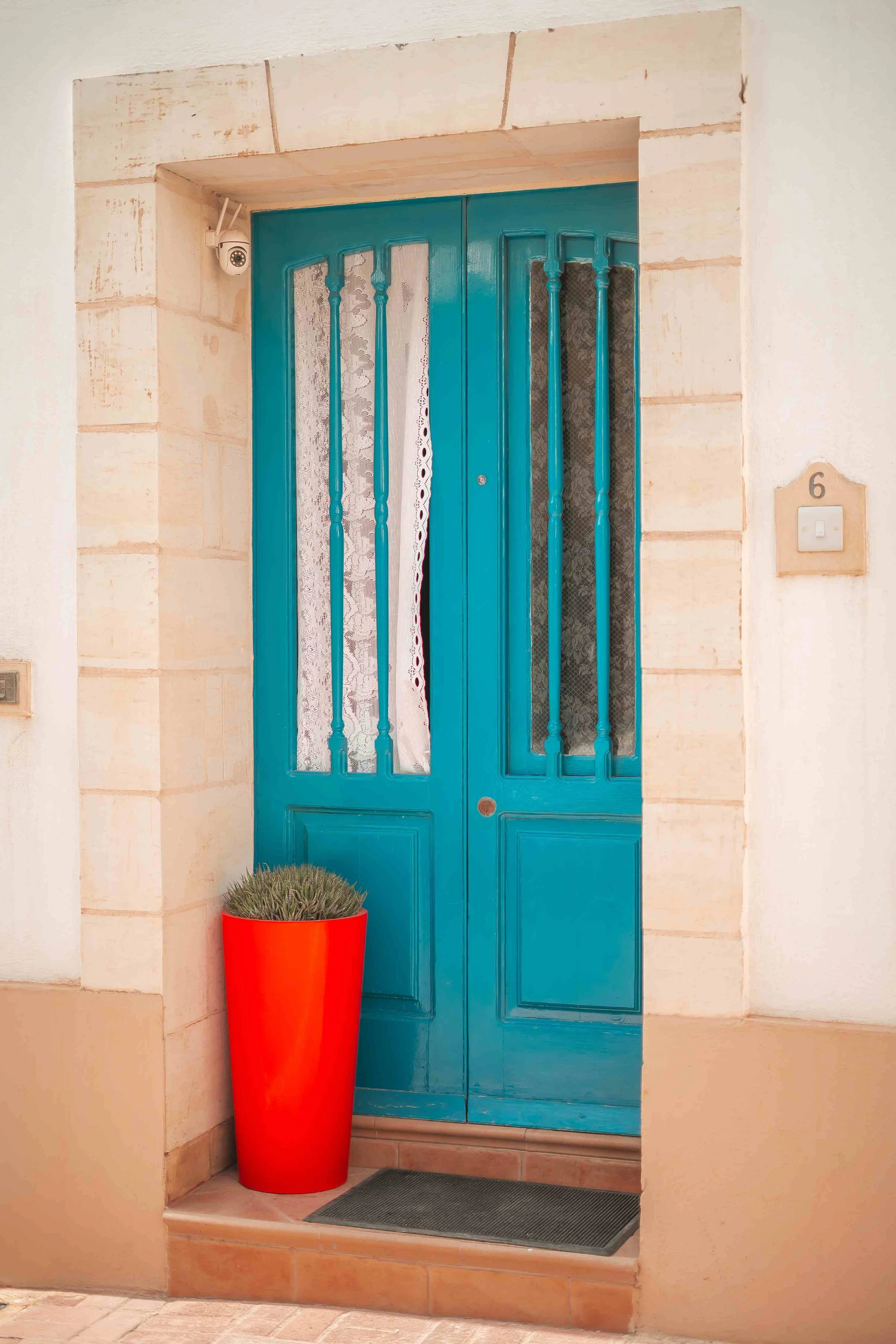
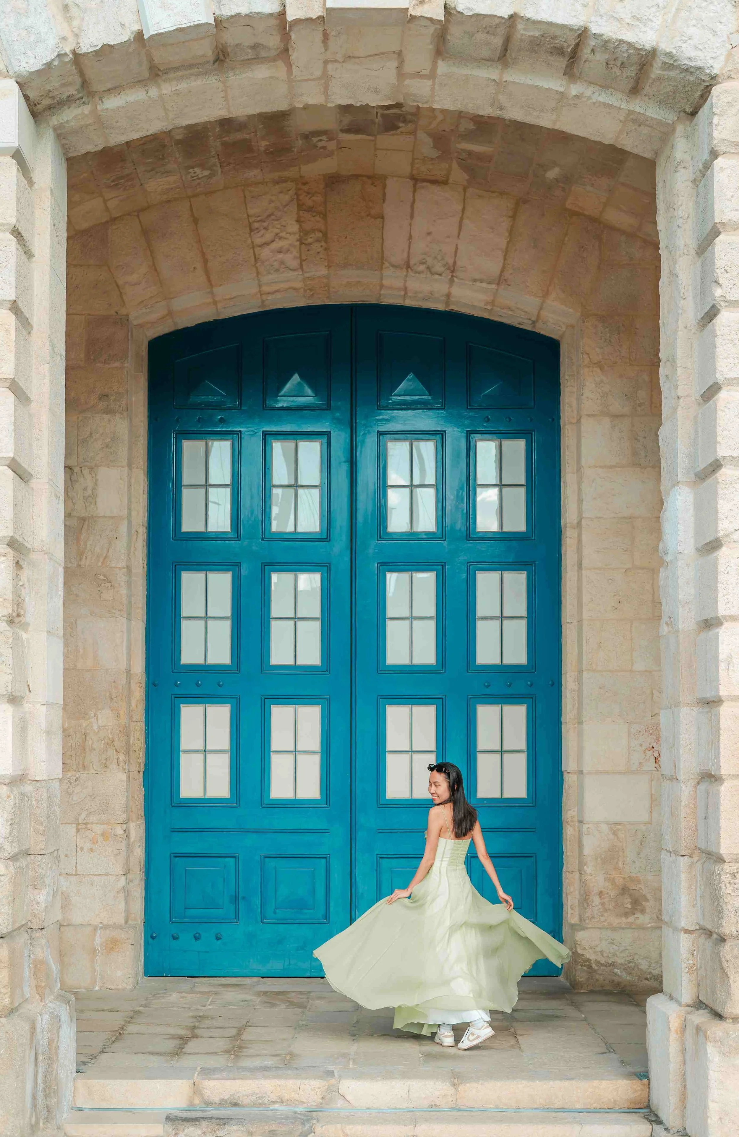
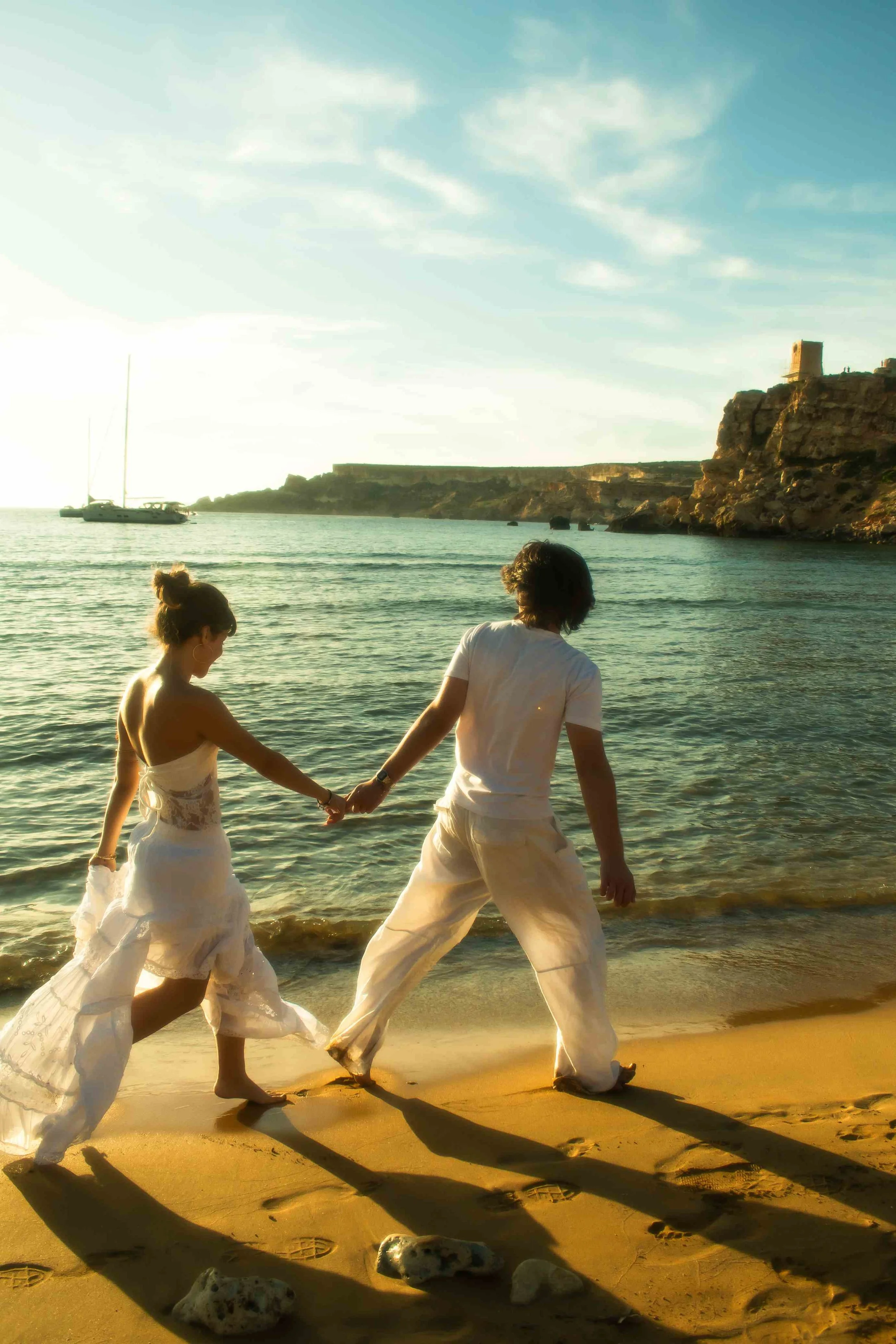
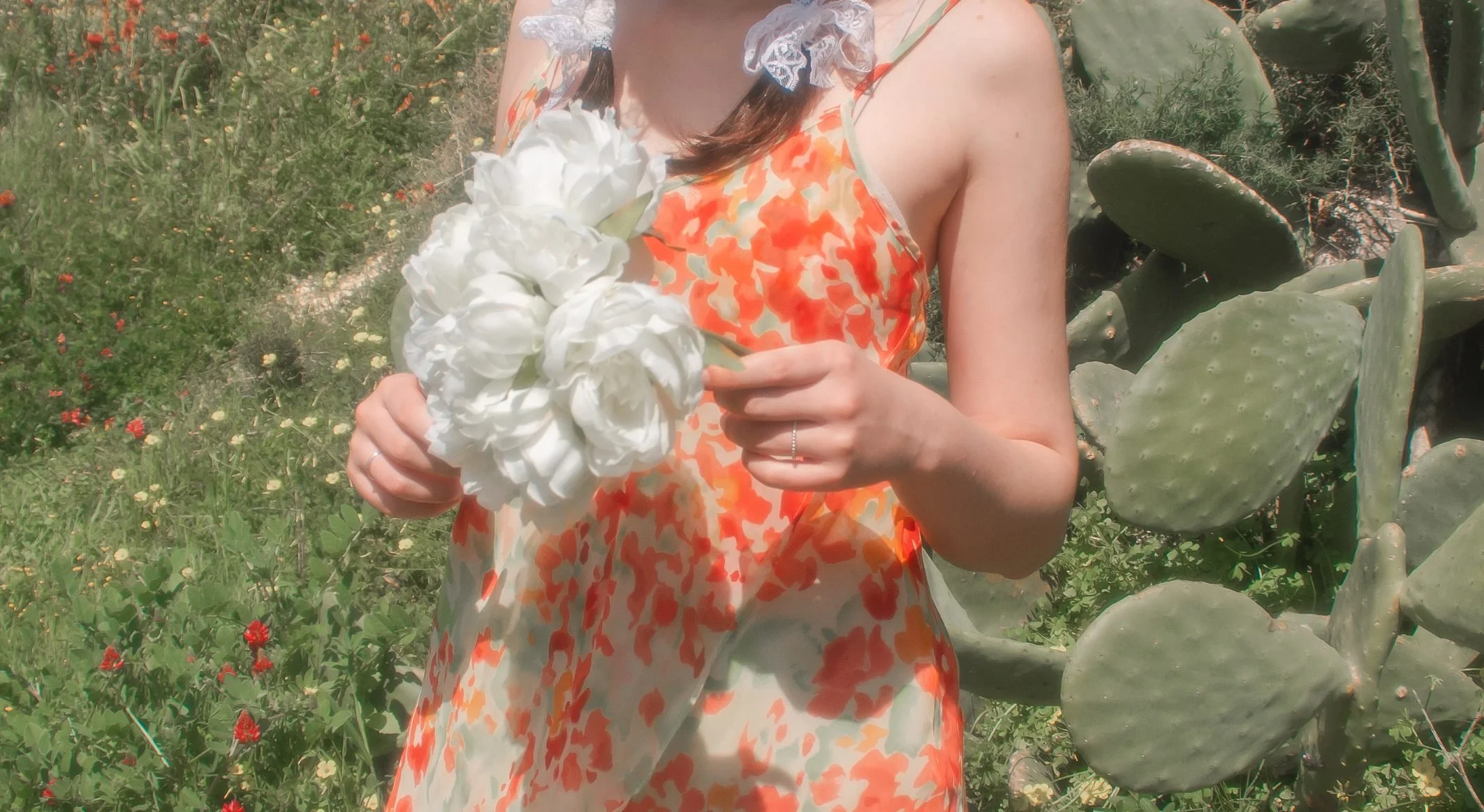
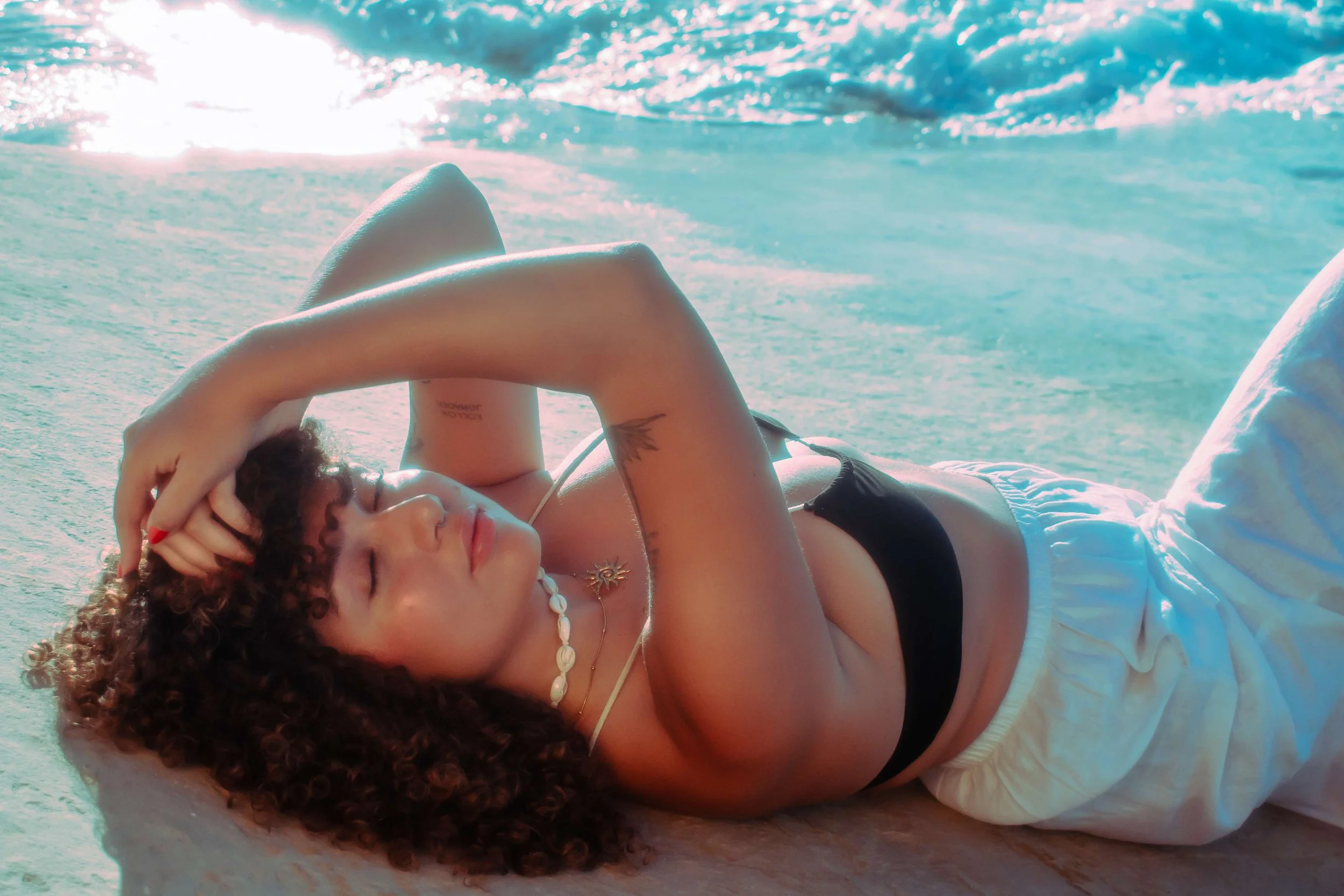
My photos:
What This Has to Do With My Photography
Most of my photos have a similar colour feel to them: warm, slightly retro, a bit dreamlike. That didn't happen by accident.
I shoot real places, real people; nothing staged beyond what's already in front of me. But I am always reading the palette; the light, the shadows, the textures around us, and thinking about what they're doing emotionally before I've even lifted the camera.
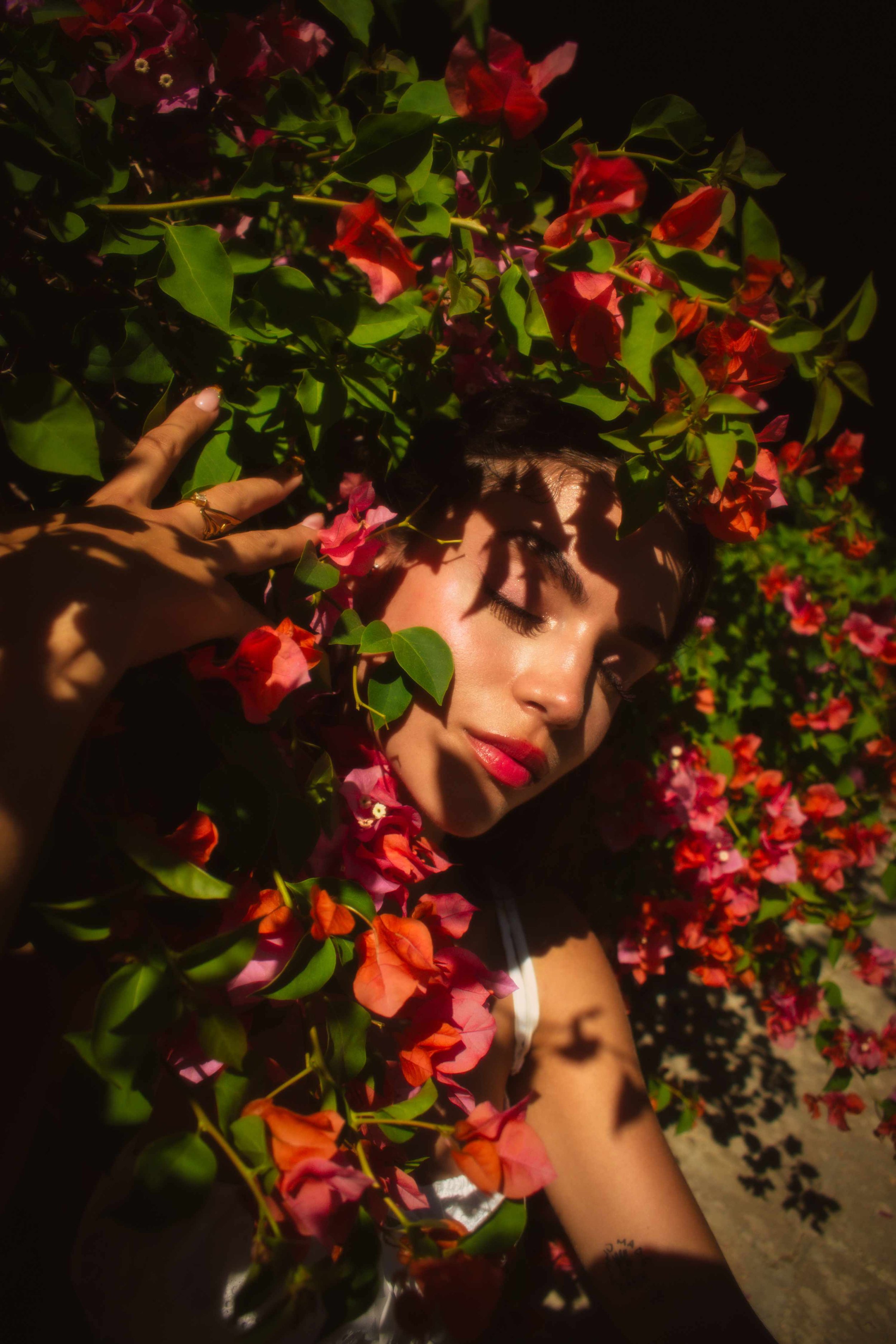
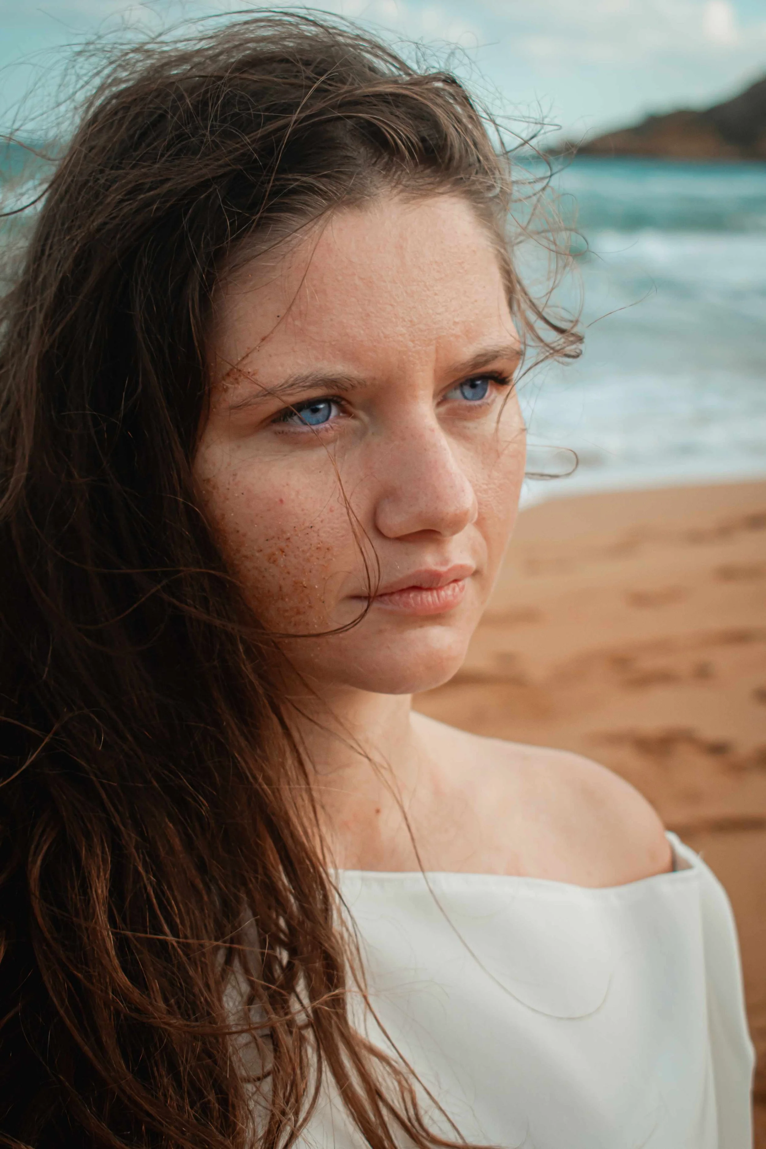
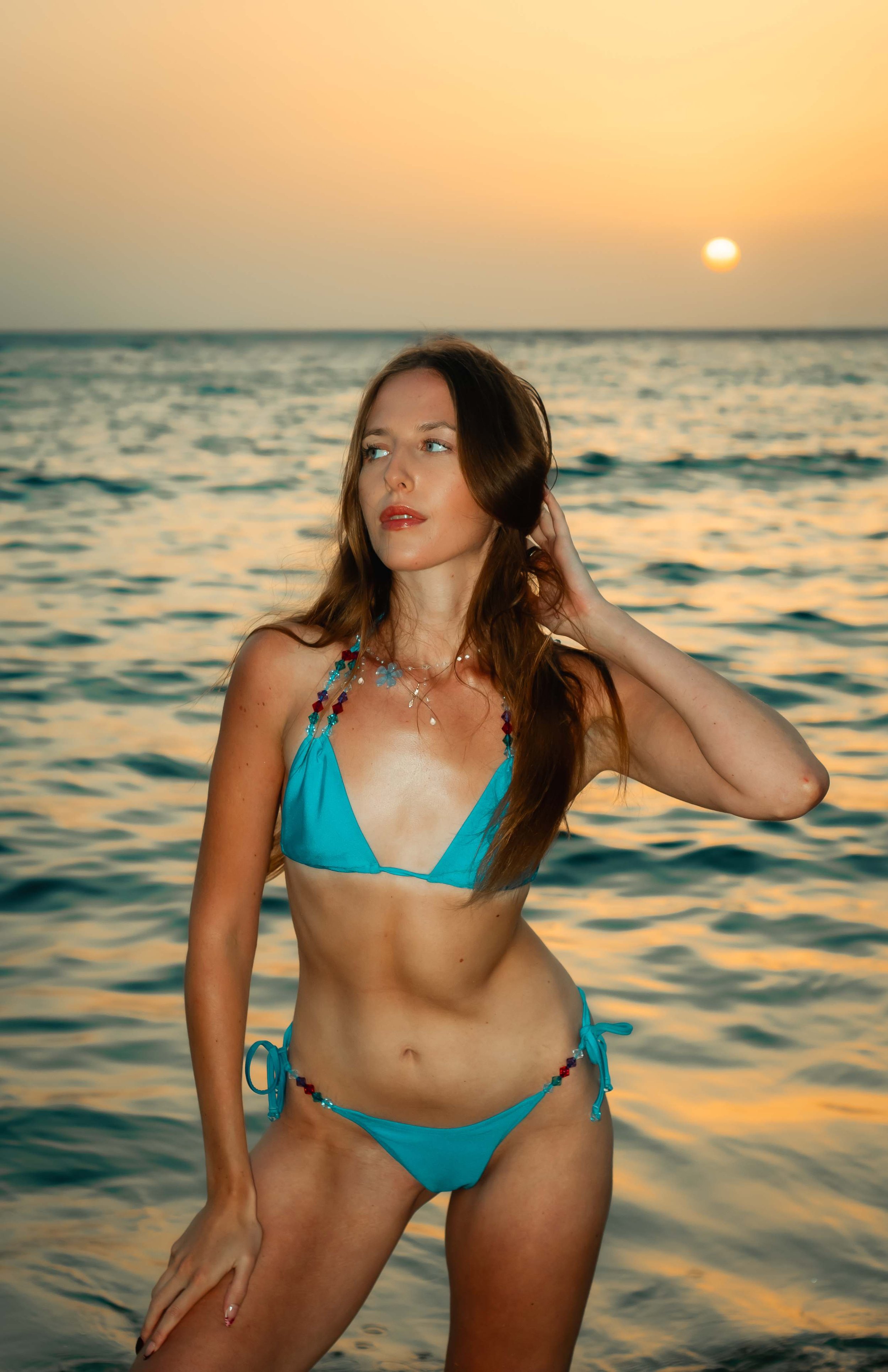
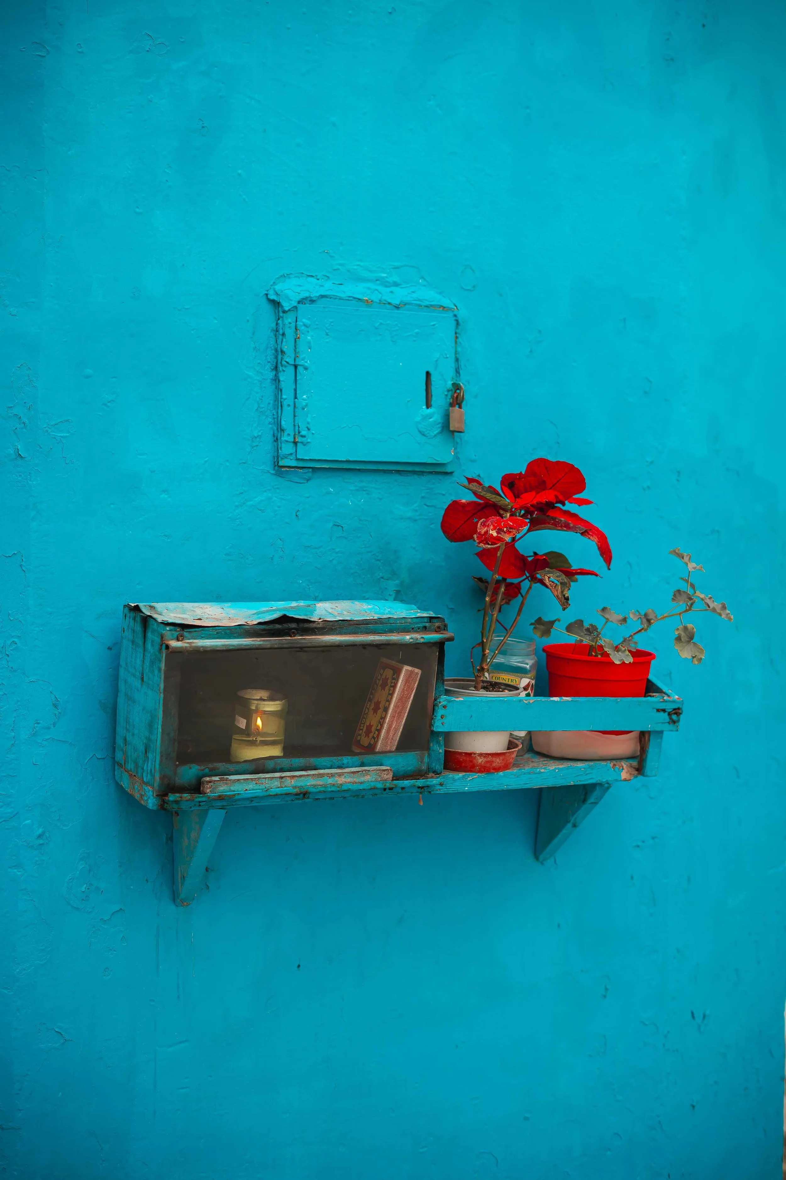
Colours carry meaning in a way that most people feel but rarely think about consciously. Alongside communications, I also studies psychology in university and the two ended up feeding each other in ways I didn't expect; in fact, it's where film aesthetics and human psychology meet. It's a well researched field and the patterns are consistent across decades of studies. Warm tones: yellows, golds, soft ambers - trigger higher arousal emotions: excitement, energy, nostalgia, closeness. Cool tones: washed out blues, faded pastels - do the opposite, creating calm, stillness, and quiet. Muted, desaturated tones tend to feel timeless; nothing about them fights the subject or dates the image, which is part of why that slightly faded retro quality produces photos that still feel right in ten years.
And then there's red. Even a small touch of it commands the frame. It's the ten percent. But it's the thing your eye finds first, every time, without being told to.
The 60-30-10 rule applies to my shoots in exactly the same way it applies to his films. Malta makes this easier than most places: honey-coloured limestone walls as a natural sixty percent, a faded blue door as the thirty, and whatever you're wearing as that ten percent accent. The architecture makes it simpler.
This Is Exactly Why I Ask to See Your Outfit First
Colour is not just decoration - it is mood. It is the difference between a photo that feels joyful and one that feels flat, between one that feels timeless and one that just feels like a nice day out.
The single biggest variable I cannot control on the day of your shoot is what you're wearing.
A bright neon top in front of a pastel blue wall doesn't just clash, it fights the whole frame. It pulls focus away from your face, your expression, the moment. Someone in dusty rose or soft cream against a warm golden Maltese wall? The colours are working with me before I've even pressed the shutter.
This is why I always ask to see outfits before a session. Not to dress you in something that isn't you, but to make sure what you're wearing is part of the palette, not against it. And because I've spent years studying colour theory, aesthetics, and psychology, I can also tell you what actually works for you specifically, not just for the location. Colour undertones matter more than most people realise. Everyone has either a warm, cool, or neutral undertone to their skin, and the colours you wear either complement that or work against it. Wearing a colour that clashes with your undertone can make you look washed out or tired in photos in a way that has nothing to do with the light or the editing. On the other hand, the right colour will make your skin glow, your eyes stand out, and your whole presence in the frame stronger. Certain colours will make eye colour pop in a way that no amount of editing can replicate after the fact. This is something I look at with every client before every shoot, and it makes a real difference to the final images.
Think of it the way Anderson thinks about every element in his frame. Everything is a choice. Yours included.
If you're not sure where to start, I'll always help. Sometimes the right colour is the one already hanging in your wardrobe that you keep walking past.
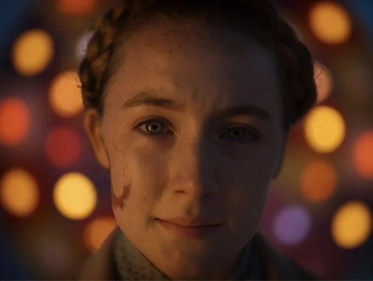
"When you're writing a story, it often feels less like you're doing architecture and more like you're doing excavation. Like it's something that already exists and we're just unearthing it, and you know it's right because it just is." - Wes Anderson
Colour by Shoot Type: A Practical Guide
These aren't rules, they're starting points. Every person is different and I always adapt. But this gives you a sense of how I think about colour depending on the session.
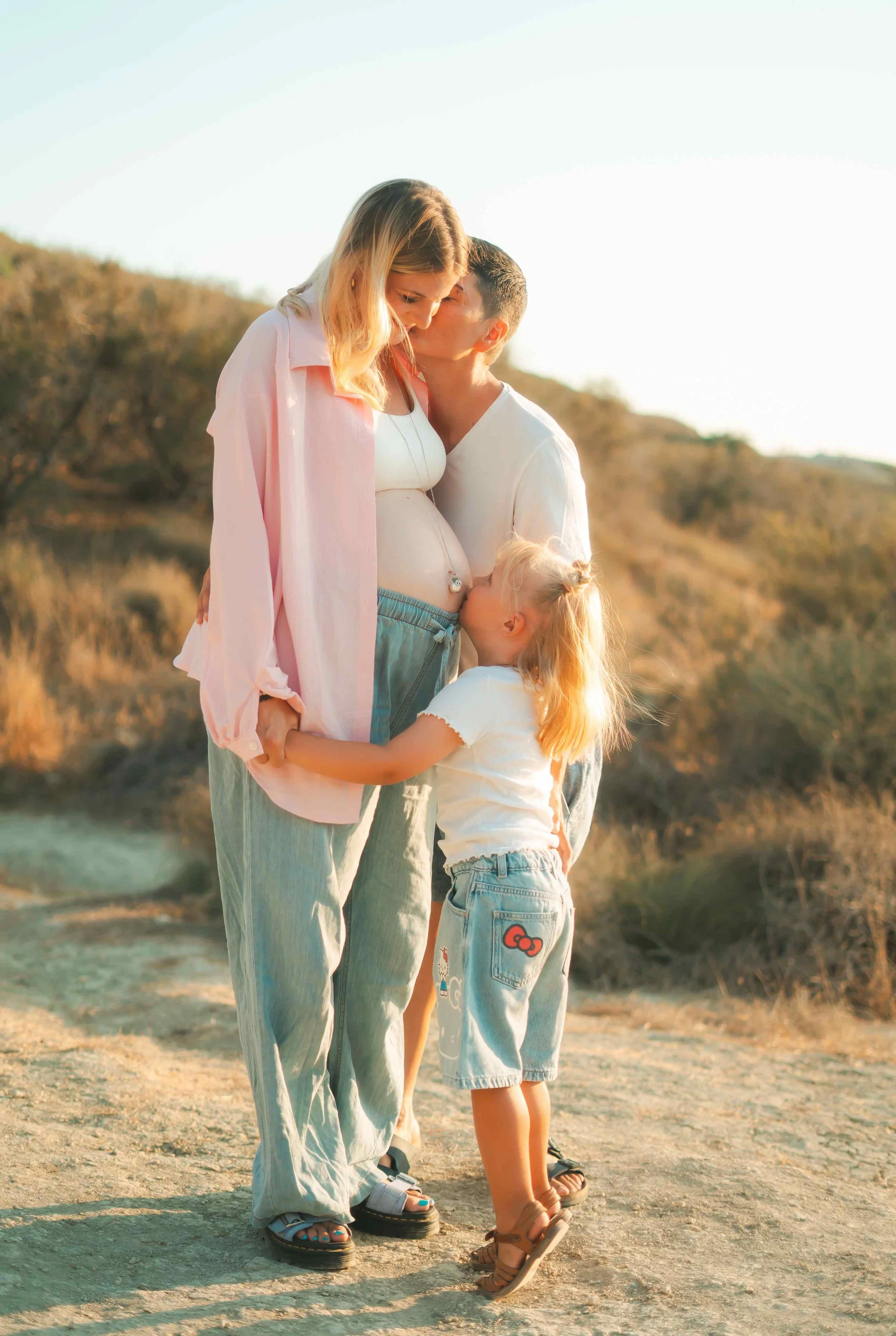
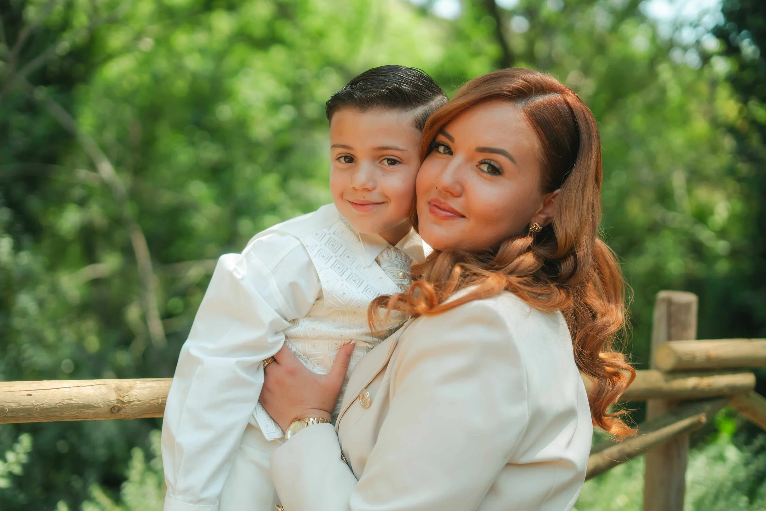
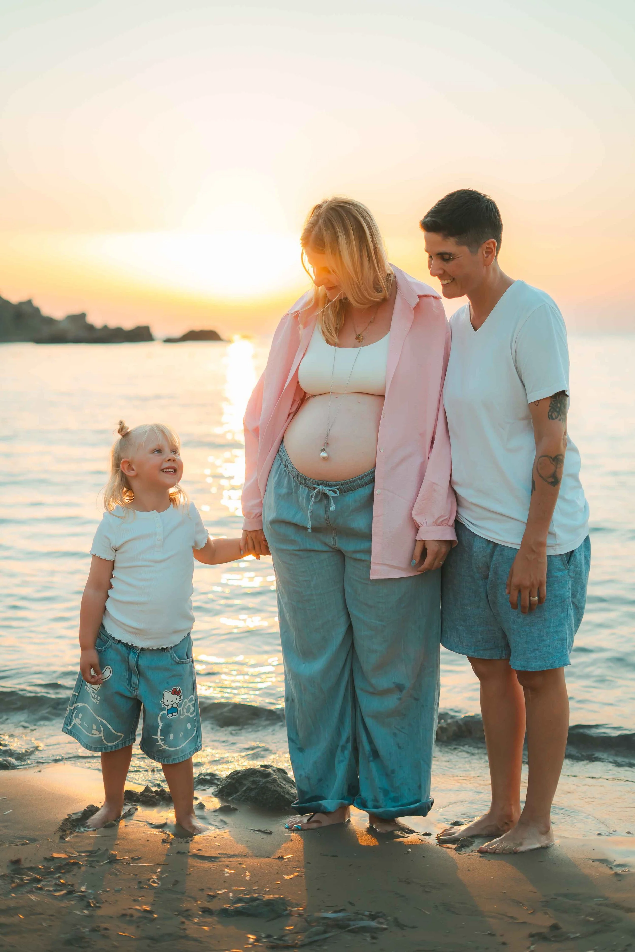
Maternity shoots Soft and clean. Whites, creams, blush tones, soft nudes. Flowing fabrics in neutral tones against natural light almost always work. Avoid strong patterns or heavy colour that competes with the subject.
Portrait shoots in Valletta or Birgu These locations can handle contrast and bold colour. Deep reds, burnt oranges, jewel tones, greens, blues… all sit beautifully against warm limestone. Soft pastels can get lost against the texture of the walls here, so this is the place to be bolder.
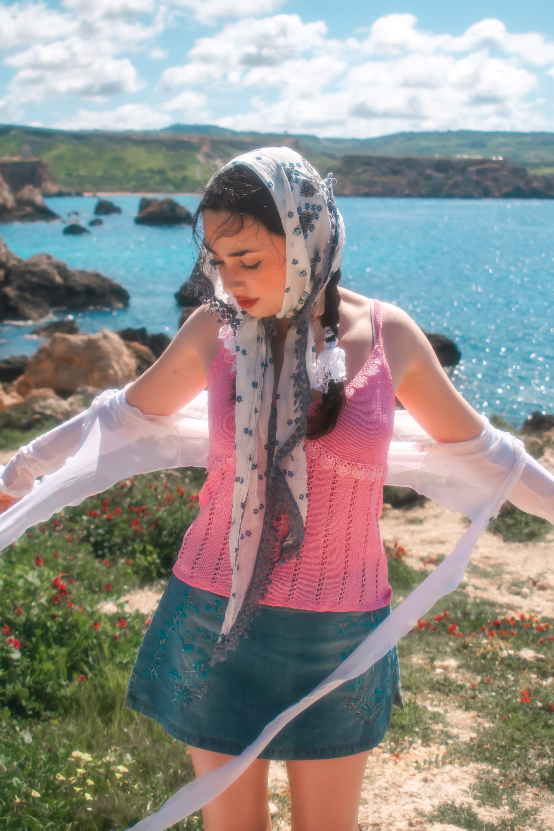
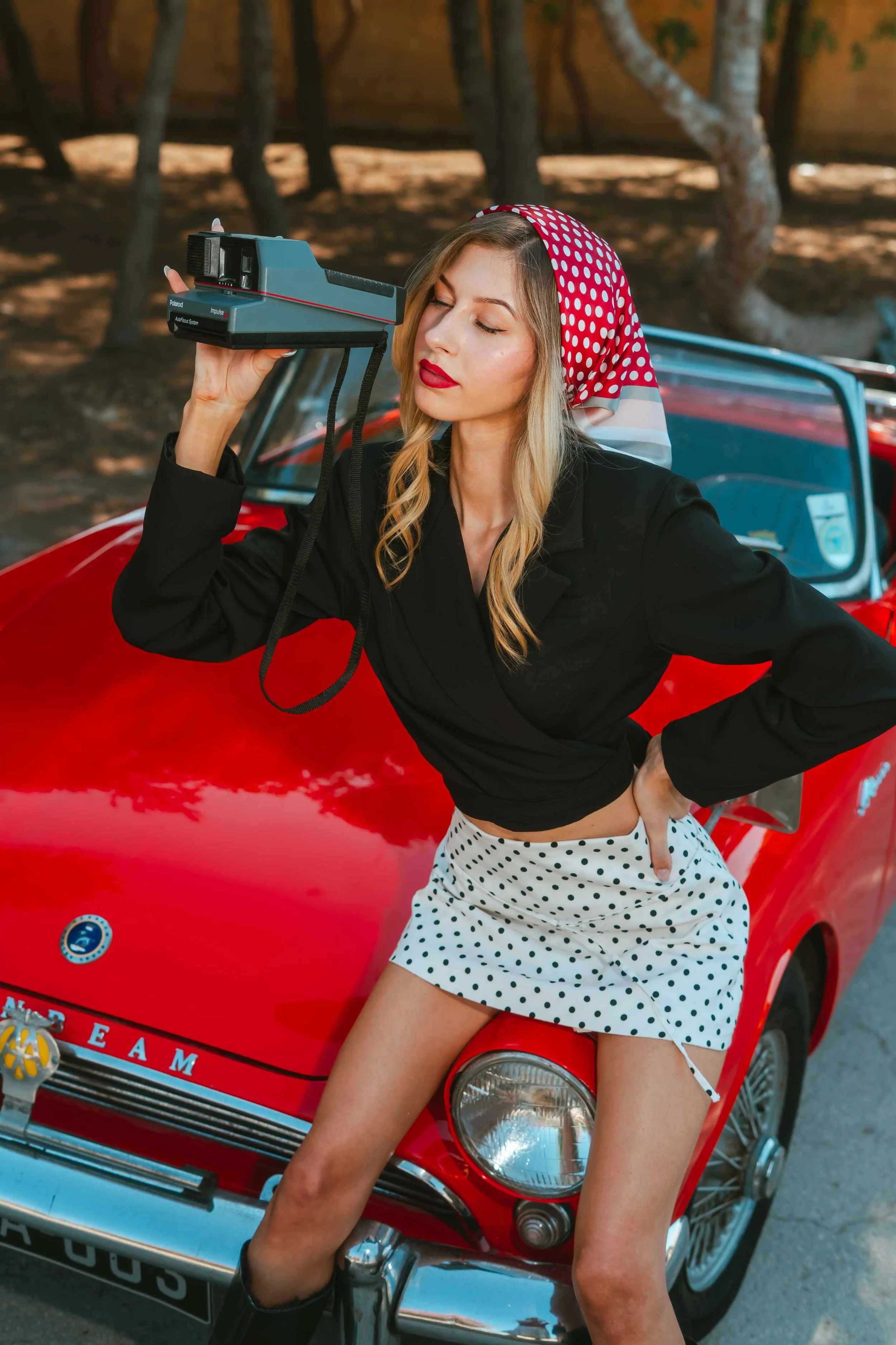
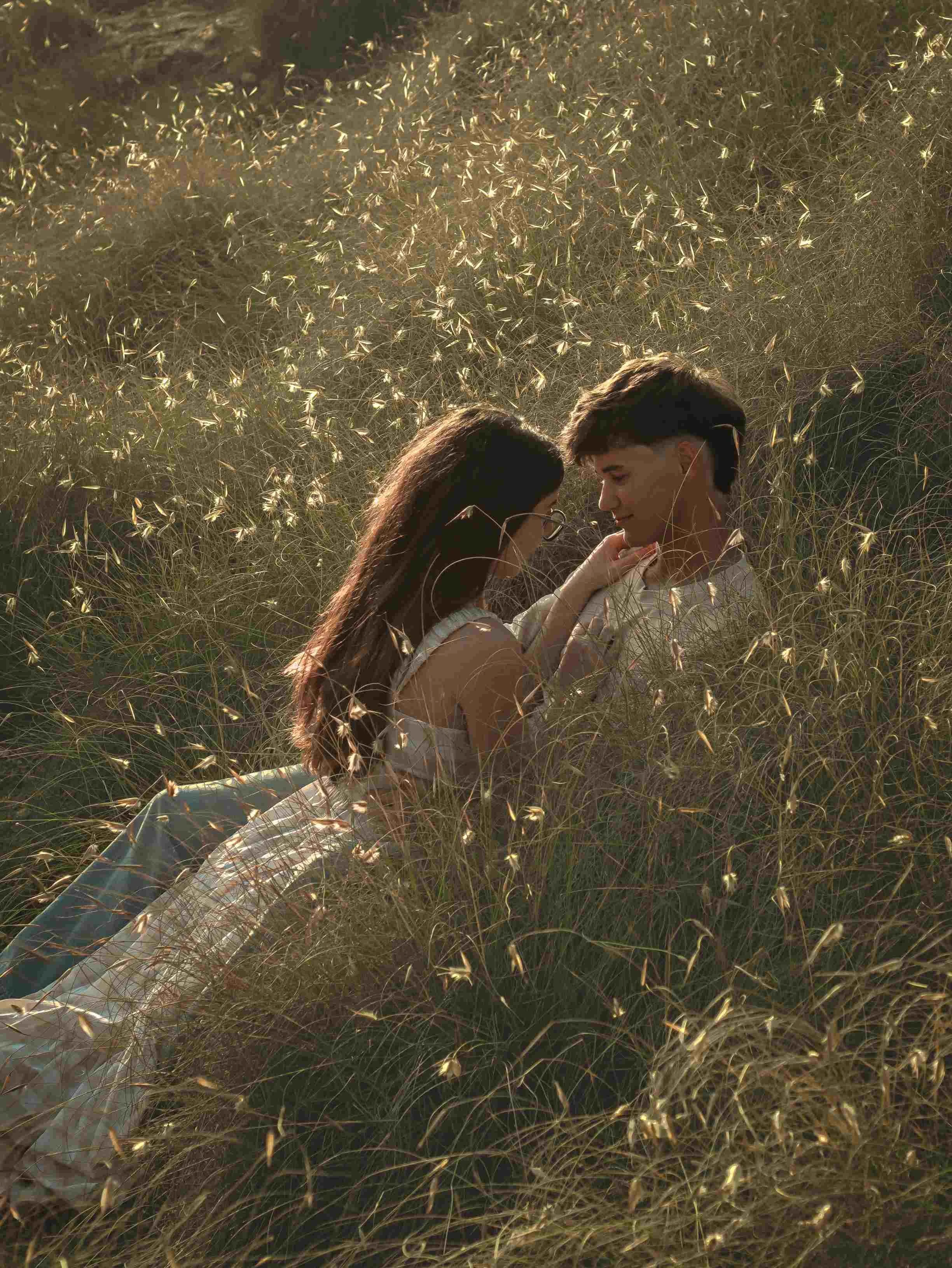
Couples photography in nature: cliffs, countryside, coastal Softer palettes work best. Dusty pinks, sage greens, muted earth tones. And when in doubt, white is always a safe option. The landscape is already doing a lot of the visual work and the outfits should complement rather than fight it. For golden hour shoots specifically, warm tones almost always win.
Birthday and celebration shoots This is where you can be more expressive. A vibrant red in Valletta stops the frame completely. In a more natural or garden setting, something like a bold pastel, strong lilac, coral; adds a celebratory energy without feeling out of place.
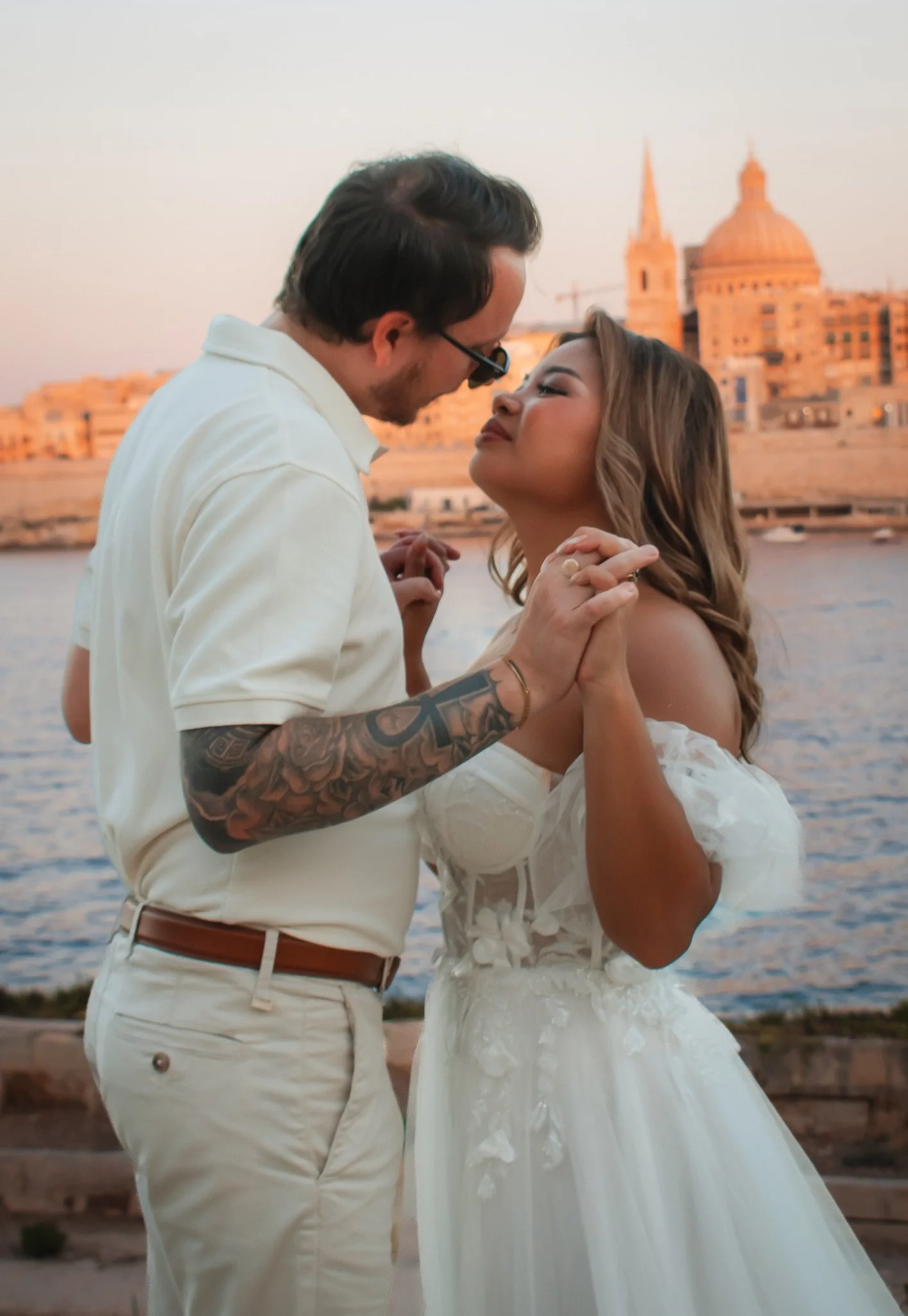
Wedding and pre-wedding photography in Malta Warm and earthy tones are consistently the most flattering for golden hour sessions. For something more editorial in Mdina, Valletta or Birgu, there's room for more contrast. The most striking pre-wedding portraits I've shot have had one person in white or cream and the other in a complementary warm tone; dusty rose, sage, rather than both in matching neutrals.
Colour is Everything
What Wes Anderson gave me wasn't a technique. It was a way of seeing. The understanding that colour communicates before language does; that a palette can carry grief or joy or wonder without a single word.
When you book a portrait session, a couples shoot, or a pre-wedding session in Malta with me, we're not just finding nice locations and good light. We're building a palette together. And that palette is what will make your photos feel like yours; specific, emotional, and genuinely worth keeping on a wall.
This is the first instalment of Inspired By; a series where I break down the things that shape how I see the world and how I shoot it. Follow along on Instagram.
📩 info@photographoebe.com | 🌐 www.photographoebe.com
Based in Malta. Shooting everything worth remembering.